
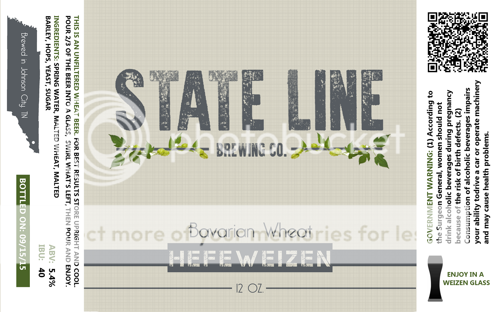
After a lot of time and work and looking around for ideas I have come up with this as a baseline for a logo/label design. Any comments/constructive criticism are appreciated good or bad. I take pride in my work and I want to do things right from the start.
I have yet to do this before and have not printed, I hope everything is still legible when printed small, look like this will be an issue at all?
For now numbers and stuff are made up for designing purposes.
Which color looks best?
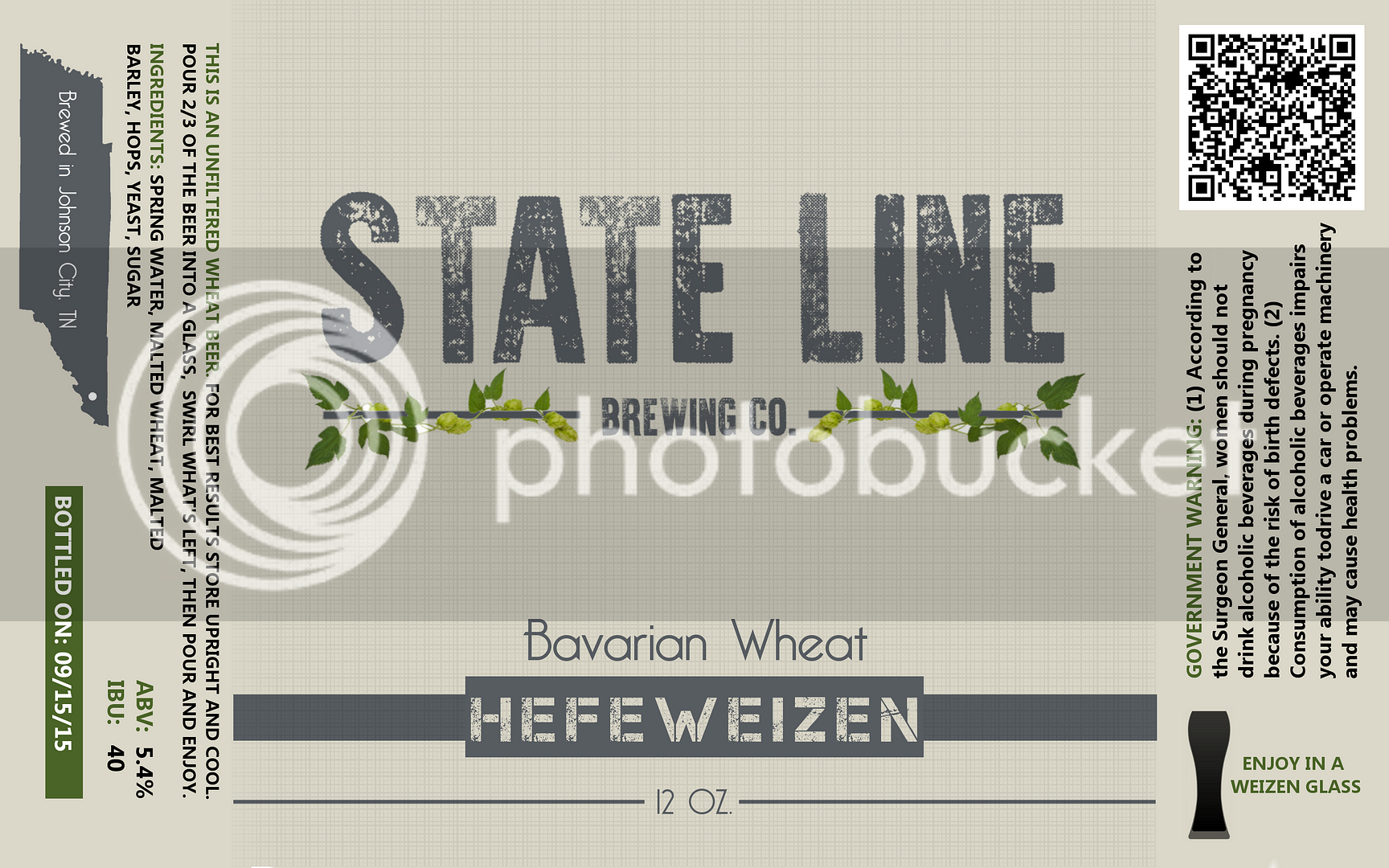
I have yet to do this before and have not printed, I hope everything is still legible when printed small, look like this will be an issue at all?
For now numbers and stuff are made up for designing purposes.
Which color looks best?


