You are using an out of date browser. It may not display this or other websites correctly.
You should upgrade or use an alternative browser.
You should upgrade or use an alternative browser.
doppelbock
- Thread starter bhines09
- Start date

Help Support Homebrew Talk - Beer, Wine, Mead, & Cider Brewing Discussion Forum:
This site may earn a commission from merchant affiliate
links, including eBay, Amazon, and others.
cmdrico7812
Well-Known Member
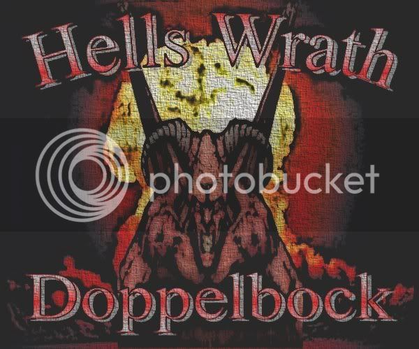
I like it. Maybe tone down the texture on it so the image is a little clearer.
I'd keep the texture but your text needs to be a little clearer- mainly the drop shadow I think is confusing the letterforms. Also the label is a little washed out, I'm not sure what program you are using but in photoshop terms, I'd take a red orange color and put it over the image on, say, overlay setting- not full opacity though. Actually if you do that, and then lose the drop shadow and maybe tint the letters slightly more to the orange, red, or even green I think you'll have a decent label.
If you wanna go super awesome, ditch the V shape those wings are making as they're sorta breaking up your composition a bit, move the torso of the demon up and then realign your text around that in sorta the same manner you're doing now.
Feel free to ignore me XD
If you wanna go super awesome, ditch the V shape those wings are making as they're sorta breaking up your composition a bit, move the torso of the demon up and then realign your text around that in sorta the same manner you're doing now.
Feel free to ignore me XD
Similar threads
- Replies
- 5
- Views
- 874
- Replies
- 27
- Views
- 1K
- Replies
- 12
- Views
- 412
- Replies
- 4
- Views
- 362


