working on my logo

Homebrew Talk - Beer, Wine, Mead, & Cider Brewing Discussion Forum

Help Support Homebrew Talk - Beer, Wine, Mead, & Cider Brewing Discussion Forum:

This site may earn a commission from merchant affiliate links, including eBay, Amazon, and others.

Maegnar

Well-Known Member
Joined
Nov 23, 2011
Messages
71
Reaction score
2
Location
Vilnius
Good evening, fellow brewers.

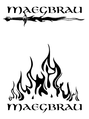
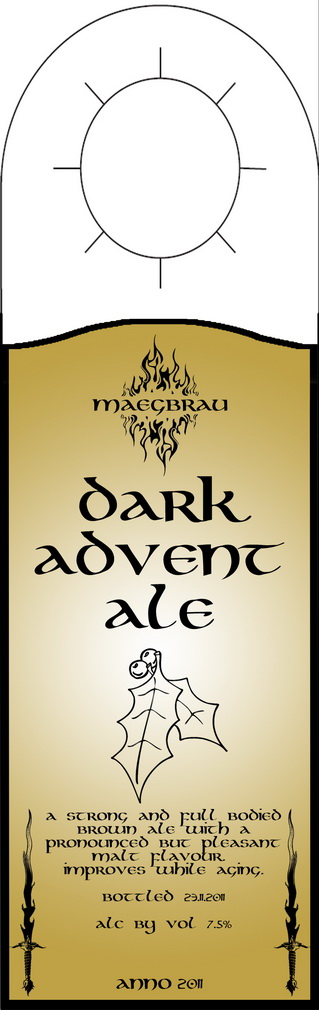
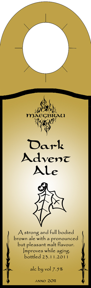
I'm working on a design of a seal/logo that would go on the labels of my HBs.
Thou it's still a work in progress - I'd like to share with you two of the options that I've came up with.
I'd like to keep the fiery theme, but I'm not sure about the font that I'm using. I like the Celtic feel.
Please give any thought you'll have - I'll gladly accept any criticism and ideas.

Also on a side note - is it a grammar mistake to write "brau" without "ä"?

logo_1.jpg
 
Of the 2 imo the first is more Celtic. It needs some work though again imo. It would make a nice neck wrap on a bottle. If you meant brew by using brau, You are correct brau is brew but that is a German to English translation . I have no idea what a Celtic translation would be.
 
Great work I like the idea of the sword but I love how the flames turned out. I think it has a nice flow to it and looks great with that font!
 
I like them both! I would decide between them by choosing where the logo is placed on label or bottle. Go with the one that fits better.
 
I like the sword logo.

I've noticed that most 'professional' beer companies (and many other kinds of companies too) don't have elaborate logo's, but rather just simple word marks.

IMHO, the sword is simple enough it doesn't take away from the name, while the fire one, although cool looking, kind of competes with and overpowers the name.
 
I'd go with the sword. I agree the flames are a little too busy. Simplicity is key. If you like the fire theme consider going with one flame something like the one below. You could even try doing some Celtic hatch work to make the flame shape... It would go better with the Celtic font.

If you like the sword, I'd suggest trying to take out some of the grainy detail.
 
Thank you all for your feedback on the initial logo. After browsing a bit on the forums - I've found a great idea to make hangers instead of conventional glued-on labels. So after a week of brainwork I've came up with a RC of the label. Here's how it looks like now. Please tell me what you think.

label_beta_0.4__small_.jpg


PS
This is a logo for my first batch - Brewferm Christmas kit.
 
sorry to "bump" it up, but I really need a feed back before I show it to my friends and family. does it seem good, or something needs to change in it?
 
Personally I don't care for the font used for the name/description. The lettering looks inconsistent (some letters appear capitalized, other look lowercase) and the spacing is funny. The numerals look out of place compared to the words preceding them. I don't like the look of a beer's name in all lowercase letters. It's a proper noun, dammit! The holly leaves are a little thin/weak/uninteresting for the centerpiece of a potent Christmas ale in my opinion too. I apologize if my words come off overly critical -- I like the Celtic thing that you're going for, and the most important thing is that YOU are happy with it. I'm just responding (honestly) to an appeal for feedback.
 
@motleybrews
I'm going to print it out on a gold paper, so yeah, the neck will be of the same color as the body.

@bigbeergeek
This is exactly the type of feedback I was looking for. Thanks!
I'll search the web for a better, yet similar celtic-themed font. This one is "same-size" type and it doesn't make a difference if I press "shift" or not. I'll also try to use "Maegbrau" instead of "maegbrau" in the title and see how it looks together with the flames. Thou I'm afraid it will add too much weight on "M" and the title will seem leaning to the left, visually.
About the mistletoe - do you think it'll be better if it's in a more bold lines, or do you think it's misplaced altogether and should be replaced by something else?
 
I personally don't mind the lowercase beer name, but the kerning is off (letter spacing). I don't know what program you're using, but you can usually turn auto-kerning off and adjust spacing yourself. It could just be me, but I have a Graphic Design degree, so I'm more sensitive than most. If you want to fake a larger capital letter and I do this sometimes, just up the point size of the first letter just a few points.

As for the descriptive font - don't use that font. It's difficult to read when small and just competes too much for attention. Typically, you'll want one font for your 'headline' or logo and your copy font should be simple and readable, but complimentary. You could use a simple classic font like Garamond for your copy, which is very readable and not modern.

I agree with bigbeergeek as well that the holly is lost. Heavier would certainly be better.
 
I like the hagner better than the others but I also am not fond of the font. At first look I read it as McBrau, sorry. I also agree that the name of the beer should be Capitalized.

On the plus side I like the name of the beer and the colors will look good on a bottle.
 
I've aggregated your suggestions and improved here and there.
Does this one looks better and/or needs any more changes?

The main logo remains unchanged - I'm quite comfortable with the letters being same size. I see it as in all CAPS, not in lower case.
Changed the font for brew name and body text, as well as made holly look stronger.
label_beta_0.6__small_.jpg
 
Nice... Are you using these for Growlers? If so, brilliant... If not, still cool. :)

My opnion. I like it all except the little leaves... Do they have anything to do with the brew? Or does it belong with the theme? I mean it is simple and neat... Not over bearing with detail, but all the info you need... If it were a brown nut ale, I guess you have...well... some nuts... a small squirrel... not sure... Perhaps a ghosted pic of Drizzit... now I am showing my old school D&D geekness...

EDIT: OHHH... Christmas Ale... ok... sorry... couple of homebrews down already... Football is almost on tonight and still celebrating my Chiefs win... But in retrospect, I think I would rather see a team in my lifetime do the undefeated thing...

Great job!!
 
Back
Top