What was the lead contentLD Carlson or BrewCraft are the ones to use, from our experience. You can see from the picture below, compared to the picture above, it's a much nicer wax to work with. Not as thick and you can still see the cap underneath!
The other one we used was some chinese made wax. Terrible idea...
View attachment 658538
You are using an out of date browser. It may not display this or other websites correctly.
You should upgrade or use an alternative browser.
You should upgrade or use an alternative browser.
Show Us Your Label
- Thread starter muse435
- Start date

Help Support Homebrew Talk - Beer, Wine, Mead, & Cider Brewing Discussion Forum:
This site may earn a commission from merchant affiliate
links, including eBay, Amazon, and others.
Gary Wolstenholme
Member
It's an old trick for making vinyl signs repositionable. Use dish soap, watered down a bit and lather it on the surface before applying the sticker/vinyl. When it dries, it gets into the adhesive making it less permanent, but sticky enough to remove and restick (and soaking re-soapys the soap) My labels are printed on a laser printer, so they'll be waterfast/the ink shouldn't run.No harm no foul. As I recall; Hot water, oxy clean, a razor blade, a green scotch pad, and some elbow grease will get em right off.....
Never heard of the soap trip but sounds promising. I may give that a try sometime. Once I started using gelatin, I’ve never looked back, but it couldn’t hurt to have multiple weapons in the arsenal.
Next time I'll try that, and let you know how I get on.
ranchonodinero
Well-Known Member
Here is my simple attempt.
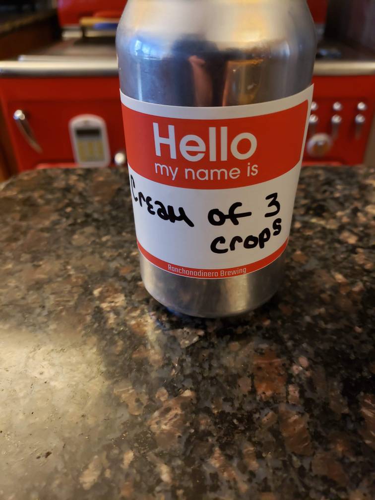

Not finished yet, but it's the first label I've created completely from scratch (aside from the Phillies and Jetro logos). Super proud of how it's turning out so far. It's my tribute to my favorite tailgating lot as I get prepared for Spring Training and baseball season in general. Started out as a pencil drawing, then I used a wet-erase marker on a transparency sheet to get the solid black lines.


treacheroustexan
Well-Known Member
Not finished yet, but it's the first label I've created completely from scratch (aside from the Phillies and Jetro logos). Super proud of how it's turning out so far. It's my tribute to my favorite tailgating lot as I get prepared for Spring Training and baseball season in general. Started out as a pencil drawing, then I used a wet-erase marker on a transparency sheet to get the solid black lines.
View attachment 665643 View attachment 665642
I love this so much, and love the memories behind it! I need to get my annual baseball beer brewed!
Daniel_Colaco
Member
Well thought-out name...
Daniel_Colaco
Member
Rye beer with spruce tips:
View attachment 640057 View attachment 640058 View attachment 640059
German style dark lager:
View attachment 640060 View attachment 640061
Single hop (Amarillo) New England IPA:
View attachment 640062 View attachment 640063
Saison brewed with pilsner, rye and spelt malts:
View attachment 640064 View attachment 640065 View attachment 640066
edit: I do all of this work by myself and I’m open to commissions. PM if you are interested.
They sure look great on the can...
Brewbabe30
Member
- Joined
- Jan 10, 2020
- Messages
- 18
- Reaction score
- 22
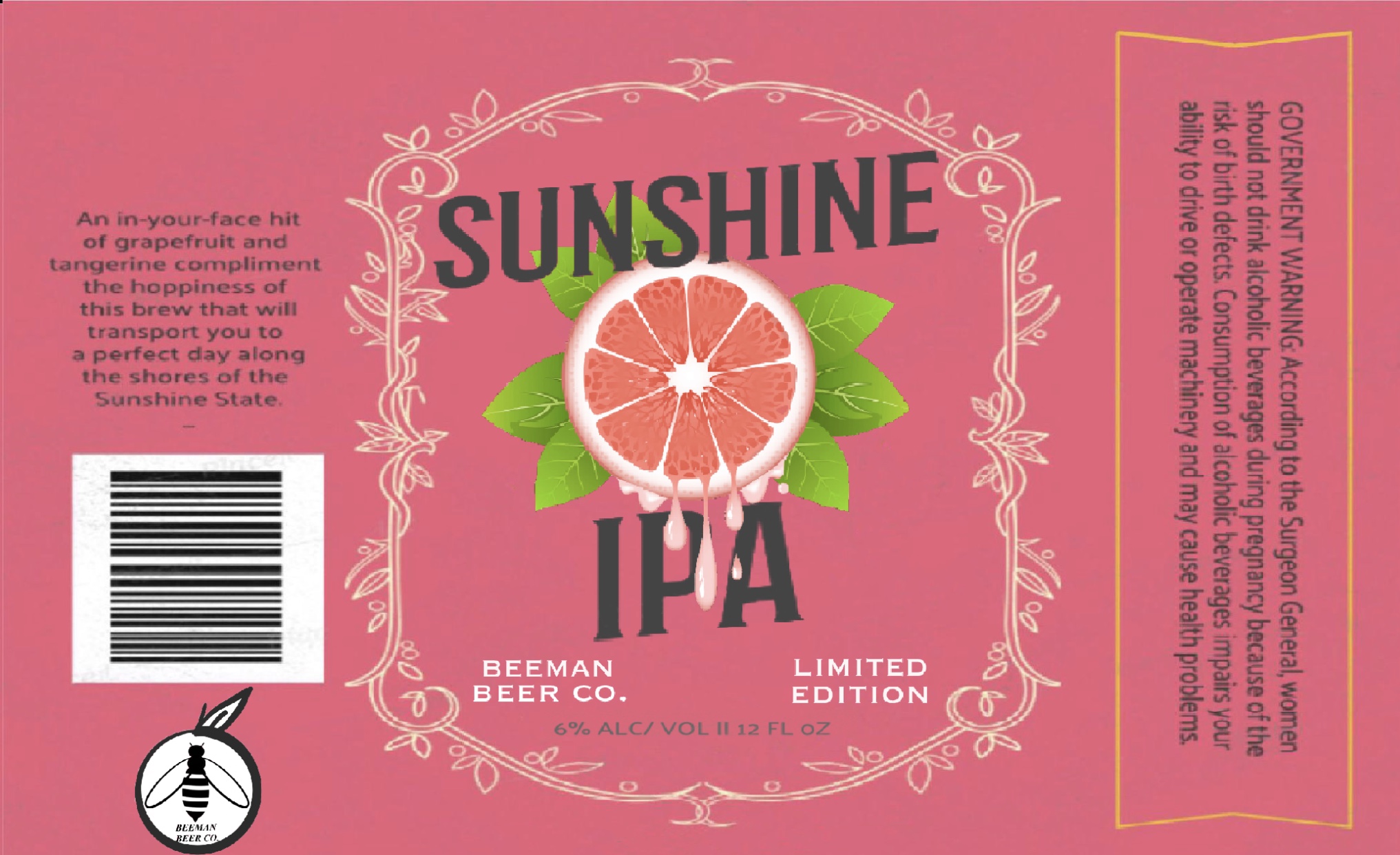
my grapefruit IPA
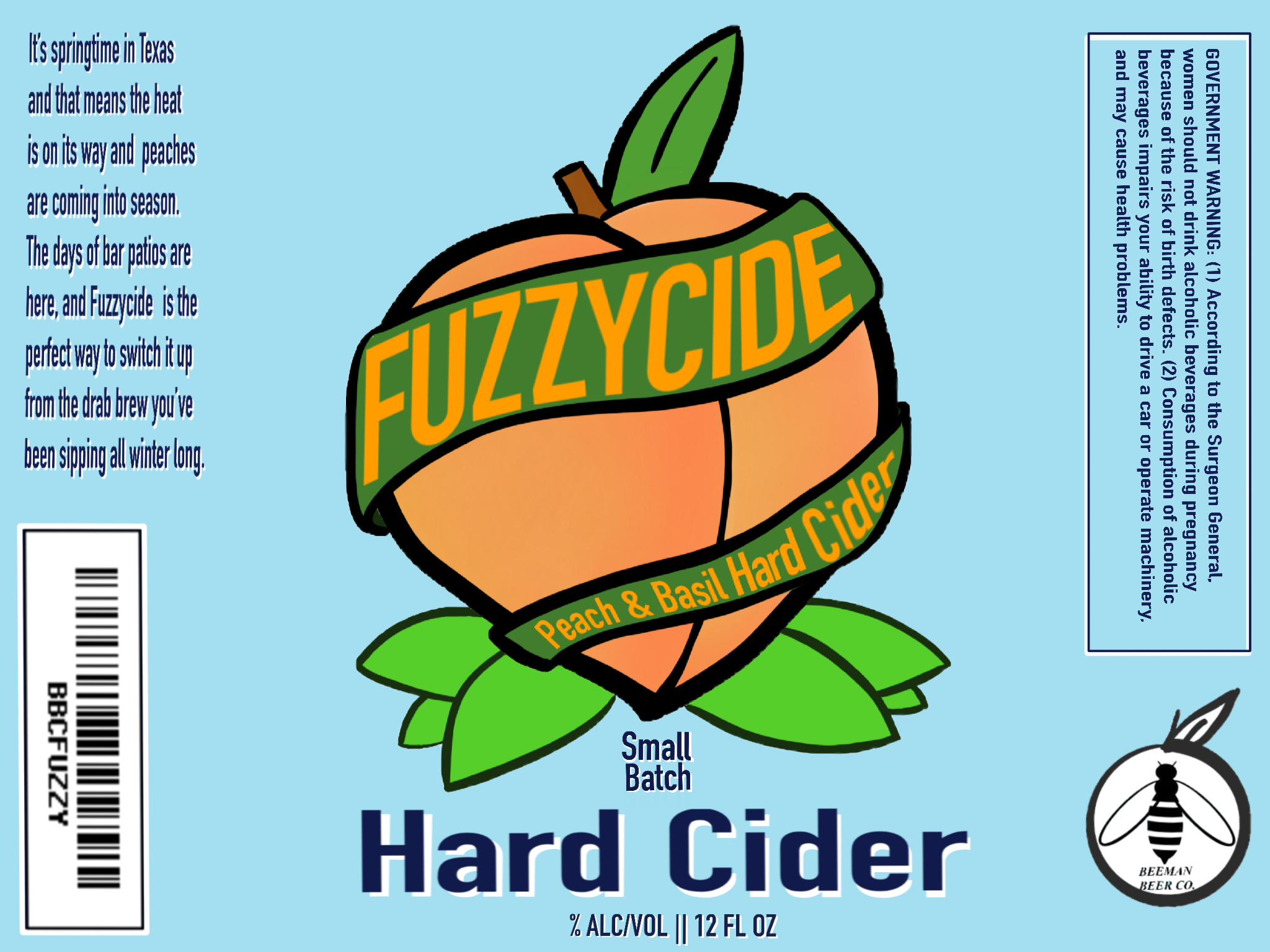
my currently working batch
6Tap
To drink beer is human..
Nice job! [emoji482]
thehaze
Well-Known Member
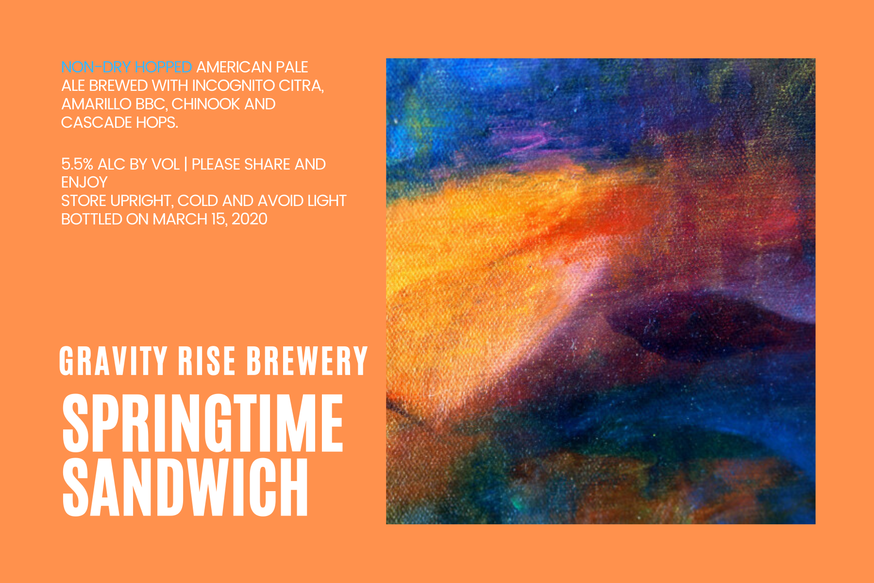
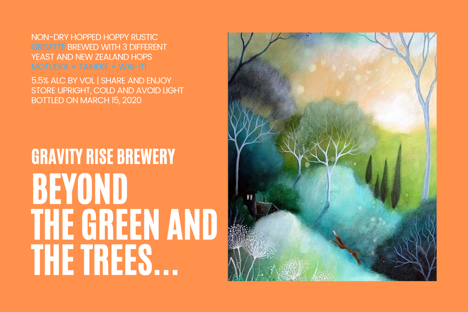
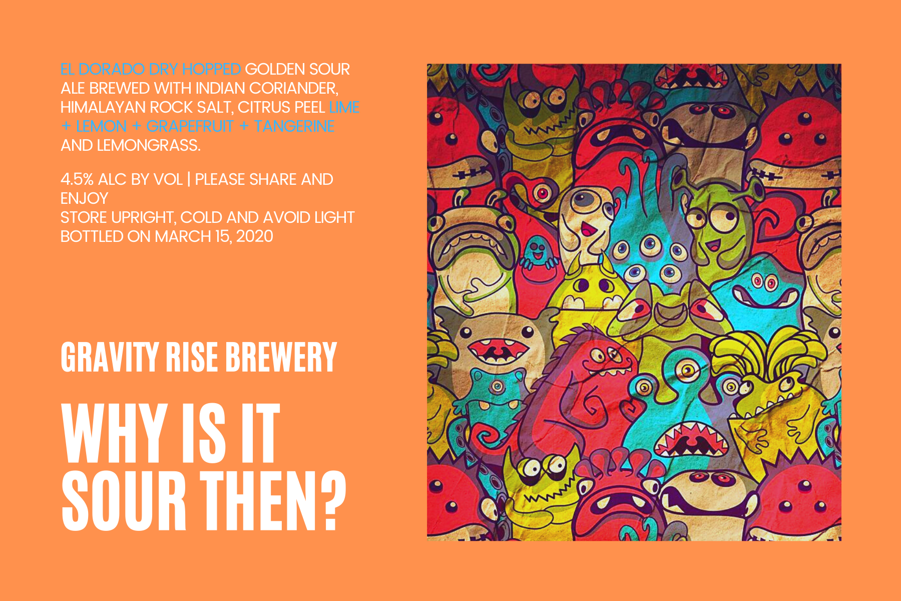
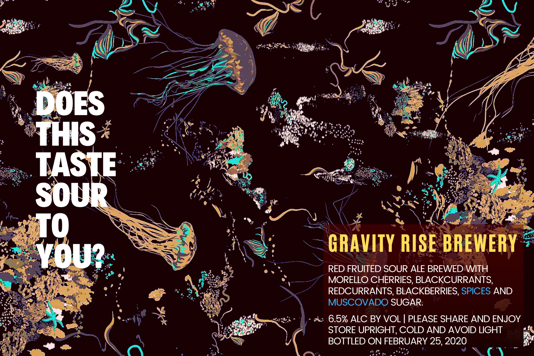
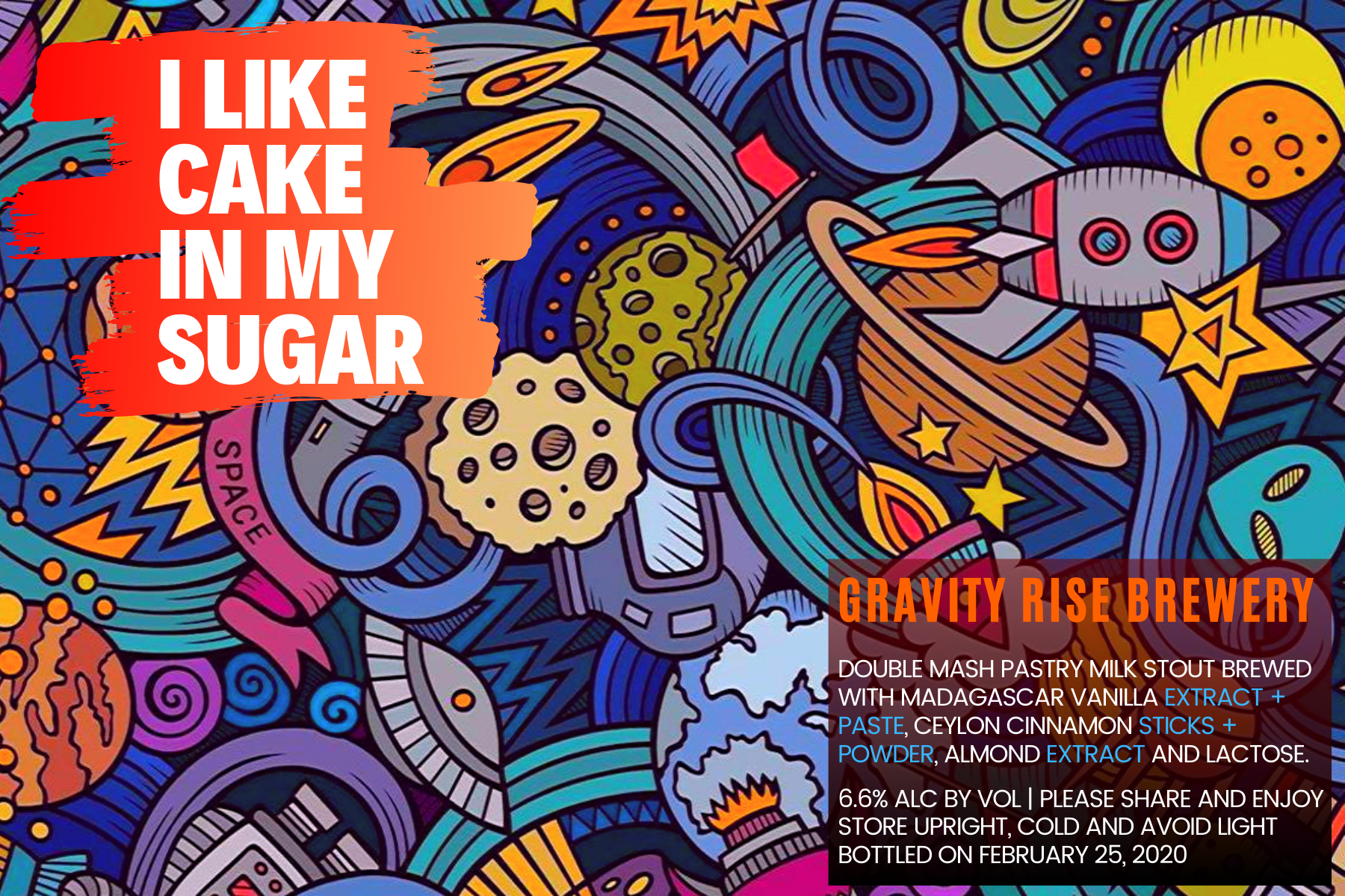
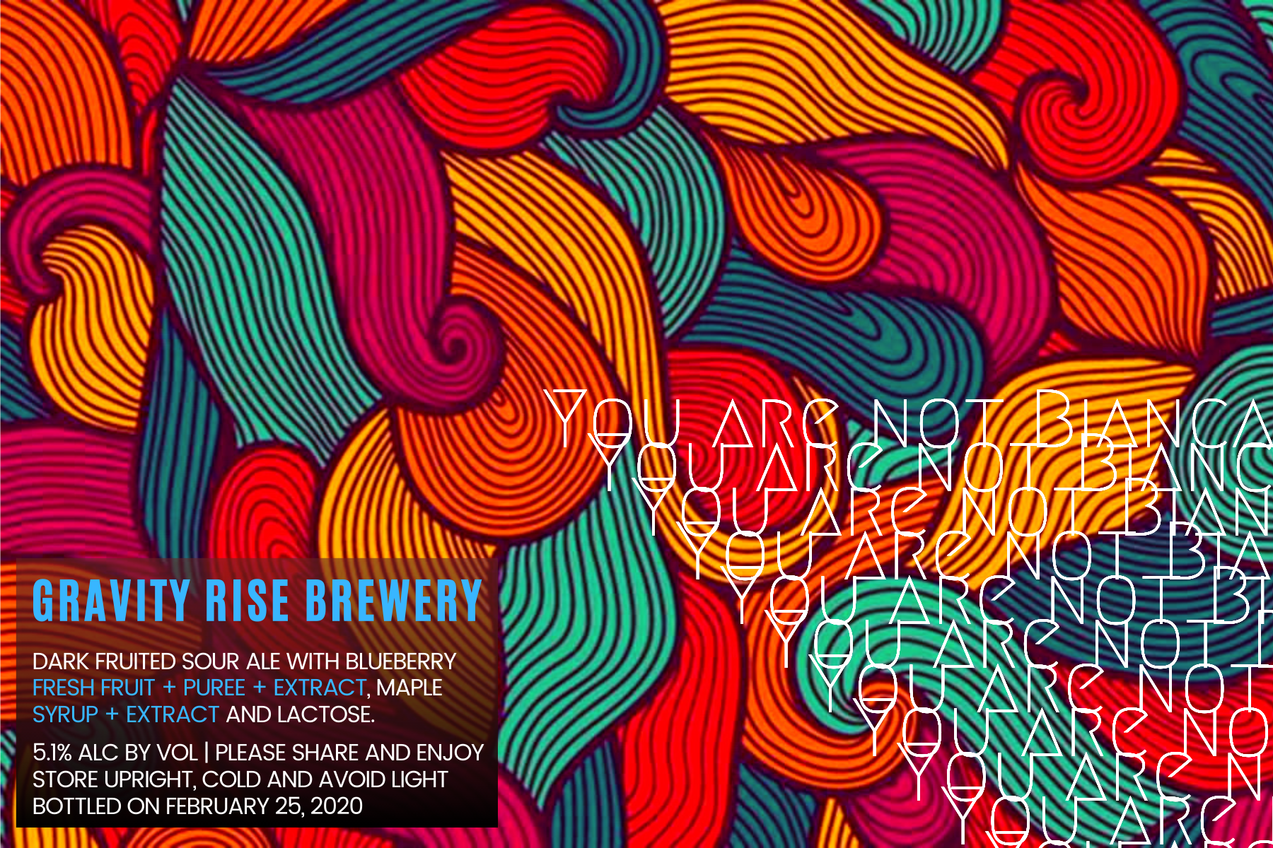
These are the labels for my upcoming 6 brews, which will all be ready in the first week of April. Can't wait!


Last edited:
These are the labels for my upcoming 6 brews, which will all be ready in the first week of April. Can't wait!
View attachment 666626 View attachment 666627 View attachment 666628 View attachment 666629 View attachment 666630 View attachment 666625
These are fantastically beautiful! I really like the 2nd, 3rd, and 4th ones. The jelly one is incredible!
thehaze
Well-Known Member
These are fantastically beautiful! I really like the 2nd, 3rd, and 4th ones. The jelly one is incredible!
Thank you. I will hopefully post pictures with the labels on the bottles, once I get around to it. Cheers.
Abhishek Dewan
Well-Known Member
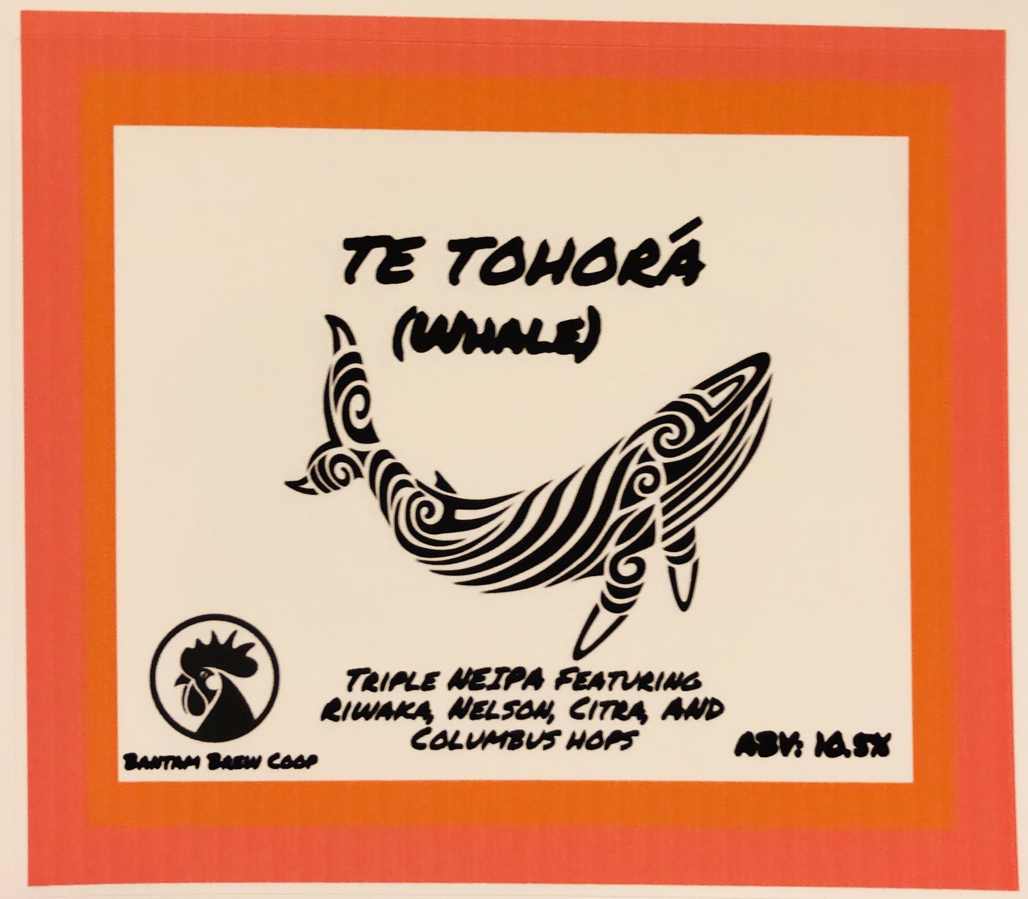
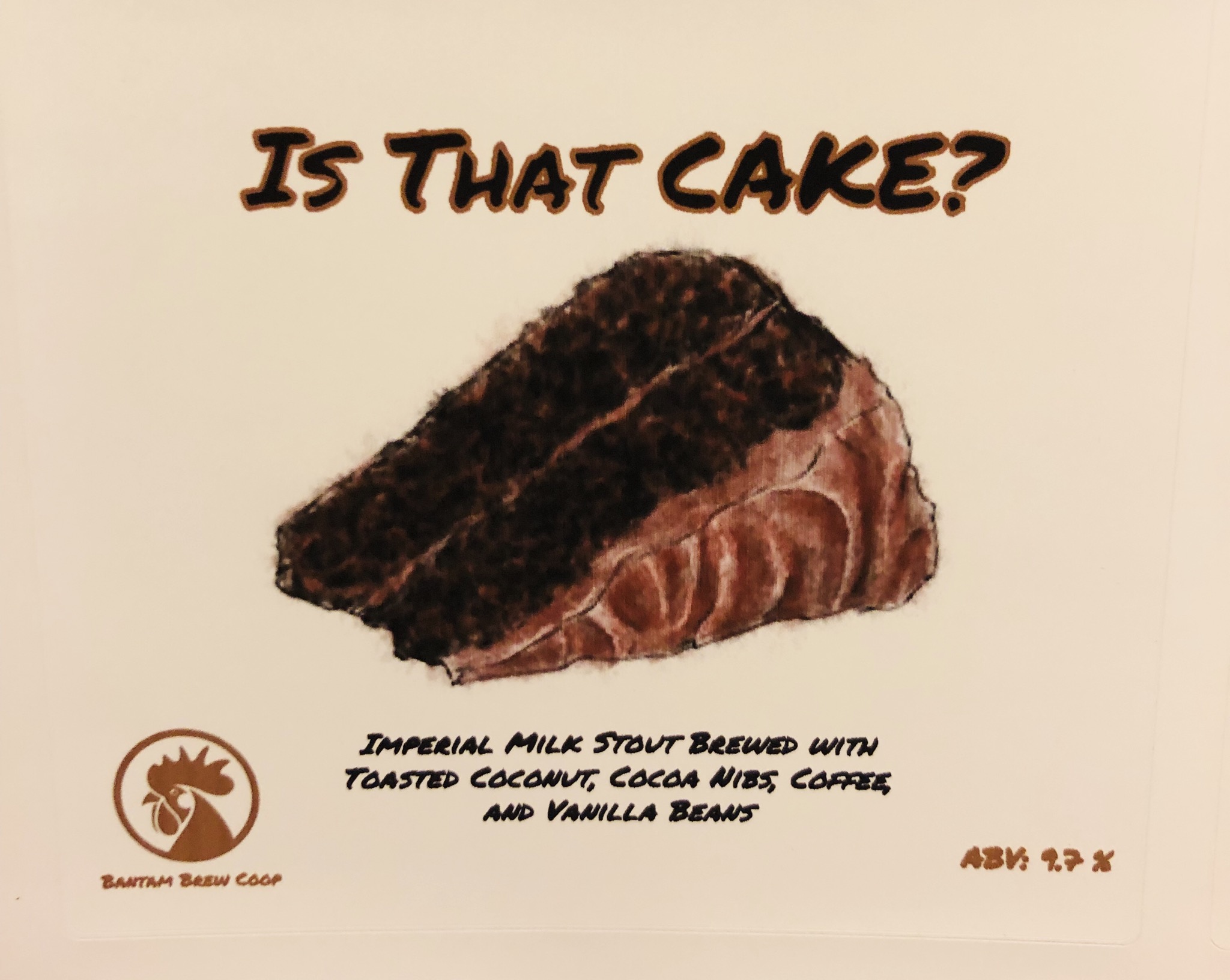
Do I read ABV on NEIPA correctly? wowThe labels for my 2 recent beers
TIPAView attachment 665683
Imperial milk stout View attachment 665684
Dgallo
Instagram: bantam_brews
Do I read ABV on NEIPA correctly? wow
Yes sir, 10.5
Dgallo
Instagram: bantam_brews
@Abhishek Dewan this is the beer the label goes too


Dgallo
Instagram: bantam_brews
Really like the logo! I was betting that was going to be called “The demon within”
- Joined
- Aug 20, 2018
- Messages
- 1,632
- Reaction score
- 4,317
EXACTLY, that's the level I want to get to@Dgallo I never tire of seeing that beer. It looks mouthwateringly good.
At this point I can only dream.EXACTLY, that's the level I want to get to
Abhishek Dewan
Well-Known Member
It's 9 am & it looks delicious enough to want to drink now. Please share recipe. Love the colour.@Abhishek Dewan this is the beer the label goes tooView attachment 666965
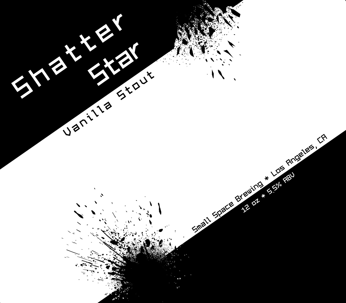
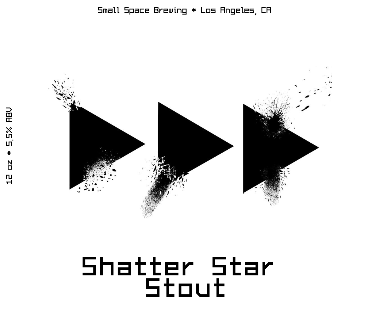
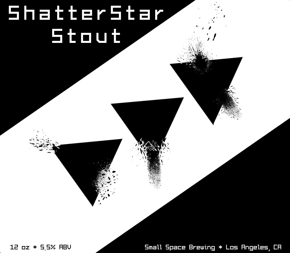
I like #3 the best, wait, #2, wait, crap, all look cool. I like the simple style of them. How did you achieve the "break out's" or "blow out's", is it a plug in or something like that?. I guess I should ask what software you use first. Again, nice simple design.
Joel B.
Joel B.
Time for an HBT rules reminder: Political posts are not allowed outside the “Debate” forum (supporting members only.) If your label contains political commentary, DO NOT post it here.
doug293cz
HBT Moderator
doug293cz
HBT Moderator
BrewMan13
Whole Nother Level Brewing
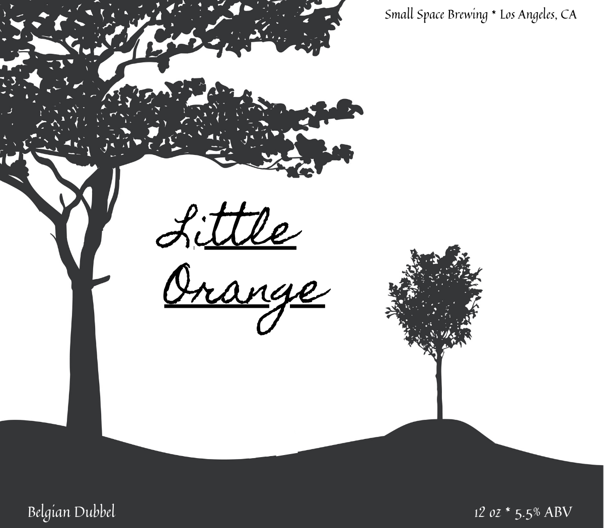
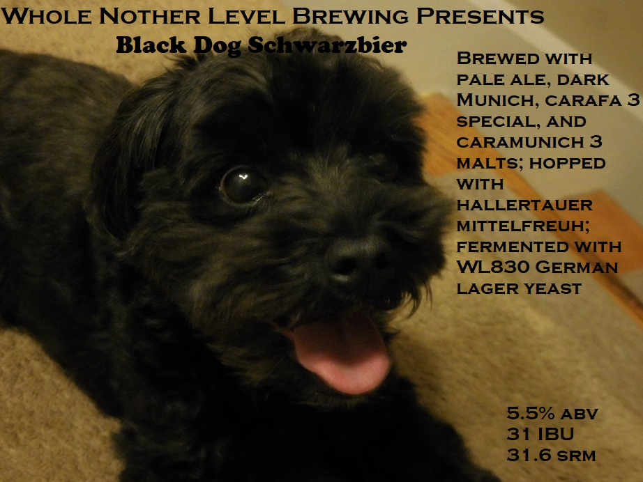
First labels I've done in years; didn't want to send out plain bottles for FOTHB. Could definitely use some polish if I was using them on more than literally just a couple bottles, but anyway...
The dog is my little girl, the tree is from the farm where the yeast was captured, and the other 2 are song/album references.
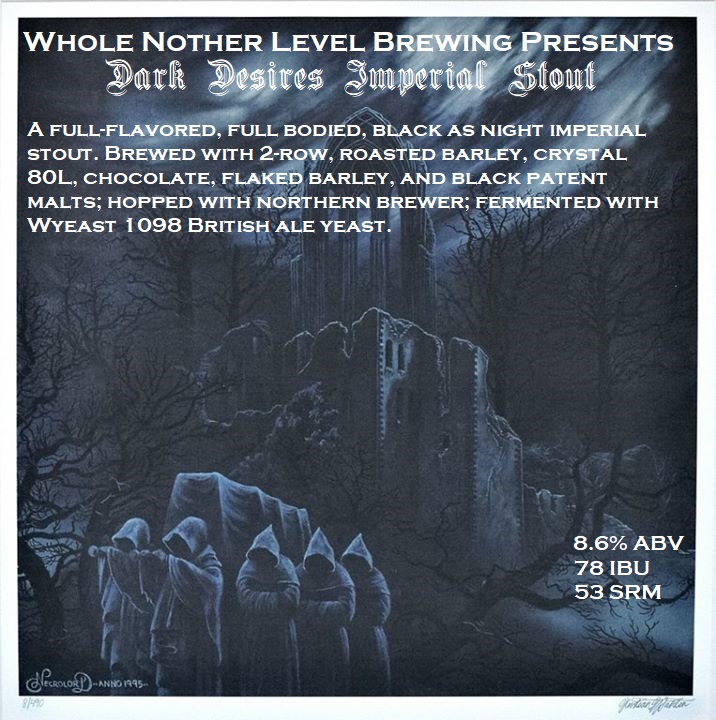
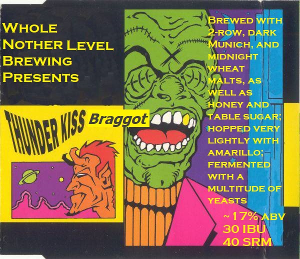
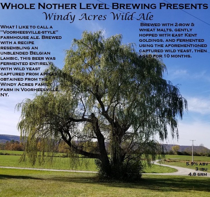
The dog is my little girl, the tree is from the farm where the yeast was captured, and the other 2 are song/album references.


I’ve been learning how to use Gimp but these designs I grab online and then messed around on Canva.comI like #3 the best, wait, #2, wait, crap, all look cool. I like the simple style of them. How did you achieve the "break out's" or "blow out's", is it a plug in or something like that?. I guess I should ask what software you use first. Again, nice simple design.
Joel B.
Makes it really easy to pass the time until my beers condition lol
I have used Gimp for some things and checked out Canva. Looks like it's a nice online editor. Didn't spend much time there but might in the future. I'm going to try to replicate that (the blow out) with Paint.NET if I can, I have a few ideas how to try. Thanks for reply.I’ve been learning how to use Gimp but these designs I grab online and then messed around on Canva.com
Joel B.
Very nice art work...but the blue text on orange is very difficult to read.. Just my two cents..These are fantastically beautiful! I really like the 2nd, 3rd, and 4th ones. The jelly one is incredible!
Very nice art work...but the blue text on orange is very difficult to read.. Just my two cents..
I don't find it difficult to read, but that might be because I am colorblind. The blue really pops against the orange. I am not a good representation though lol.
Similar threads
- Replies
- 4
- Views
- 524
- Replies
- 7
- Views
- 890
- Replies
- 86
- Views
- 3K
- Replies
- 262
- Views
- 10K

