Show Us Your Label

Homebrew Talk - Beer, Wine, Mead, & Cider Brewing Discussion Forum

Help Support Homebrew Talk - Beer, Wine, Mead, & Cider Brewing Discussion Forum:

This site may earn a commission from merchant affiliate links, including eBay, Amazon, and others.
A few more that my wife made. The 4 Eleven is a pic of my cascade hops that I grew. 4 eleven is just the address of my in laws where I grow the hops.

4eleven high res.jpg


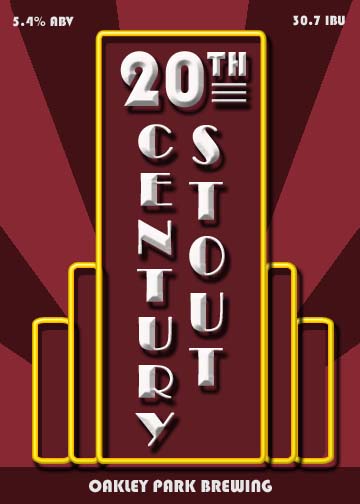
20th century laber.jpg


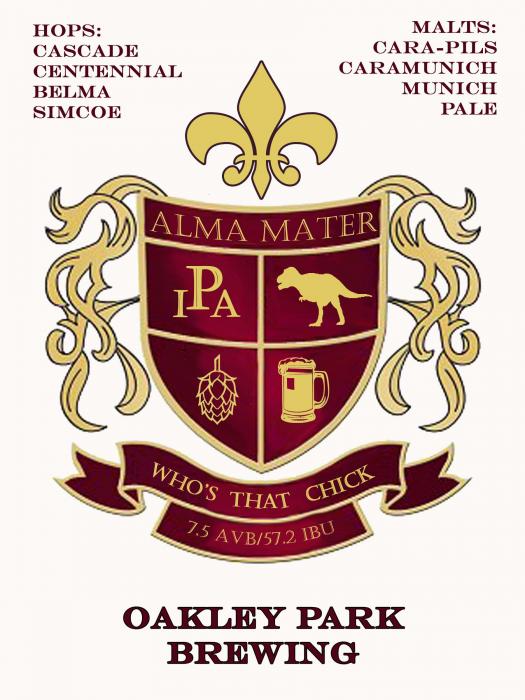
Alma Matter label.jpg


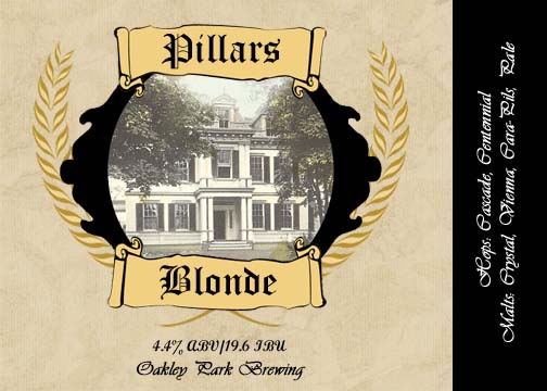
pillars label.jpg
 
Yeah, I think that's the way to go. I found a how-to on outlining text with the Paths tool, but the only hitch is that it will only outline it in black. Which works fine for this, since I think black outlining red would look better than vice-versa.

I use GIMP a lot. The easy way to do outlining for text is to use the select by color tool. It looks like a finger pointing at a blue, red and green strip. With your text layer selected, use the select by color tool, and select any of the text. Then, create a new layer (full size, transparent), position it underneath the text layer (using the layer dialog), then in the select menu, click grow. Grow it by however many pixels looks good (usually between 1 and 3), then use the paint bucket to fill it in. Make sure to select "Fill whole selection" for the bucket tool options. It may sound hard or like a lot of work, but it only takes a few seconds. Way easier than trying to mess with paths. Afterwards, you can merge the text layer down, and then autocrop layer (both in the layer menu at the top) to move it around if you want. I'm not sure how you got the glowy white stuff behind the font, but you can also use the same method to do that. All you have to do is grow it out more, then use the feather tool under the select menu. Play around with what you feel looks good.

This is probably old news for many, but if the text is its own layer, you can just right-click the layer and click 'Text to Selection' or something like that. Then it's easy to add outlines, inner lines, etc. by growing or shrinking selection.

GIMP is good, given a bit of time to get antiquated with it.
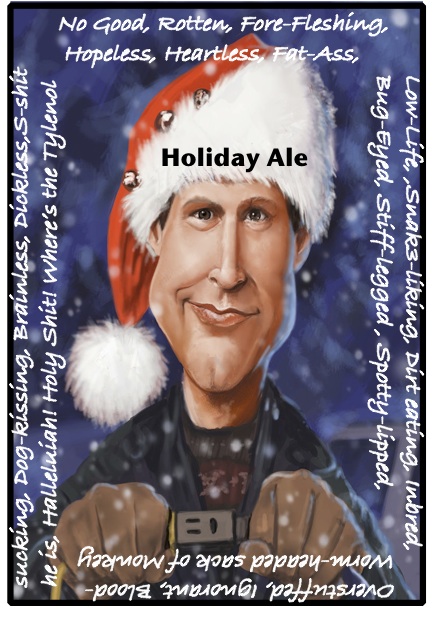
This was for my latest porter

I think you meant acquainted, but your label looks nice and antiquated! (pun intended?)
 
Looking for some constructive criticism.

This is only the 2nd label I've ever made.

I like to make the 'Holiday Ale' fit the contour of Clark's hat, and I think the quote might be too busy

I think the busy-ness of the quote is fitting. Pretty creative. I think though you could do something different with Holiday Ale. Not shure what though.Different color or/transparent or different lettering style to start maybe?I could be wrong about that though. I still like it as is though.:mug: Just had an idea, seeing Holiday ale lit up brite would be pretty cool. Like on the plug or something.
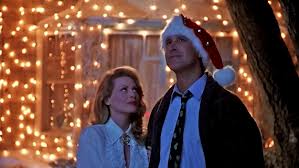
Just a thought...

just a thought.jpg
 
I think the busy-ness of the quote is fitting. Pretty creative. I think though you could do something different with Holiday Ale. Not shure what though.Different color or/transparent or different lettering style to start maybe?I could be wrong about that though. I still like it as is though.:mug: Just had an idea, seeing Holiday ale lit up brite would be pretty cool. Like on the plug or something. Just a thought...
Feeble attempt

image-1826981542.jpg
 

Attachments

  • HolidayAleFront.jpg
    HolidayAleFront.jpg
    349.2 KB · Views: 983
Nice job guys. I love the recent labels on this page. We are doing our last of 6 brews this weekend. Here are the labels for the other 3 this year.

Akbar.jpg


CrazyHorse.jpg


Carmen.jpg
 
My buddy just finished up the label for my pumpkin beer that will be ready to bottle on Sunday! I plan to print it on like a like brown type paper, same shade as cardboard. Anyone have any advice/info on printing or on where to find nice paper that would look good with this logo?

When we were kids we always considered ourselves "punks" haha and a popular saying is "up the punx" so I kind of combined them with pumpkins.

What do you guys think?
UP THE PUNKINS-3done.jpg
 
MikeCass said:
My buddy just finished up the label for my pumpkin beer that will be ready to bottle on Sunday! I plan to print it on like a like brown type paper, same shade as cardboard. Anyone have any advice/info on printing or on where to find nice paper that would look good with this logo?

When we were kids we always considered ourselves "punks" haha and a popular saying is "up the punx" so I kind of combined them with pumpkins.

What do you guys think?

Looks good! How would it look with black in orange? No white.
 
some people have had good luck printing labels on paper grocery sacks. simply cut the sack down to 8-1/2x11 stick it in the printer and go
 
Love both of those!

Ok, so how do you link a picture from Flicker? Mine didn't work above and I'm using the mobile app so I don't have too many options
 
these turned out GREAT!
what do you keep them on with? using the milk method?


The ones pictured I just used a glue stick because I just wanted to see how they all looked on the actual bottles. But when I am actually bottling, I use an aerosol spray adhesive I got from my local hardware store. It works great!

Thanks everyone for the positive feedback on my labels! I am super excited about them, hopefully the beer lives up to the labels haha.
 
bizarrojosh said:
Looks good. Is that some hobbit or lord of the rings art work?
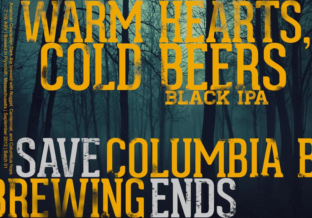
I was browsing through a website called deviantart.com when I ran across the dragon holding the beer. The artist does a lot of this type of work and I asked him if he would format the art for label size. It's not a hobbit or LOTR work but is in that genre.

I was going to have him draw something for me from scratch based on an idea I have (not the same genre as the dragon) but he made me a great offer to use the dragon which was a lot cheaper than paying for a new piece so I went for it
 
Here's my label for one of our Oktoberfest party beers. In the printed version the hops look much more crisp - not sure why they're blending in so much online. Thoughts?

Emancipator Bock.jpg
 
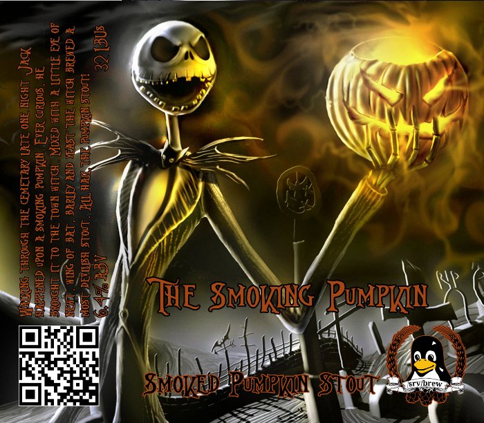
This label is fraking awesome! Nightmare is one of my favorite movies (well, my #1 favorite Disney or Tim Burton movie, at least.)
Haha thanks. I've been a big Nightmare fan for a long time. I figured pumpkin stuff needs to be Jack related. The background was unedited by me. I just grabbed it off Deviantart or something. Most of the time I have to do a lot of tweaking to get a label right, but this image just happened to fit perfectly with my name/theme. :) Thank you for the pumpkin beer pointers! I think I'm going to need a few iterations with this recipe to really get it tweaked.
 
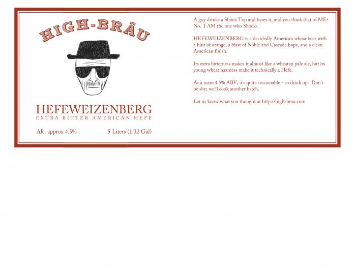
Brewed two mini-kegs of this for our Blazonctoberfest (company is Blazonco) event today. It was a big hit!

In case the text is unreadable:
"A guy drinks a Shock Top and hates it, and you think that of ME?
No. I AM the one who Shocks.

HEFEWEIZENBERG is a decidedly American wheat beer with
a hint of orange, a blast of Noble and Cascade hops, and a clean
American finish.

Its extra bitterness makes it almost like a wheaten pale ale, but its
young wheat haziness make it technically a Hefe.

At a mere 4.5% ABV, it's quite sessionable - so drink up. Don't
be shy; we'll cook another batch.

Let us know what you thought at http://high-brau.com"

hefeweizenberg.jpg
 
Back
Top