Show Us Your Label

Homebrew Talk - Beer, Wine, Mead, & Cider Brewing Discussion Forum

Help Support Homebrew Talk - Beer, Wine, Mead, & Cider Brewing Discussion Forum:

This site may earn a commission from merchant affiliate links, including eBay, Amazon, and others.
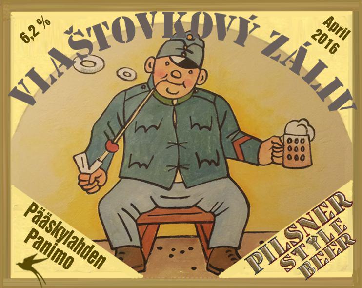
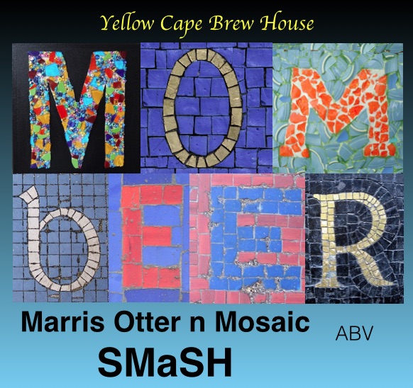
another in the smash series.
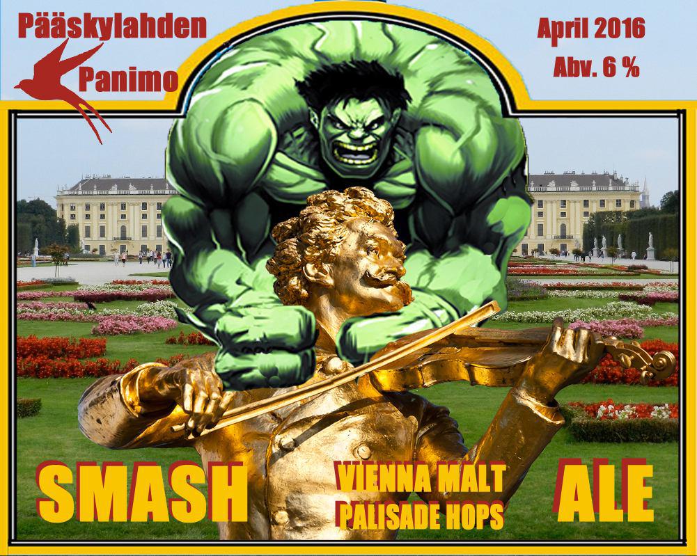
smashviennaapril.jpg
 
Not exactly a label, but my custom tap handles/personal "brewery" logo. I tinker in illustrator but am not particularly gifted, but this is what I came up with. Still need to finish them with and add a chalkboard to the side and/or top, but that will happen soon. Let me know what you think!

IMG_20160116_153924.jpg
 
Not exactly a label, but my custom tap handles/personal "brewery" logo. I tinker in illustrator but am not particularly gifted, but this is what I came up with. Still need to finish them with and add a chalkboard to the side and/or top, but that will happen soon. Let me know what you think!

Where did you get the handles done?
 
Where did you get the handles done?
Local trophy engraving shop in MA. Laser engraved. The wood is a short Parsons table leg from Lowes and I removed the screw and drilled out the hole before putting in a brass threaded insert.
 
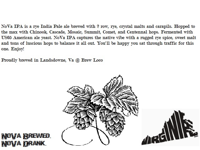
Here's a label I did quickly last night in MS Paint. I'm on 5.0 of this recipe and I think it's almost there. Just need to up the abv to about 7% and up the IBU's a little and perhaps add a little more rye. It's amazing after 5 times of brewing nothing but this beer I'm not tired of it at all.

NoVaIPA.jpg


NoVaIPAback.jpg
 
Here's a label I did quickly last night in MS Paint. I'm on 5.0 of this recipe and I think it's almost there. Just need to up the abv to about 7% and up the IBU's a little and perhaps add a little more rye. It's amazing after 5 times of brewing nothing but this beer I'm not tired of it at all.


Look good but might want to spell check the hops before printing. Just trying to help.
 
Look good but might want to spell check the hops before printing. Just trying to help.
Hey thanks man! Last time i made a label i put the year as 2105, heh. Maybe I'm making them a little toooooo quickly :beer:
Not sure if I'm printing this label though since the keg is about to kick.
 
I'd change "smell" (which generally has a bad connotation) to "aroma"...

Also... why can't fat chicks drink it?

Edit: Sounds delicious, by the way!


Good point on using "smell"!
Fat chicks can drink it... but they gotta pay!!! ...... Sorry, bad joke on a Family Guy reference!

Don't forget that you don't want to run over a glass of beer with your car!!
 
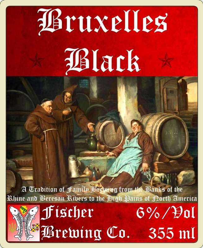
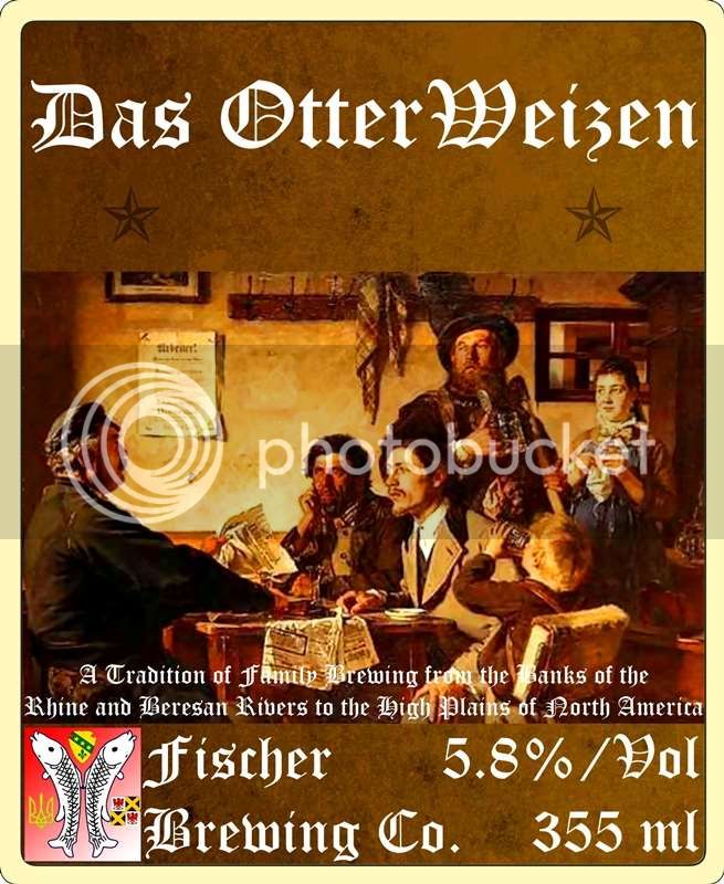
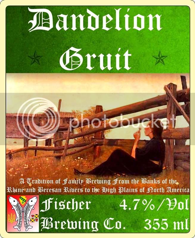
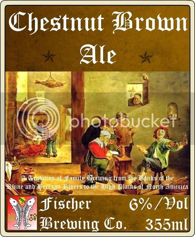
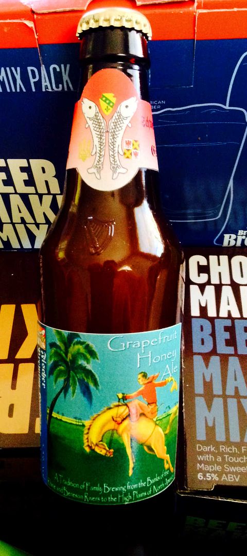
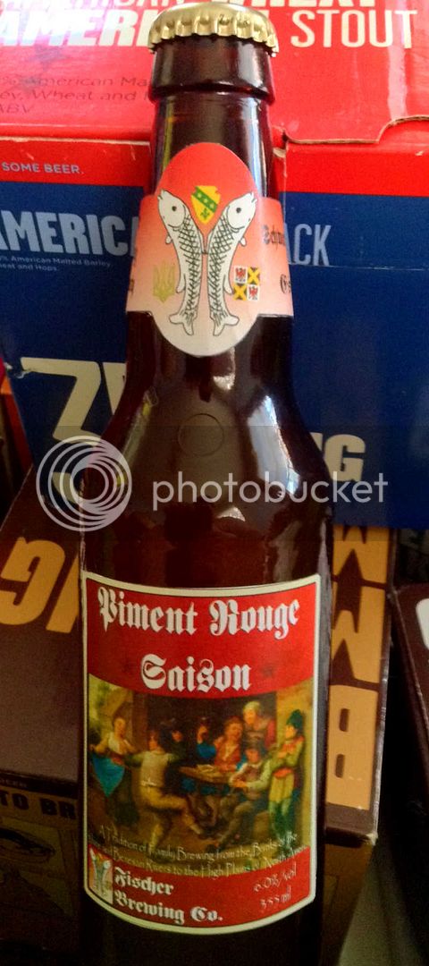
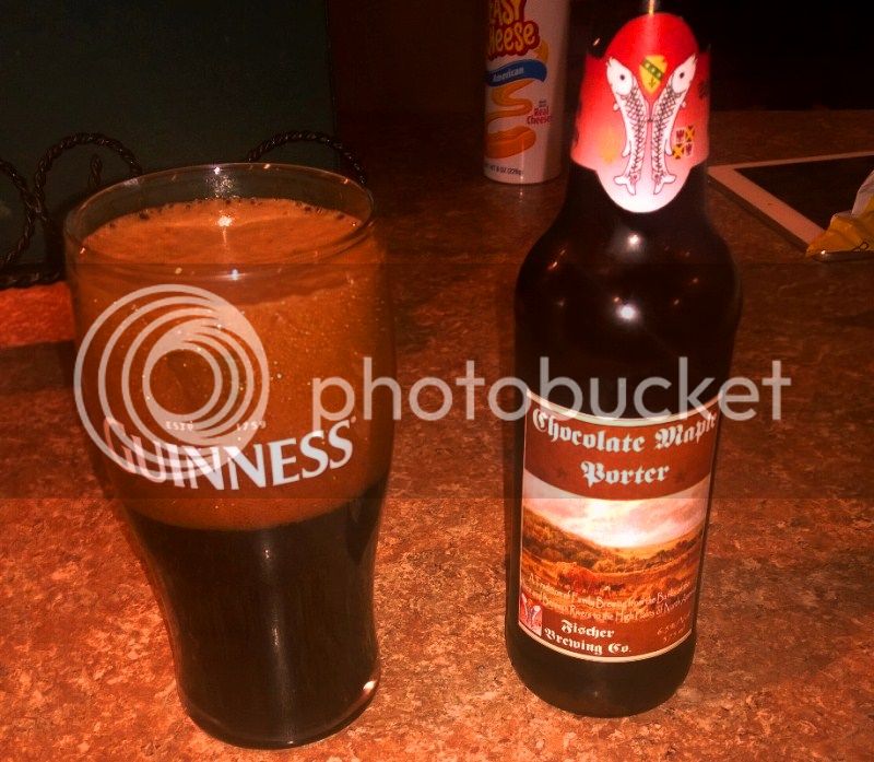
Here are a few of my labels to date -


Bruxelles%20Black%20Label%20Small.jpg


Das%20OtterWeizen%20Label%20Small.jpg


Dandelion%20Gruit%20Label%20Small.jpg


Chestnut%20Brown%20Ale%20-%20Label.jpg


Grapefruit%20Honey%20Ale.jpg


Piment%20Rouge%20Saison.jpg


ChocolateMaplePorter-8.jpg


It would probably be fair to say that the basic design is a bit "one-note," but the continuity of that theme is important as a matter of establishing "tradition." For me, the illustration/painting that is used is what's important, where the character of each particular brew should be demonstrated.
 
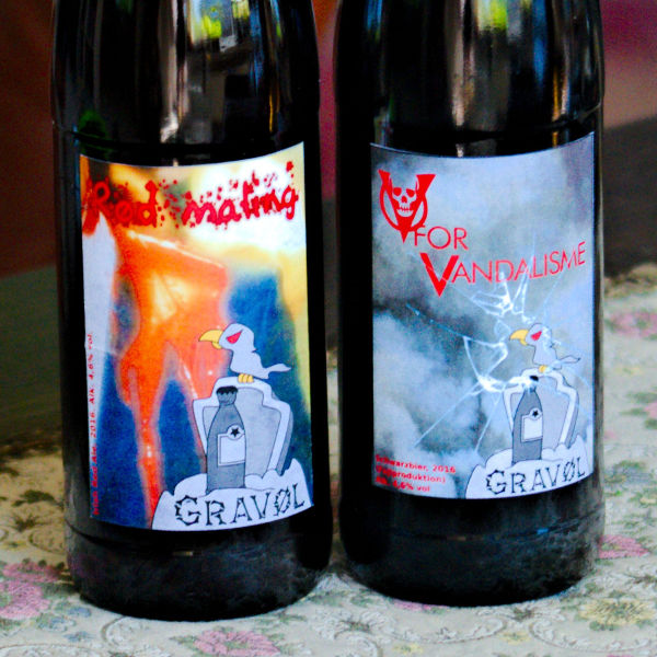
"Rød maling," or "Red Paint," is an Irish Red Ale. The blurred background image is a reference to a 2003 incident in the Danish parliament. Two activists had thrown red paint at prime minister Anders Fogh Rasmussen, shouting: "you have blood on your hands!" using the red paint to symbolize the bloodshed of the war in Iraq, which Bush sycophant Rasmussen was responsible for dragging Denmark into, famously stating that: "Iraq has weapons of mass destruction. This is not something we merely believe. It is something we know." (We now know better, and the extent of the damage caused by his national politics is only now becoming clear, too.)

The perpetrators managed to smuggle the paint into the parliament by asking to visit a parliament member of the political party Enhedslisten who was unaware of their plans. "Rød maling" was brewed for Enhedslisten's fridge in the parliament as a humorous reminder of the incident. Hopefully my friend and member of the party's board of directors won't get caught when he carries a bag containing "red paint" into the parliament.

"V for vandalisme," or "V for Vandalism," a Schwarzbier, is also a humorous remark to Enhedslisten, although more personally. My above-mentioned friend had asked me to brew beer for the chief strategist's 40th birthday, and I had to come up with another joke. The chief strategist has a slightly rogue past: in 1998 he was convicted for vandalism against the fence around an internation camp where asylum seekers were stowed away for years with virtually no rights. The far right parties spare no excuse for thus referring to him as a violent criminal so it seemed appropriate to turn it into a beer joke.

DSC_6271.jpg
 
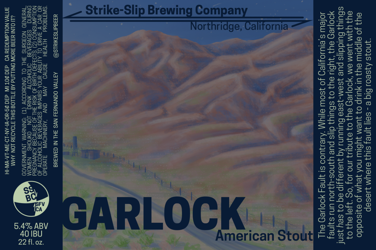
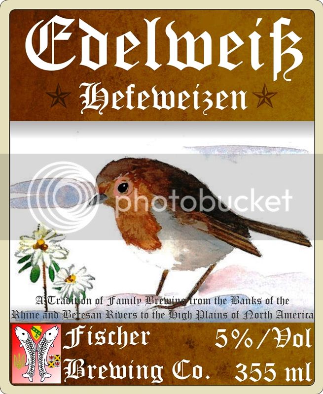
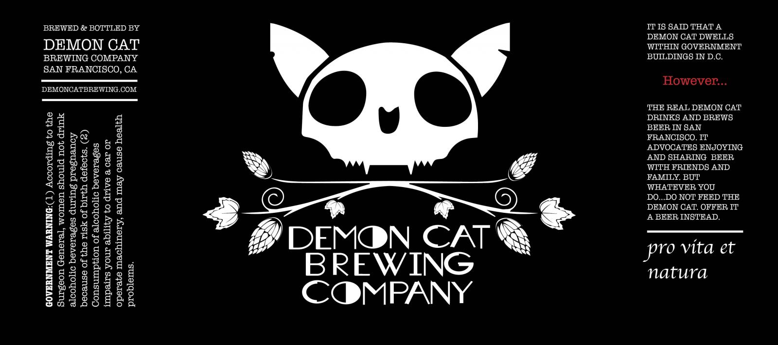
Label idea, any constructive criticism or ideas? Been playing around with Inkscape and trying to make the program do what I want has been fun.


Depends on what kind of image style you're going for... I like the minimalist simplicity of it. If I was doing it, I'd make the font pop a little more with an outline or color change. But that's just my opinion.
 
Depends on what kind of image style you're going for... I like the minimalist simplicity of it. If I was doing it, I'd make the font pop a little more with an outline or color change. But that's just my opinion.

I like the font the way it is. Integrates well with the graphic. Also just an opinion.

Brew on :mug:
 
I like the font the way it is. Integrates well with the graphic. Also just an opinion.

Brew on :mug:

Depends on what kind of image style you're going for... I like the minimalist simplicity of it. If I was doing it, I'd make the font pop a little more with an outline or color change. But that's just my opinion.

Thanks both for the opinions, I appreciate it. I'll play around with the text some more and see what I can come up with. I'm thinking maybe some orange would pop well on the blue.
 
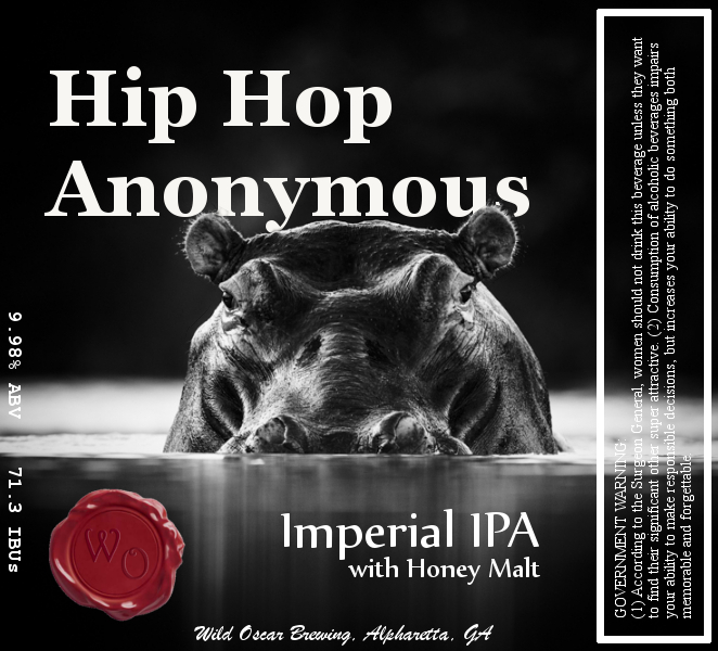
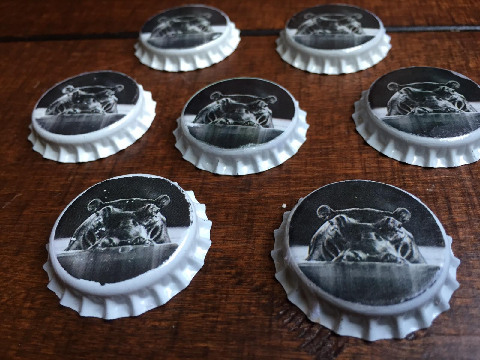
Just finished the label this morning. This is for my Hopslam clone. I probably could've spent more time on the text and fonts, but I really needed to finish this since I bottled a week ago. Also, the caps I made based on the BREW magazine article from a couple months ago (https://www.homebrewtalk.com/showthread.php?t=583411).

Hippo Black and White Label.jpg


IMG_1359.jpg
 
Here's the label that I came up with for my Edelweiß, which I will be brewing later this week -

Edelweiszlig%20Label%20-%20Small.jpg


I had considered a few classic Alpine scenes, but this one struck close to home, and I decided to go with it. I like the image of a young robin - a harbinger of spring here in Montana - anxiously waiting for spring (which is often late in Montana) as an Edelweiß flower emerges from the snow.
 
Back
Top