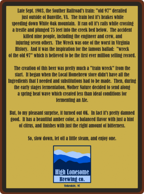
I don't know why the text is so hard to read on here. But, it looks fine on my machine and prints good too. But, I did want to share and see what you all think.
I'm still not sure about the text yet. It's a first draft.
Here's a second version that I think I like better:
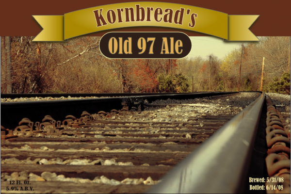
And here's a back label: