Smokey Boggart Label

Homebrew Talk - Beer, Wine, Mead, & Cider Brewing Discussion Forum

Help Support Homebrew Talk - Beer, Wine, Mead, & Cider Brewing Discussion Forum:

This site may earn a commission from merchant affiliate links, including eBay, Amazon, and others.

Boerderij_Kabouter

Well-Known Member
Joined
Dec 21, 2007
Messages
7,763
Reaction score
178
Location
Oconomowoc, Wisconsin
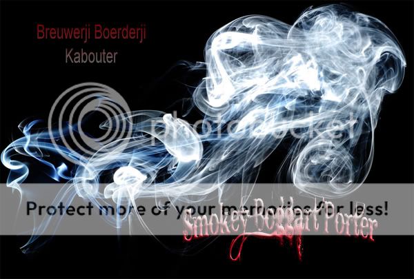
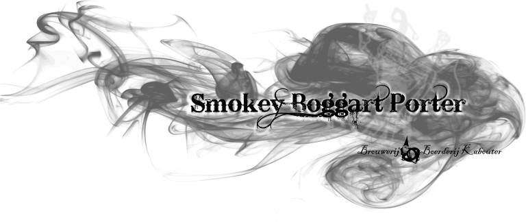
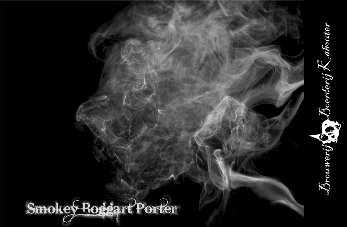
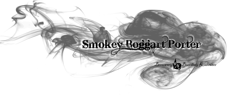
I am starting to work on a new label for my smoked porter. The Smokey Boggart.

I was thinking something like this...

Smokey_Boggart_500x814_svg.png


I am not sold completely though. Any ideas, this or completely different would be great.

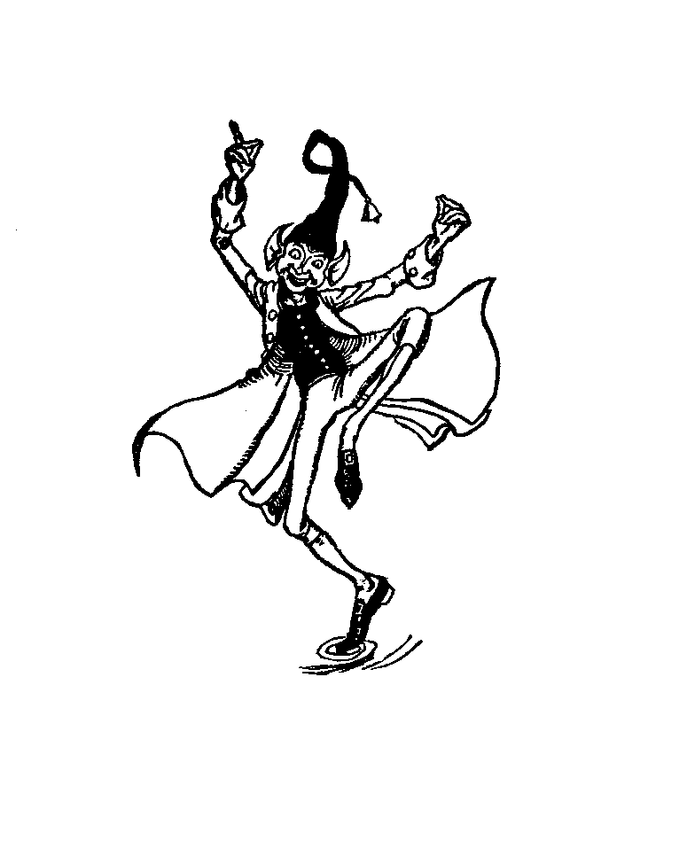
A boggart is a gnome, imp, or spirit who is up to no good. So I want to label to follow that spirit.

Thanks,
Justin
 
I would lighten up the smoke, not so thick. Spin it sideways and have it behind/infront of the lettering, not covering, just fogging the lettering a little.
The font is great for the name., Love black and white labels
 
I like it a lot. The only thing I'd suggest is changing the font color to make it stand out just a bit more...seems to blend in with the smoke behind it. Maybe just adjust the shadowing to white or a blurred effect?

PS...where'd u get the smoke backdrop pic?
 
doesn't sound like your a photoshop guy, so I won't get super techy, but I would change the contrast of the smoke, reduce some of the black waves to air it out a bit more. I would make the brewery font bigger so people can read a bit better who made it! Take your credit :)
 
I use Inkscape and a little bit of GIMP.

Increase contrast? By black waves are talking about the color waves settings?

I'll try fiddling with some of those things. THANKS!!!
 
I'm sorry I should have said to mess with the "levels"....need to have good mixture of white, gray and black tones. Your last version is mainly just gray. See, the 1st image from the 1st post is a negative and you just didn't notice, or maybe you like black smoke i dunno, there just aren't too many things that give off black smoke except for a bad car exhaust, house burning down or something..lol... anyway you might try to flip it (invert the pic) and make the smoke white on a black background.... I think it would work better, just my 2 pennies.
 
maybe something like this, I messed with it for a few mins:

SP.jpg


I didn't get super in-depth and didn't mess with your brewery name too much, just giving an example.
 
This is the other image I have been thinking of using.

zpage081.gif


I think it might look cool if I can somehow turn him into a smoke figure, like he is made out of smoke.

I love designing labels, it is cool.
 
Maybe something like this:

Smokey_Boggart_III_768x324_svg_copy.png


I tried to make him look more like smoke but you very quickly loss his form so I just did it a little and threw him in with the smoke.
 
I personally liked it before the change. It looks good now, too. Without knowing that the face is supposed to be in there, I'd never notice it. Although, FWIW, I'm not one to see imaginary Greek gods, farm animals or elephants dry-humping when looking at cloud formations either.

IMO, it looks great.:mug:
 
I like it overall as I think the whiter smoke looks better. The only thing I would change would be to see how your brewery logo would look in a greyscale instead of just black and white. It just kinds of pops off the label with all that bright white.
 
Just my opinion, but if your going for a more "elegant look" using any of the first posted ones they all look great, However i like the last one the best. The first few just seems funny as the smoke really would never flow like that. And the reason the last one looks better to me is because it actually gets a better image of flowing smoke.

Have fun, and which ever you choose will really look good.
 
I personally liked it before the change. It looks good now, too. Without knowing that the face is supposed to be in there, I'd never notice it. Although, FWIW, I'm not one to see imaginary Greek gods, farm animals or elephants dry-humping when looking at cloud formations either.

IMO, it looks great.:mug:

Exactly. If I didn't know what I was looking for, I never would have found it.

I still stand by the blurred horizontal smoke from earlier. Sometimes a more complex solution is just more complex, not necessarily better. It's your label though, so screw what we say, and do what you like! I think they all look great, I just like that one the best.

Note: That one, or the black with white smoke... I like them all, but those two are the ones that would convince me to drop $11 on a 6-pack of something I hadn't tried before. (Craft beer is expensive in SD :( )
 
Back
Top