Another First-Time Label Designer!

Homebrew Talk - Beer, Wine, Mead, & Cider Brewing Discussion Forum

Help Support Homebrew Talk - Beer, Wine, Mead, & Cider Brewing Discussion Forum:

This site may earn a commission from merchant affiliate links, including eBay, Amazon, and others.

TheWhaleShark

Well-Known Member
Joined
Jan 15, 2010
Messages
58
Reaction score
0
Location
Albany, NY
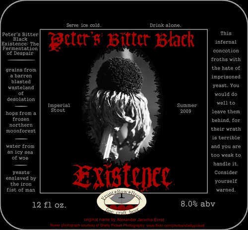
Do your worst. I'm a big boy; I can take it.
4394784961_f7a26cf00d.jpg

The little logo at the top of the label is going to be my "brewery" logo, so that's going to be conserved from label to label.

EDIT: This is part of a Flickr set. This is the 9th revision. You can view the previous 8 versions (and larger sizes) on my Flickr page.
 
I'll give my feedback on the current newest revision in the Flickr set (R11).

Looking very nice. The better centering of many of the elements really helps this version over previous ones. The irregular blur outline makes the dead flower image, IMO. Since the brewery logo is no longer at the top, I'd suggest dropping the top of the image to have less blank space up there and match the margin space you've got on the sides. Could be an illusion, but both "Imperial Stout" and "Summer 2009" look just a little higher than centered, and "Summer 2009" looks a little higher than "Imperial Stout," so you might check on that. Also, it looks like you have three different font sizes on the side bars; I'd see if you can't standardize them all to the same size for cohesion. Oh, and you appear to have missed the period at the end of "Consider yourself warned."

Question on the logo: is the irregularity of the gap between the black shapes (seats?) intentional? I could see it going either way, but if not it's something to look at.

Very cool overall. And props for crediting the image, very few people do that. :rockin:
Thanks for the feedback! I took away the fade and with a jagged edge effect, to make it look a little more "grungy" and less like a bad Photoshop job. I'm also going to upload a version that's a touch bigger; currently, it's sitting at 3.25" wide and about 3" tall, and I'm looking to up that to have more presence on the bottle.

There are two different font sizes going on with the side text, and I may very well revise that. The right-hand column looks different because I used broader spacing; it takes up more of the black space that way.

I'll think about dropping down the top of the image - play around with it and see how it looks.

The "Imperial Stout" and "Summer 2009" are perfectly aligned; I used a vector drawing program, so they can't be off. It might have something to do with the specific letters making one appear taller.

Thanks again!
 
Shameless self-bump.
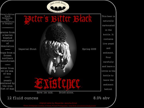
4426437165_e4d731dd7f.jpg

This is the form I finally settled on. What do we think?

Working on #2 as soon as I can get the artwork lined up.
 
Back
Top