
TimSTi
Well-Known Member
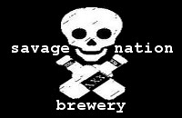
Hey guys I whipped up a quick logo for my brewery. Let me know what you think. Any tips/ideas/advice from the experts out there would be great. Thanks!
****UPDATED****
So after taking into account the opinions here and learning a bit about Inkscape I attempted a new Logo. Check it out below:
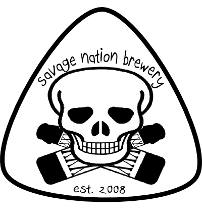
Whatta ya think????
****UPDATED****
So after taking into account the opinions here and learning a bit about Inkscape I attempted a new Logo. Check it out below:
Whatta ya think????

")

