First label

Homebrew Talk - Beer, Wine, Mead, & Cider Brewing Discussion Forum

Help Support Homebrew Talk - Beer, Wine, Mead, & Cider Brewing Discussion Forum:

This site may earn a commission from merchant affiliate links, including eBay, Amazon, and others.

TimSTi

Well-Known Member
Joined
Oct 14, 2008
Messages
233
Reaction score
2
Location
Staten Island, NY
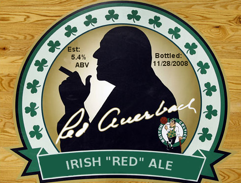
Here's the first label I whipped up for my Irish Red Ale. I'm new to gimp, formerly used photoshop but dont have a new copy of it. Tell me what you think. Arching the text down the bottom where it says Irish Red Ale was a pain. I haven't found a tool like photoshop has to make it easy. Well here it is. (P.S. I'm orginally from Boston ;) )

3098060411_7b624cc56b.jpg


*edited*
I found a tutorial for gimp that got it to look slightly better
 
Looks good. Try Inkscape for your text. There's even a tutorial floating around for scrolls/ribbons and putting text on them.
 
Looks good.

This tutorial may or may not make GIMP text-skewing easier. Or some of the Filters|Distorts|CurveBend functionality. I have only briefly looked at the former.
 
If your gonna keep the Celtics logo on there you should try to change that wood floor background to a parquet one like they have at the garden. Just my 2 cents though. I think it looks pretty good:mug:
 
Nice. The silhouette is very cool. Reminds me of a mobster haha.

However, I don't think that the Celtics logo has any chance of being legible when printed on a small scale. The wood grain is quite nice. Do you plan on printing this on a color laser with high rez? If not, it might not look like wood at all.

I've printed a test run of it and it came out as expected from my inkjet, good enough!
 
Back
Top