BargainMugs
Well-Known Member
- Joined
- May 17, 2010
- Messages
- 361
- Reaction score
- 12
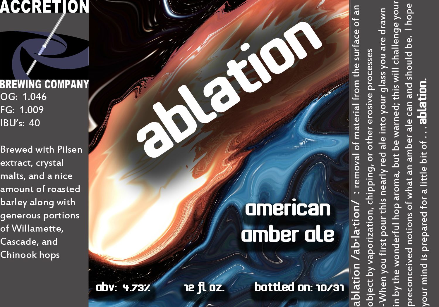
Great clean design and good use of typography. 
I'm not completely sold on the font choice for "Brew Co." It's probably the weight in contrast to the other fonts.
I'm not completely sold on the font choice for "Brew Co." It's probably the weight in contrast to the other fonts.


")