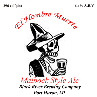
That's really cool! He's a very thought provoking skeleton. The skeleton style kind of reminds me of a cool font I used awhile back. Its called FrankenDork.
That's really cool! He's a very thought provoking skeleton. The skeleton style kind of reminds me of a cool font I used awhile back. Its called FrankenDork.
Sorry, on the deadguy clone. The "Miabock Style Ale" part just looks a little squished. The B looks like a blob and the CK runs together a little. It might look a little better if the text was stretched as wide as the black text below it and it might read a little more clearly.
Sorry, on the deadguy clone. The "Miabock Style Ale" part just looks a little squished. The B looks like a blob and the CK runs together a little. It might look a little better if the text was stretched as wide as the black text below it and it might read a little more clearly.
Yeah I'm not liking that line of text either, that font makes the I and B unclear. I still need to play around with it a little more...I'm just getting the hang of Adobe ELements. Thanks for the tip about stretching it, I'll give it a try.
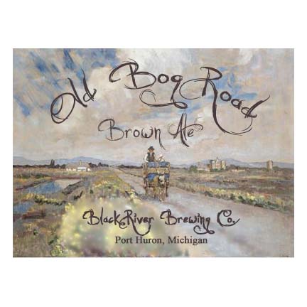
This is going to be the poster/tap head for the 1880's style beer I'm going to brew for my best friend's 1800's era Base Ball team, the Port Huron Welkins.
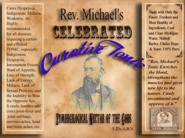
I'm trying to go for that patent medicine/snake oil look.