You are using an out of date browser. It may not display this or other websites correctly.
You should upgrade or use an alternative browser.
You should upgrade or use an alternative browser.
Show Us Your Label
- Thread starter muse435
- Start date

Help Support Homebrew Talk - Beer, Wine, Mead, & Cider Brewing Discussion Forum:
This site may earn a commission from merchant affiliate
links, including eBay, Amazon, and others.

daveooph131
Well-Known Member
This one is for our Mosaic hopped extra pale ale.
I really like this. Very creative
stamandster
Well-Known Member
It's more for a friend and mines beer reviews but we'll be adding labels to glasses... sooo....


Eddiemk4VW
Well-Known Member
And here is my second homebrew and label.
Awesome label!
Can't read brewery name though. Just my 2 cents.

splattsmier
Well-Known Member
recent label
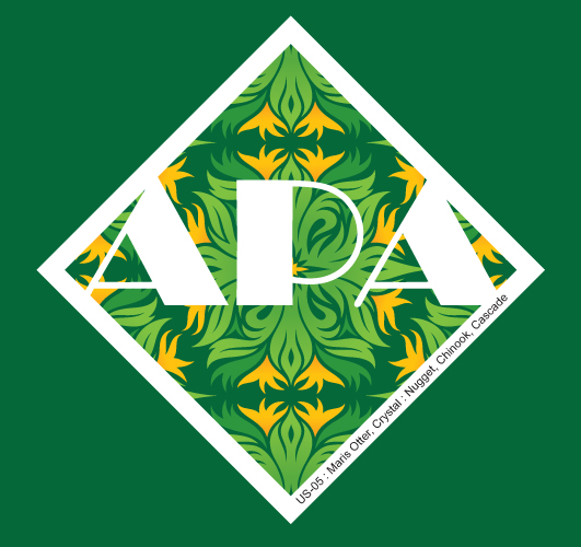
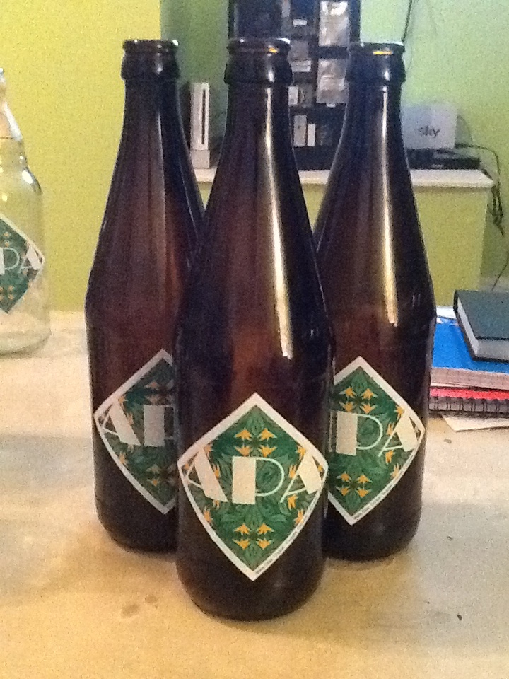
Lookin' good! 'Cept you misspelled "Amercian India Pale Ale"
jlb307
Well-Known Member
For a Nugget Nectar clone I'm gonna try out.

cookiepussbrewery
Active Member
- Joined
- Feb 20, 2013
- Messages
- 26
- Reaction score
- 2
Here is my newest based on a Rye IPA that is in the secondary now.

FredTheNuke
Well-Known Member
For a Nugget Nectar clone I'm gonna try out.
Good label (u may wanna fix thing to think in government warning).
binkleybloom
Active Member
First brew - based on a Troegs Perpetual IPA clone. Bottled yesterday. Time isn't moving quickly enough! ")

Jim_Holmes
Well-Known Member
mines nothing special just copied from Labelizer

zdbrown1, I really hate to be that guy but on your Pale to the Chief label, "American" is spelled wrong, unless you meant to spell it that way.
I know... Already fixed
Sent from my Nexus 5 using Home Brew mobile app
JustinCider
Well-Known Member

Still pretty rough...I'll finish it when i put it on the finished product and see how the colors work with the color of mead....I think it will be a good match...but i might mess with the color levels a bit.


Kubrickx - love the labels, but I'm questioning your local water supply!
Kubrickx - love the labels, but I'm questioning your local water supply!
Lol
A labeled beer, even with an unispired label is infinitely better than the best unbeered label. 
mines nothing special just copied from Labelizer

Jim_Holmes
Well-Known Member
A labeled beer, even with an unispired label is infinitely better than the best unbeered label.
yea one of these days ill sit down and design something different but for now i just started brewing and the labels were free on the site. i didnt have access to a color printer at work so, black and white it was. i agree though its better to have a plain label than no label at all. thanks for the encouragement
Eddiemk4VW
Well-Known Member
These are so artistic and personal. I like looking at them. Keep it up guys! And ladies, I don't want to leave ya'll out. I hope to be as creative when I start to make labels.


JakeSparrow
Well-Known Member
- Joined
- Sep 4, 2013
- Messages
- 200
- Reaction score
- 18
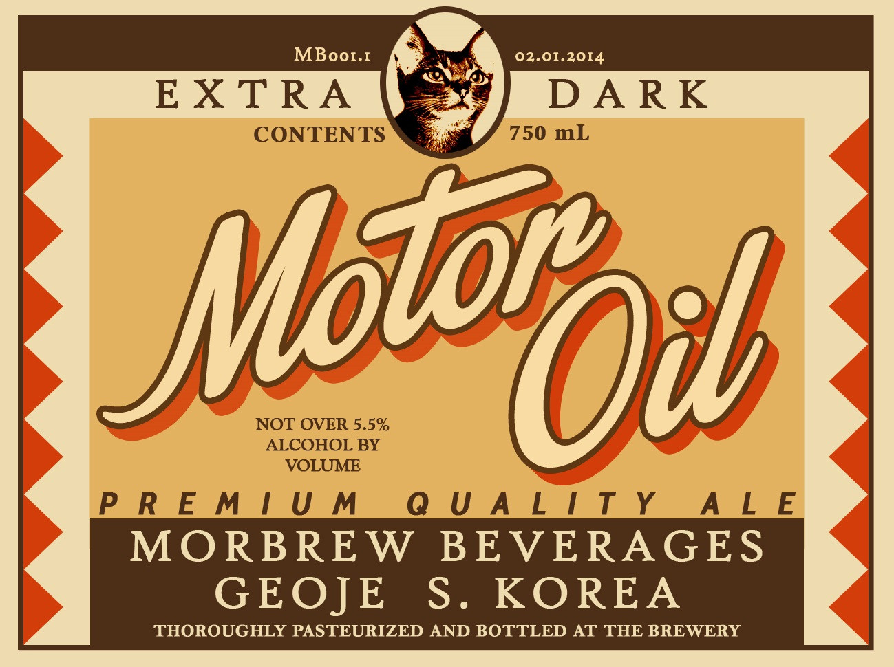
Nice work morbster I like the professional quality of the label and the attention to the typography involved. This is a nice thread I like seeing everyone's labels. I certainly can't wait to design a label for my first batch once it's all bottled up. When you guys are using milk as an adhesive, what kind of paper are you usually printing on?
rlmiller10
Well-Known Member
Wow there are some awesome labels on this thread. Makes mine look rather plain. 

Nice work morbster I like the professional quality of the label and the attention to the typography involved. This is a nice thread I like seeing everyone's labels. I certainly can't wait to design a label for my first batch once it's all bottled up. When you guys are using milk as an adhesive, what kind of paper are you usually printing on?
Thanks JakeSparrow, I appreciate the compliments. Nevertheless, I must give google the credit for the brunt of the creative work. I simply took a picture of an old beer label and modified it to my liking.
As for the paper, I've just been using the normal paper that's in our office printers. I think the type of printer may play a larger role than the paper itself. At my office, the printed paper comes out with a slight gloss on it, which is great for avoiding smudged colors.
JakeSparrow
Well-Known Member
- Joined
- Sep 4, 2013
- Messages
- 200
- Reaction score
- 18
rlmiller nothing wrong with simple it gets the job done. However with some different fonts, more text, some texturing and borders/framing it would take that same simple label and make it pop.
Titan88
Creator of MashLab Brewing Software
Some ideas I'm tinkering around with...


JustinCider
Well-Known Member

Great label Justin!
budgetbrewing
Member
- Joined
- Dec 2, 2012
- Messages
- 20
- Reaction score
- 5
My wife designed this label for an upcoming brew festival. Recently changed the name to Tonic No. 3 since it was the third batch of Amber ale. . Fell in love with an old label and decided to go early 1900s in the design/name.
Morbster, that label is incredible nice to see something retro as well.
 . Fell in love with an old label and decided to go early 1900s in the design/name.
Morbster, that label is incredible nice to see something retro as well.
Titan88
Creator of MashLab Brewing Software
Some ideas I'm tinkering around with...
And here's a couple more, along with my test logo.


Morbster, that label is incredible nice to see something retro as well.
Thanks pal, I appreciate the kind words. This was the first label I'd designed, but I really enjoyed using a vintage label design. I may stick with similar themes in the future.


JustinCider
Well-Known Member

Ima huge LOTR fan...a friend of mine came up with this label idea....its probably been done before...this is my spin on it.
Similar threads
- Replies
- 4
- Views
- 521
- Replies
- 7
- Views
- 884
- Replies
- 86
- Views
- 3K
- Replies
- 260
- Views
- 9K
