You are using an out of date browser. It may not display this or other websites correctly.
You should upgrade or use an alternative browser.
You should upgrade or use an alternative browser.
Possible Logos
- Thread starter Badseed
- Start date

Help Support Homebrew Talk - Beer, Wine, Mead, & Cider Brewing Discussion Forum:
This site may earn a commission from merchant affiliate
links, including eBay, Amazon, and others.
nukinfuts29
Well-Known Member
Love the name! Your work is better than mine, all my attempts with my Emu suck bad. Trying to make wood planks with an emu "burned" into it is harder than I thought haha.
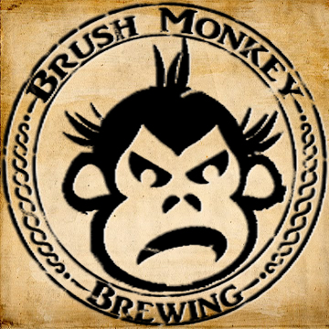
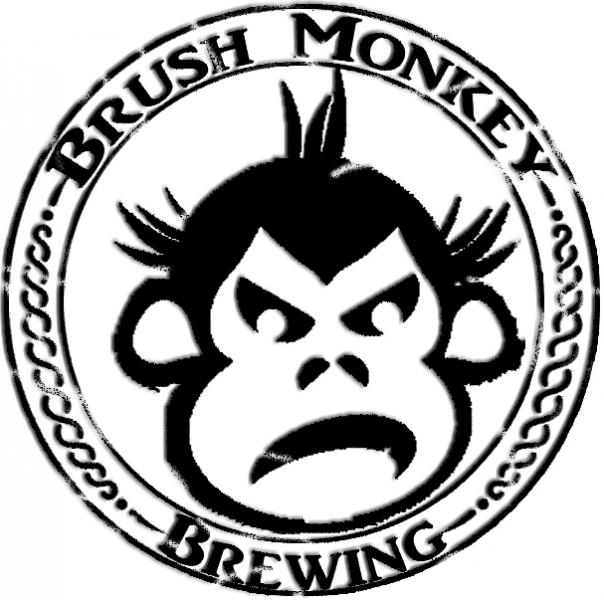
I would vote for #1 or #4. #2 is too plain, #3 would be better if it was not on the solid black backdrop.
I would vote for #1 or #4. #2 is too plain, #3 would be better if it was not on the solid black backdrop.
HankyPanky
Well-Known Member
I am a fan of 1 and 2, think it gives it a classic look. Nice work man!
Thanks for the support guys. I had a hard time coming up with the design but the name was pretty easy. Growing up in the sticks, my dad would always refer to me as a brush monkey so Brush Monkey Brewing just stuck. #1 and #3 are the label versions and #2 and #4 are designs that just may end up on a few glasses.
I would get someone to make a rubber stamp of #2. That would look so cool on some bottlecaps.
I_B_Mongo
Well-Known Member
I would get someone to make a rubber stamp of #2. That would look so cool on some bottlecaps.
I had a rubber stamp made with my logo. It looks really good on manilla hang tags in place of labels. I used Simon Stamps, and they were great to work with! I had a 2" stamp made, and it think it was about $15 after shipping.
iijakii
Well-Known Member
That's a badass logo and name.
saintdog327
Well-Known Member
Love the stencil-like monkey! The only criticism I would give is that the monkey's chin on the top two seems to be slightly uncentered/misplaced in proportion to the rest of his head within the circular frame. I would try and balance the space above his head with the botom of his face. Possibly re-work the hair so it doesn't take up so much space? Or shorten/thin out his chin to create more space between frame? Nonetheless, love the label and name, especially the black/white ones! Good luck with the brewing!
Thanks, the face is off center because I initially had ideas for a background behind the face something like hop buds or grains and I wanted it to show. I never could settle on anything so I just left it simple. Good point I could probably center everything again because I think that the simplistic logo works.:rockin:
saintdog327
Well-Known Member
Go all Bruce Willis on that logo hehe
Similar threads
- Replies
- 27
- Views
- 1K
- Replies
- 3
- Views
- 567
- Replies
- 7
- Views
- 566


