
StarCityBrewMaster
Well-Known Member
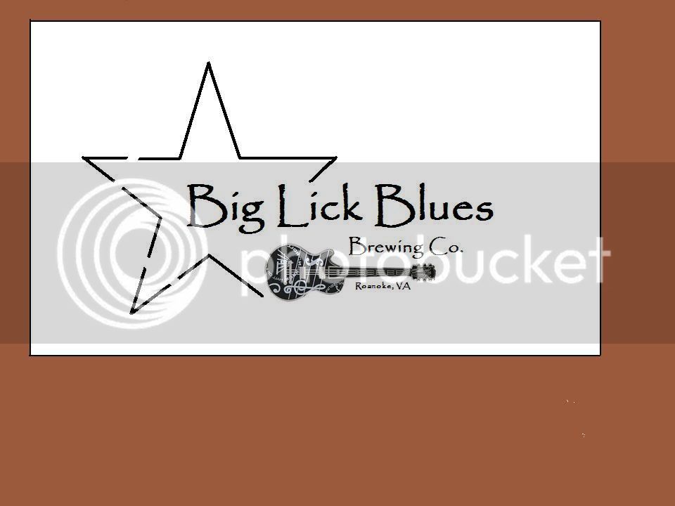
Here is the meaning and history behind my new logo.
I'm in Roanoke, VA which is called the Start City of the South. We literally have a giant star that sits on top of Mill Mountain, lights up at night and overlooks the city.
http://en.wikipedia.org/wiki/Roanoke_Star
Roanoke was also once called The Big Lick
Known as the "Capital of the Blue Ridge," and a crossroads for commerce, the city of Roanokes history began in the 1740s. Mark Evans and Tasker Tosh came from Pennslyvania and took up land near the salt licks where Indian and animal trails crossed in the center of the valley.
For generations, those salt marshes, or licks as they were called, had been a gathering place for buffalo, elk and deer, as well as for the Indians who hunted them. The salt marshes were to lend their name to the first village in the Roanoke Valley which started on the east-west path as Gainsborough in 1834; the town soon came to be known as Big Lick.
Blues is simply because the live music scene here is big compared to other places I've been. All of the night life is made up of mostly local bands performing at any given watering hole which always makes for a good time.
All this being said here is the logo - let me know what you think! I have a very artistic friend who is going to help me make this look not so "cut and past" like and add some color............

