I think I've decided on a name and label

Homebrew Talk - Beer, Wine, Mead, & Cider Brewing Discussion Forum

Help Support Homebrew Talk - Beer, Wine, Mead, & Cider Brewing Discussion Forum:

This site may earn a commission from merchant affiliate links, including eBay, Amazon, and others.

MBasile

Well-Known Member
Joined
Jun 26, 2009
Messages
1,577
Reaction score
31
Location
Austin
Feros Ferio is the motto of my families clan (I'm 1/4 Scottish, but it's the part of my heritage that interests me the most). It means "I am fierce with the fierce." The background is the modern Chisholm tartan.

Attempt 1
http://i17.photobucket.com/albums/b81/MBasile/FerosFerioBrewing3.jpg

Here's the tutorial for doing the gold lettering:
Learn Adobe Photoshop Tutorials - Text Effects - Gold-Plated Text - Photoshop Essentials.com

I used some of the techniques in that tutorial for the "Feros Ferio" text too.

Attempt 2
1LightAle.jpg


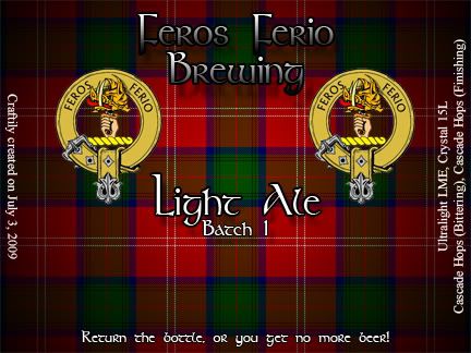
Background is just computer generated tartan pattern with a gradient overlaid on it.
 
I dig the logo quite a bit (the belt is a clever touch,) but as a design snob, embossed letters never sit well with me. They always have that "sub par mid-90s rap album" vibe IMHO. But my opinion really shouldn't matter to you - you like what YOU like!
 
I dig the logo quite a bit (the belt is a clever touch,) but as a design snob, embossed letters never sit well with me. They always have that "sub par mid-90s rap album" vibe IMHO. But my opinion really shouldn't matter to you - you like what YOU like!

haha, thanks for the input! I'm an artist (photographer) so I'm fine with the constructive criticism of the lettering :)

How would you do the name though? I thought plain colored text was too boring, but the embossed text does look a little over the top. Unfortunately I'm a photographer, not a graphic designer, so I'm better at creating with what's there with the camera, rather than creating from a blank canvas.
 
So I reworked it a little (I had to change the size of the label so it was similar to that of real labels and would fit on the bottles) so I figured I'd make it a little less over the top. I went online to find a celtic style font and found one called "Stonehenge"

1LightAle.jpg
 
I like the latest attempt, especially the 'return the bottle' warning... good idea.
The only thing I'd change is maybe lighten the Feros Ferio Brewing text a little, or at least lighten the dark part of the gradient. It might be my laptop, but the bottom of the Fs are hard to see and it almost looks like a C. Otherwise, it's a nice font (and label).
 
Back
Top