I think I've finally got it...

Homebrew Talk - Beer, Wine, Mead, & Cider Brewing Discussion Forum

Help Support Homebrew Talk - Beer, Wine, Mead, & Cider Brewing Discussion Forum:

This site may earn a commission from merchant affiliate links, including eBay, Amazon, and others.

Dude

Supporting Member
HBT Supporter
Joined
Jan 15, 2005
Messages
8,768
Reaction score
143
Location
Ramstein-Miesenbach
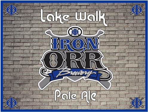
I'm thinking this will be the standard "label" for my bottles. I've been workign on this for a while and I'm about 95% decided on this one.

Everything will stay the exact same for every beer except for the label text.

I like it. What can I improve on or change?

636-IOBLWPA.jpg
 
I really like it. Only thing I was thinking is that there is a lot of brick on either side. Maybe make the label a bit narrower? Just a though. Looks kick a$$
 
I'm wondering how it would look if the bricks were a little fuzzier, a little less in focus, so that the (kick-ass) logo would stand out a bit more. If the background's a bit softer, it'll make the logo be more of the focus (which I think is what you want), and it'll have a bit more "pop."

Looks good, though!

This is like your favorite recipe, right? You gotta put it in the database for us.
 
i agree with jester, there is a lot of brick. have you considered making it portrait rather than landscape?
or you could fuzz up the bricks a bit...
 
I like it, but here is my criticism. The brick is obviously a picture of bricks and the logo and writing are rendered with a graphics tool. I think you'd have a much more appealing label if you matched your design elements.

If you want to follow my advice, you could take the bricks and make them look more like a rendered graphic or make your graphics appear to be painted on the wall. You could also make the logo appear to be attached to the wall; like it’s a sign.
 
in photoshop give the bricks a painted look using one of the built in filters... the have your logo on a different layer and use overlay or one of those on the layer options. it will make the logo look like it was painted on the bricks.
 
I like it as is Dude, looks real good. One idea: If you wanted different beers to stand out, then you could do a simple, transparent layover on the bricks of different colors. Red ale, a soft red over the bricks... weizen, a soft yellow, etc. This would work real well since the bricks are already grayscale.
 
I like it!

The only thing I would think about trying something else is the brick background. Unless of course it has some meaning to you.

With the Lake Walk, and Iron Orr.....It makes me think of some sort outdoors shot of a lake in the background......

just my 2 cents.....It really does look good though
 
I like.

But you do need something on the sides, maybe a description of the beer or how we can contact you when we are addicted and need MORE.

But if you dont want to do that, maybe put some hop vines on the bricks?
 
Thanks all for the comments....

yeah, if I were a little more advanced in my PSP skillz, I could do more with filtering and layers...I'll work on it.

As for the sides of the label being bare...I think it kind of needs that seeing the label will be on a bottle. It'll look better actually on a bottle, I think.

We'll see....I have an idea for it but I need to experiment with it...I'm stoopid on PSP as far as manipulating to what I want to do.
 
Great logo! But I would take out the background, it kinda takes away from your logo. Keep the logo and just put the name of the beer below it and I think it would be perfect.
 
For a homebrew this is a great logo as depicted. Personal taste wise, I agree with spuddybuddy, your base logo is awesome and I'm not sure the bricks add anything. For a commercial brew, the bricks and grey color just don't yell out "grab me and buy me!" but I know that's not your intent. Bottom line: if you like it, run with it!
 
Back
Top