Kolsch Label For Critique

Homebrew Talk - Beer, Wine, Mead, & Cider Brewing Discussion Forum

Help Support Homebrew Talk - Beer, Wine, Mead, & Cider Brewing Discussion Forum:

This site may earn a commission from merchant affiliate links, including eBay, Amazon, and others.

brokenanchor

Well-Known Member
Joined
Sep 2, 2008
Messages
289
Reaction score
1
Location
Columbia, MO
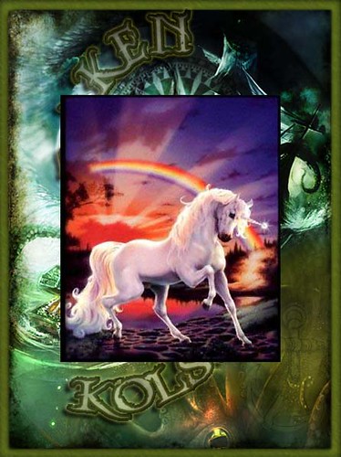
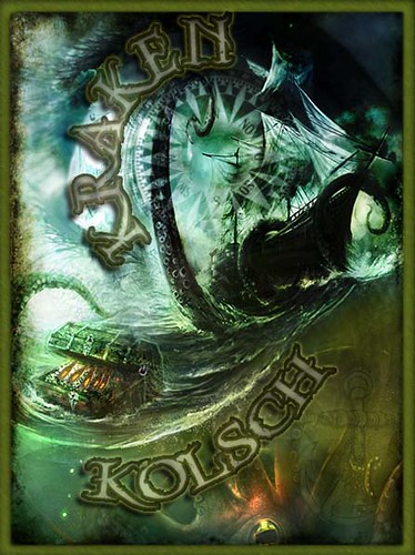
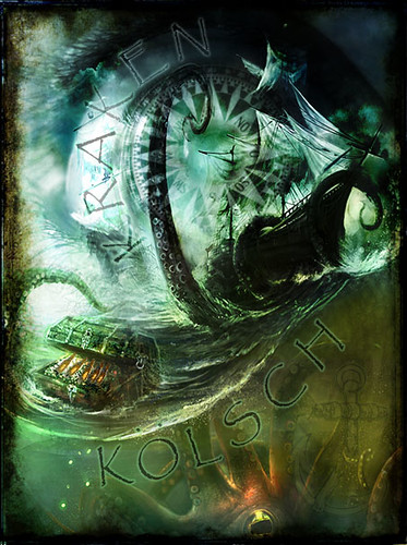
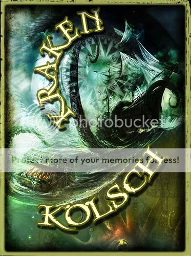
So I just whipped up this label, for a beer I'm brewing this weekend. Still has to have the abv and info added to it. That might go on a back label though since I think it would look too busy on the front with that added. Thoughts?

3488842673_100b1cd292.jpg
 
Nice...I'm continually amazed at the quality of these labels and wonder where ppl are getting their software and images/illustrations from. This one looks great!
 
I make my labels with Photoshop CS3. The images are taken from deviant art with the permission of those who created them. I just learned some blending options and this is actually two different photos blended on top of each other.

Pirates_of_the_Spanish_Main_by_viag.jpg


Encompass_by_cfryant.png


Photoshop is one of my hobbies, so if anyone has a picture and an idea of what they want let me know and I'll throw something together for you.
 
Very nice, but I'd suggest making the text stand out a bit more. Try increasing the stroke, adding shadow (not too much), and maybe making the font a little bolder.

As an artwork, it works, but as a label, it just needs a smidgeon extra 'oomph'.

I had a go myself... still not satisfied, but hopefully you can see what I'm getting at.

kraken.jpg
 
I dunno. Somehow, seawater, seaweed, and fishy reminders are not what I'd associate with a kolsch.
 
Nice...I'm continually amazed at the quality of these labels and wonder where ppl are getting their software and images/illustrations from. This one looks great!

GIMP and Inkscape are what I use.... both free downloads after a quick google search.

90% of my images are stolen from unsuspecting folks off the web, often as simple as the image search on google. I can't compete with most folks on here, but they turn out well in my opinion, and are free.
 
I love the label, but do agree the font needs to stand out more.


GIMP and Inkscape are what I use.... both free downloads after a quick google search.

90% of my images are stolen from unsuspecting folks off the web, often as simple as the image search on google. I can't compete with most folks on here, but they turn out well in my opinion, and are free.

I use Paint Shop Pro, and also steal stuff off of Google image
 
wow, so I just started browing through this board and this was the first thread I opened. Just wipped it up huh? That's some great artwork. I agree with celestialparsnip that the title needs to be emphsized more. Maybe also try to mute some of the detail (water splashes and detail of the border) , as it might get a little foggy once it's label size.
 
Yeah, I was thinking that the letters needed to be darker, but I still don't want to distract from the overall picture. Celestial I really like the input, what kind of font is that? I'll probably take that font keep the shadow and reduce the fill so it looks a little more transparent in the middle. I'm not too worried about the smaller details because the printer I use is in a tech lab and is absolutely ridiculous. Great ideas thanks everyone.
 
The font is called Torquator, and can be found here.

I'd also suggest placing a border around the whole shebang, to give it more definition. The blackened edges are cool, but a boundary will help keep the eye focused on the centre.

How about something like this?

kraken2.jpg
 
Fixed that for ya Lou...I like it better now too ;)

3504616583_8609344289.jpg


No but really thanks for the help celestial I liked the font but lessened the fill a little bit and messed with the border...I might mess with it a little bit more, but I really like how it turned out.


3504616565_3bdc2424fa.jpg
 
Back
Top