You are using an out of date browser. It may not display this or other websites correctly.
You should upgrade or use an alternative browser.
You should upgrade or use an alternative browser.
I need help with my logo
- Thread starter pnj
- Start date

Help Support Homebrew Talk - Beer, Wine, Mead, & Cider Brewing Discussion Forum:
This site may earn a commission from merchant affiliate
links, including eBay, Amazon, and others.
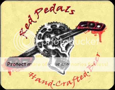
I like the overall image. Not really crazy about the way the red blood is looking but still gives it a unique overal feel. The text could use a little work, but that's just being nit picky.
It think the crank skull image would benefite from being redrawn on the computer to sharpen it up a bit.
the art work itself is great.
It think the crank skull image would benefite from being redrawn on the computer to sharpen it up a bit.
the art work itself is great.
Thanks for the feedback.
Some of the folks in the chatroom made some suggestions too. I kind of like the distressed look of the skull/cranks so I don't think I'll redo it. But I might change the overall look of it in photoshop, maybe with curves or something..?
What don't you like about the text? Some said it was too red... Does the font work or would something else look better?
Do you have some other suggestions for the red pedals instead of a 'blood' look?
some minor changes below...

for the text I think it's cause the "Red Peddle" looks like it's inside of the "hand crafter beer" part.. either make the hand crafter smaller like reduce the circumfrence or enlarge the Red peddle..
for the blood I think it's just the splattery look around it. But I still like it so it's not really a change..
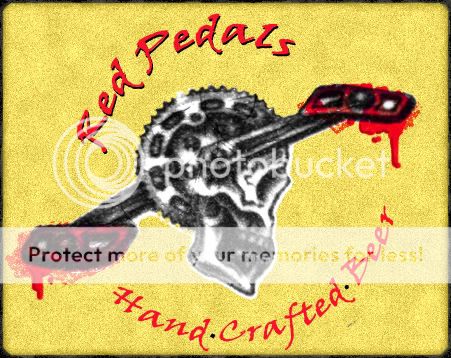
I like the lighter color of the second version it makes it look better overall.
If you can try to get rid of the white around the skull cranks. or try the eraser brush at about 20% and feather all around the peddle so it's white. or distress it a little.
But like I said it's just me being nit picky. I really do like the overall look and if you didn't change anything it'd still look sweet.
mullenite
Well-Known Member
One thing that bothers me about the text is that everything else has some kind of rough texture to it and the text is smooth in comparison.
I just played with it really quick.
I think i'd pick a different font. but this one allready had the stressed look so I just went with it. But you can make any font stressed easy enough.
I had some lines completing the text "circle" but didn't like it. lol
I need to get back to my anvil image now.

I think i'd pick a different font. but this one allready had the stressed look so I just went with it. But you can make any font stressed easy enough.
I had some lines completing the text "circle" but didn't like it. lol
I need to get back to my anvil image now.

starrfish
Well-Known Member
I like Coy's maybe some red spattering around edges lust some small splats to round it out.
maybe bust the contrast on the skull layer... try the "multiply layer" may blend with the background too much or it may blend together nicely.
xjncoguyx nice play on philly! I used to live in Elkins Park, Willow Grove, and West Chester... before "turning in my Yankee card" lol
maybe bust the contrast on the skull layer... try the "multiply layer" may blend with the background too much or it may blend together nicely.
xjncoguyx nice play on philly! I used to live in Elkins Park, Willow Grove, and West Chester... before "turning in my Yankee card" lol
Looking good guys. thanks for the help.
Honestly, I don't like the red/blood look on the pedals. But I feel the pedals should be red and the blood thing seems to fit/work.
I'll play around with some of these ideas soon.
Honestly, I don't like the red/blood look on the pedals. But I feel the pedals should be red and the blood thing seems to fit/work.
I'll play around with some of these ideas soon.
maybe bust the contrast on the skull layer... try the "multiply layer" may blend with the background too much or it may blend together nicely.
I was just going to suggest using the multiply blend on that layer. That'll eliminate the "cut and paste" look of the white behind the skull and make the label feel more cohesive - like it was all created at the same time. I really like coy's font suggestion, too (I might be a bit partial since we work together, though) Looks pretty rad though - the gear with the skull. Nice work!
Turn off the stroke on the text and leave it off, the image in post #8 is much better than the others as the stroke just looks cheap and amateurish. After that go into the text box and decrease the space between each letter by placing the cursor in the space and pressing option (or I think ALT on a PC) and pressing the left arrow key. See if you can find a distressed font that isn't all caps though.
definitely agree about the stroke. Not so sure about not using all caps, though. In instances when you are bending text, having the same letter height helps to create a sort of consistent block/shape around the graphic. I think mixed cases looks a little haphazard when it's just floating.
just my two cents though.
What if you just make the pedals red - instead of dripping/spraying red?
just my two cents though.
What if you just make the pedals red - instead of dripping/spraying red?
Turn off the stroke on the text and leave it off, the image in post #8 is much better than the others as the stroke just looks cheap and amateurish. After that go into the text box and decrease the space between each letter by placing the cursor in the space and pressing option (or I think ALT on a PC) and pressing the left arrow key. See if you can find a distressed font that isn't all caps though.
Similar threads
- Replies
- 33
- Views
- 1K
- Replies
- 1
- Views
- 556
- Replies
- 27
- Views
- 1K


