
cyberbackpacker
Well-Known Member
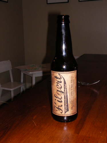
EDIT: (10/15/08)
Well, after some more piddling, I think I have finally come to a final brewery name and logo.
I want it to look "old school" and my wife mentioned making the logo/label seem more "hand made/home brewed" to go along with the brew. Plus I really want easy manipulation and printing.
This logo/label fits all of those criteria IMO. I have printed them on paper bags (cut them down to 8 1/2 x 11 for easy laser jet printing) to give the "hand made/home brewed" feel and look really great to me. As far as easy manipulation, the lettering in the "flag" for the brews name is easily altered for whatever brew is being bottled. Additionally I have another version without the small "Bottled on: ______" in the bottom right corner. Since I do not have the big pipeline, this is not necessary as of yet.
Lastly these are applied vertically, not horizontally as shown. Again my wife, an Interior Designer with much better aesthetic sensibilities than most, gave me this idea.
Without further ado here is the new (and final ) logo:

And the winterfest label:

Well, after some more piddling, I think I have finally come to a final brewery name and logo.
I want it to look "old school" and my wife mentioned making the logo/label seem more "hand made/home brewed" to go along with the brew. Plus I really want easy manipulation and printing.
This logo/label fits all of those criteria IMO. I have printed them on paper bags (cut them down to 8 1/2 x 11 for easy laser jet printing) to give the "hand made/home brewed" feel and look really great to me. As far as easy manipulation, the lettering in the "flag" for the brews name is easily altered for whatever brew is being bottled. Additionally I have another version without the small "Bottled on: ______" in the bottom right corner. Since I do not have the big pipeline, this is not necessary as of yet.
Lastly these are applied vertically, not horizontally as shown. Again my wife, an Interior Designer with much better aesthetic sensibilities than most, gave me this idea.
Without further ado here is the new (and final
) logo:
And the winterfest label:


")


