Show Us Your Label

Homebrew Talk - Beer, Wine, Mead, & Cider Brewing Discussion Forum

Help Support Homebrew Talk - Beer, Wine, Mead, & Cider Brewing Discussion Forum:

This site may earn a commission from merchant affiliate links, including eBay, Amazon, and others.
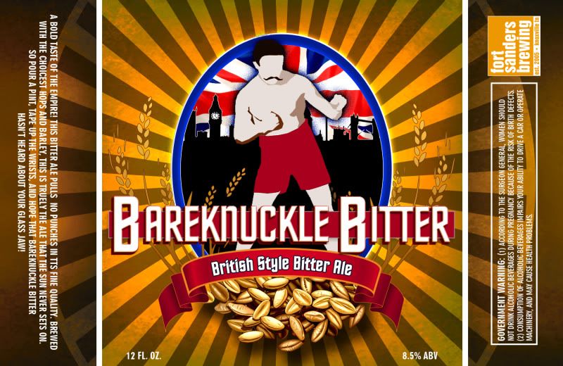
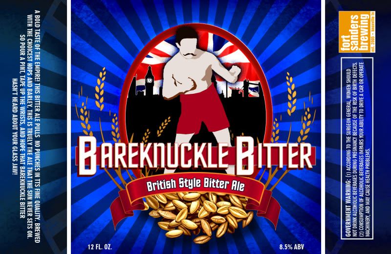
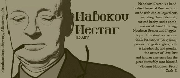
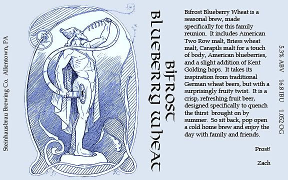
My God, I am seriously embarrassed after seeing the quality of labels on this thread. Here is a very rough set of labels for my brewing on demand (BOD) tap handles for my 3 keg garage 5cf keezer.

Basically just to know which one you're pouring.... don't judge... Ok, judge... whatever.

Love the simplicity in labels like this. The Cascadian is the best IMO. The start something font is a bit off for how nice the the top font is. Great layout, maybe just work with the fonts (start something and your IBU, ABV, etc) to make them go better. Nice work!
 
Here's a more-or-less complete label for my Kölsch. Pretty happy with how it turned out, though I may add a few details to fill in some of the blank space and/or play with the layout of the ABV text.

foolsgold.jpg
 
I've come to enjoy making the labels almost as much as the beer itself. I have an entire shelf dedicated to my bottles.

DunkelFront.png


DunkelBack.png
 
neckershipwreck.jpg


shipwreckedsaison-1.jpg


This wreck sits out in front of my BIL's families beach house. Pretty neat, I love taking pictures of it. ABV and stats will be added before they are printed.
 
Just whipped this up for a family reunion beer. The family is fond of fruit beers, and this has been requested way too much over the past few months. Comments and criticism are welcome.

1a0af3d0.jpg


Also, thanks for the vote of confidence Genjin!
 
zarathustra19 said:
Just whipped this up for a family reunion beer. The family is fond of fruit beers, and this has been requested way too much over the past few months. Comments and criticism are welcome.

Also, thanks for the vote of confidence Genjin!

Are you also from Scandinavia?
 
This is a label I made for a Russian Imperial Stout that I just bottled.

It's easier to read at full resolution. The quote next to Drago says "I will crush you!".

You could also have put your old Mayor in there. That would've been funny. :ban:
 
Hmm, I've only completed three batches, but here they are:
578227_379254402117334_100000983319347_1046140_1710585770_n.jpg


The Falconsgate Trippel was a clone of Maredsous Triple Belgian.
The Falconsgate Tripel Was a modification on the above recipe.
The Falconsgate Fat Pat, was my first personal recipe, a stout initially brewed on 17 March, 2012.
 
Channel66 said:
This wreck sits out in front of my BIL's families beach house. Pretty neat, I love taking pictures of it. ABV and stats will be added before they are printed.

Wow great picture and it makes an awesome label!
 
Zeus1120 said:
Having a hard time deciding which color scheme I like more... I'm leaning towards the gold. Thoughts? Ideas?

I think your main logo pops more with the blue background. Really like the blue
 
And speaking of not being able to make up my mind:

Purple is quite the royal color:
HopulenceIPALabelPurple.jpg


But if art school taught me anything, "just make it red" is a perfectly acceptable solution to any problem:
HopulenceIPALabelRed.jpg
 
And speaking of not being able to make up my mind:

Purple is quite the royal color:
HopulenceIPALabelPurple.jpg


But if art school taught me anything, "just make it red" is a perfectly acceptable solution to any problem:
HopulenceIPALabelRed.jpg

I like the purple. Makes me think "pimp suit" when viewing with the Rolls.
 
My first label I've done. Used AutoCad, so it isn't as nice as most of these in thus thread. Haha

2012-04-02 17.02.49-1.jpg

On the bottle

ForumRunner_20120503_132940.jpg

Sorry, about the rotated picture.
 
I'm lovin all these labels! Here are a few I've worked up:

multi_w.jpg


Just bottled the Nitwit so I'm in the process of attaching labels. Here's a bottle with the label:

nitwit2w.jpg


I have to say I have about as much fun designing labels as I do brewing beer.

Cheers
 
And speaking of not being able to make up my mind:

Purple is quite the royal color:
HopulenceIPALabelPurple.jpg


But if art school taught me anything, "just make it red" is a perfectly acceptable solution to any problem:
HopulenceIPALabelRed.jpg

Pimp juice if I've ever seen a label for it!
 
Just a label I am playing around with. I didn't design any of it. I snagged the seal from http://www.says-it.com/seal. I found the laughing silhouette online a while ago and held onto it. Brumbly is my girlfriends nick-name for me. Irish red is the first beer I plan to brew when I get everything up and running.

Threw it all together with a crash course in GIMP and here it is.

I am not quite convinced I like the fleur de lis. I am working on a couple designs to replace it; maybe a knot of some sort. Dunno yet.

I hope you like it.

ZHLoL.gif
 
fartsponge said:
@rejart

Those are pretty awesome. What label paper are you using?

Thanks. I just printed them out on regular paper with a color laser printer (inkjet won't work for this). Just dip in milk and slap it on.
 
7 lb LME + 2 lb corn sugar + 2 oz cascade hops + Munich yeast = 2 cases of 7+% ABV beer for under $29.

BeerLabelSummerSwill.jpg
 
Add an e at the end to get the international version. :D

JDFVo.jpg


Alc% is just a placeholder, it's fermenting right now.
 
Cooked this one up for my Saison. Stole inspiration from Great Divide's Colette, not totally sold on my color scheme.

Product%20-%20Great%20Divide%20Colette.preview.jpg


farm.jpg
 
Just tweaked these in anticipation of the family reunion in July. Taking both of these along. Hopefully it will be an improvement over using bottles without their labels removed, like last year.

306fdd56.jpg


f1c335d4.jpg


Any comments or criticism is appreciated.

Zach
 
Forgot the brew dates on this one, but oh well. We've already started drinking it, as I'm a bit behind. Can you find the hilarious brew day accident??

I find that late additions of steel are good for yeast metabolisms. ;)

The only thing I'd change on your label would be to angle the text in the clamp to make it look like it's laying on the same surface the clamp is on. Otherwise, I'm a big fan. Well done! :)
 
Loving the Alphonse Mucha-esque illustrations on these. Really diggin' the red one. Great work!

Just tweaked these in anticipation of the family reunion in July. Taking both of these along. Hopefully it will be an improvement over using bottles without their labels removed, like last year.

306fdd56.jpg


f1c335d4.jpg


Any comments or criticism is appreciated.

Zach
 
Back
Top