Showing off new logo

Homebrew Talk - Beer, Wine, Mead, & Cider Brewing Discussion Forum

Help Support Homebrew Talk - Beer, Wine, Mead, & Cider Brewing Discussion Forum:

This site may earn a commission from merchant affiliate links, including eBay, Amazon, and others.

Burro2882

Well-Known Member
Joined
Apr 29, 2009
Messages
123
Reaction score
1
Location
San Diego, CA
HooksLogo.jpg


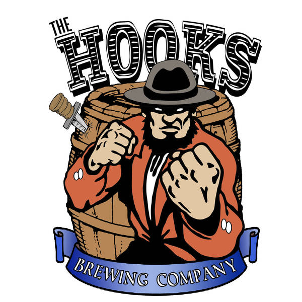
I decided to go with a new theme, name, and logo (was previously "Burro's"). The name "the hooks" refers to a nickname given to The Canal District, an area of Buffalo New York back in the mid to late 1800's. It was also known as the wickedest street in the world back then, notorious for its hundreds of saloons and whore houses. It was also a very dangerous place to wonder through. The locals often preyed on the immigrants that passed through on their way west, robbing and sometimes killing them.

I thought about several different visuals for this. I considered incorporating a prostitute or street sign or a saloon in the background but I decided to keep it simple. I didnt want to clutter it up.

Feel free to suggest ways to improve the design. I used Illustrator and photoshop.
 
It is very cool. I, too, think it would be cool to have a prostitute incorporated but I'm not sure how you could do that without making it into a busy scene like a street shot.
 
I love it! Awesome job. I wish I was talented when it came to drawing, I have ideas for a logo myself but no skeelz!

Again, awesome job!
 
I actually really like it. I like the saloon girl (come on, nobody likes to be called a whore) idea. But, if the Hooks really was a badass place, your imagery is better.

Only one tiny criticism: the pic gives the feeling of being slightly off balance. The right side is "heavier". The guy is slightly off center, the barrel is slightly bowed, and the pic as a result looks (although I think it's an optical illusion) slightly crooked.

I KNOW I'm nit picking and I apologize. But it's so cool, I would hate for something so correctible stand in the way of brilliance!
 
Only one tiny criticism: the pic gives the feeling of being slightly off balance. The right side is "heavier". The guy is slightly off center, the barrel is slightly bowed, and the pic as a result looks (although I think it's an optical illusion) slightly crooked.

Your absolutely correct. It is a bit heavy on the right side. I will probably try to correct that a bit. I actually purposefully positioned him that way because I thought with the knife sticking out of the left side it would even it out. I may have overdone it though.
 
Nice work, I agree with the feeling of being off center... but still like it a lot!

Lift the lettering off the barrel, make the barrel smaller or less bulging.
 
Burro2882 said:
Your absolutely correct. It is a bit heavy on the right side. I will probably try to correct that a bit. I actually purposefully positioned him that way because I thought with the knife sticking out of the left side it would even it out. I may have overdone it though.

The more I look at it, I think the barrel and "Hooks" is bugging me more than the man. I think the barrel is on a slight angle. The "s" hangs over the right side of the barrel more than the "h" on the other side. This makes the lettering closer to the banner on the right- adding to the perceived tilt.

The man adds to it as well, but the more I look, the more I think it's the barrel and letters.

PS my wife is a graphic designer and we'll go through this exercise with her logos. For her, we get really picky because a paying client will be pickier. If I'm going too far, tell me and I'll shut up.
 
The problem is definitely the mis alignment of the "hooks" combined with the man being slightly off center. Both contribute to the barrel looking crooked. It's not though. Kind of an optical illusion. Im going to fix the text and see if I can budge him over a tiny bit.

Thanks for all the input thus far. And "whore" doesn't offend me. It was probably the term used most in that time period.
 
I really like your logo. I don't see the 'weighted' feeling others are getting, but do agree that raising the Hooks would help open it up a bit.

As a slight aside, and if you dig some interesting reading, there's a brewery (beer's so-so) on Pearl Street of Buffalo, near the heart of the Hooks area. Check out http://www.pearlstreetgrill.com/index.html for some cool info. Incidentally, the vicinity is still a little rough- but only during hockey season. The Sabres play about 200 yards from the brewery.

In your logo, the forward fist really pops the entire shot for me. Kyle
 
Conan, Yeah I used to work there actually. It's an awesome place with surprisingly great bar food. And their beer isn't bad either. I grew up in Lockport and lived in Buffalo for a few years before moving out to San Diego a few years ago. Thanks for the link.

Have you read; America's Crossroads, Canal Street/Dante Place? Huge read with TONS of interesting articles and stuff about the "Infected District". Unfortunately its out of print now but there are a few copies out there floating around.
 
Does anyone else see an Amish guy? I think it's the hat and beard. I do really like the logo though
 
Now that you mention it. Yeah!

Its actually an alternative fighting irish I believe, but the beard looks very amish looking. I'm going to add the mustache to it to make it look less amish. Or maybe I'll give him a derby cap instead. Thanks for commenting.
 
Conan, Yeah I used to work there actually. It's an awesome place with surprisingly great bar food. And their beer isn't bad either. I grew up in Lockport and lived in Buffalo for a few years before moving out to San Diego a few years ago. Thanks for the link.

Have you read; America's Crossroads, Canal Street/Dante Place? Huge read with TONS of interesting articles and stuff about the "Infected District". Unfortunately its out of print now but there are a few copies out there floating around.

Not to take it any more off topic, but I just amazon searched this book- apparently, someone thinks it's worth a TON of money. Literally, one copy available for $200. Maybe the library. Kyle
 
Not to take it any more off topic, but I just amazon searched this book- apparently, someone thinks it's worth a TON of money. Literally, one copy available for $200. Maybe the library. Kyle

Yup. I was able to find a copy that was owned by a charity organization. I got it for $80 and the money went to a good cause.
 
Back
Top