My Kilju Label Ideas

Homebrew Talk - Beer, Wine, Mead, & Cider Brewing Discussion Forum

Help Support Homebrew Talk - Beer, Wine, Mead, & Cider Brewing Discussion Forum:

This site may earn a commission from merchant affiliate links, including eBay, Amazon, and others.

Krypticklown

Member
Joined
Jan 28, 2009
Messages
22
Reaction score
0
Location
Johnson City, TN
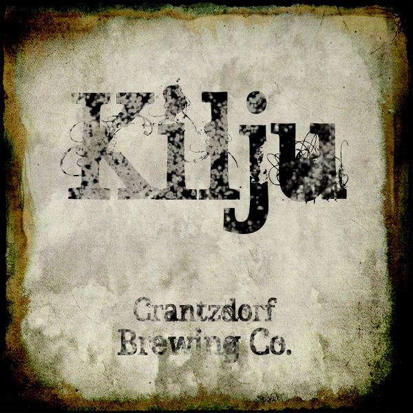
So I'm gathering my Kilju ingredients Monday (we've decided to start out with something easy) and had a sit down with SWMBO and we tossed together some ideas for the label (she got to choose the bottle) and here's what we've been debating on:

Kilju_Logo.jpg


or

Kilju_Logo_2.jpg


we've decided to go for the 750ml blue Riesling bottle..so any suggestions?
 
There's really nothing technically wrong with it. It's
simple, the border looks nice.

I, personally, think that stylized text is messy
unless it serves a very specific function. But I don't
know what Kilju means, so I could be off base
there.

I personally think it would look nicer just as the
underlying font without the wispy vector embellishment.
Along with that vein of thinking, I feel like the weathering
effects in the second image destroy the legibility of the
text.
 
Kilju is just a Finnish alcohol, it doesn't taste so great straight, but mixed with juice its pretty nice on a Sunday. I dunno I just wanted to play around in GIMP to see if I can make the text more weathered looking.
 
Absolutely play around.

When it comes to text, it's better to not deteriorate the bulk of it's
weight (blackness) or shape. Fonts are painstakingly designed to
have very subtle balance. Altering the weight or shape really does
affect readability and the overall effect the text has in the design.

That being said, just do what you want if you like it - it's your label ;)

You could reduce the amount you have "bitten" out of the text, and
reduce the amount of black space in the bowl of the "u" and not
effect the text too much, but still have embellishments.

Less, targeted embellishment is more IMO
 
Back
Top