Labels from Boerderij Kabouter

Homebrew Talk - Beer, Wine, Mead, & Cider Brewing Discussion Forum

Help Support Homebrew Talk - Beer, Wine, Mead, & Cider Brewing Discussion Forum:

This site may earn a commission from merchant affiliate links, including eBay, Amazon, and others.

Boerderij_Kabouter

Well-Known Member
Joined
Dec 21, 2007
Messages
7,763
Reaction score
178
Location
Oconomowoc, Wisconsin
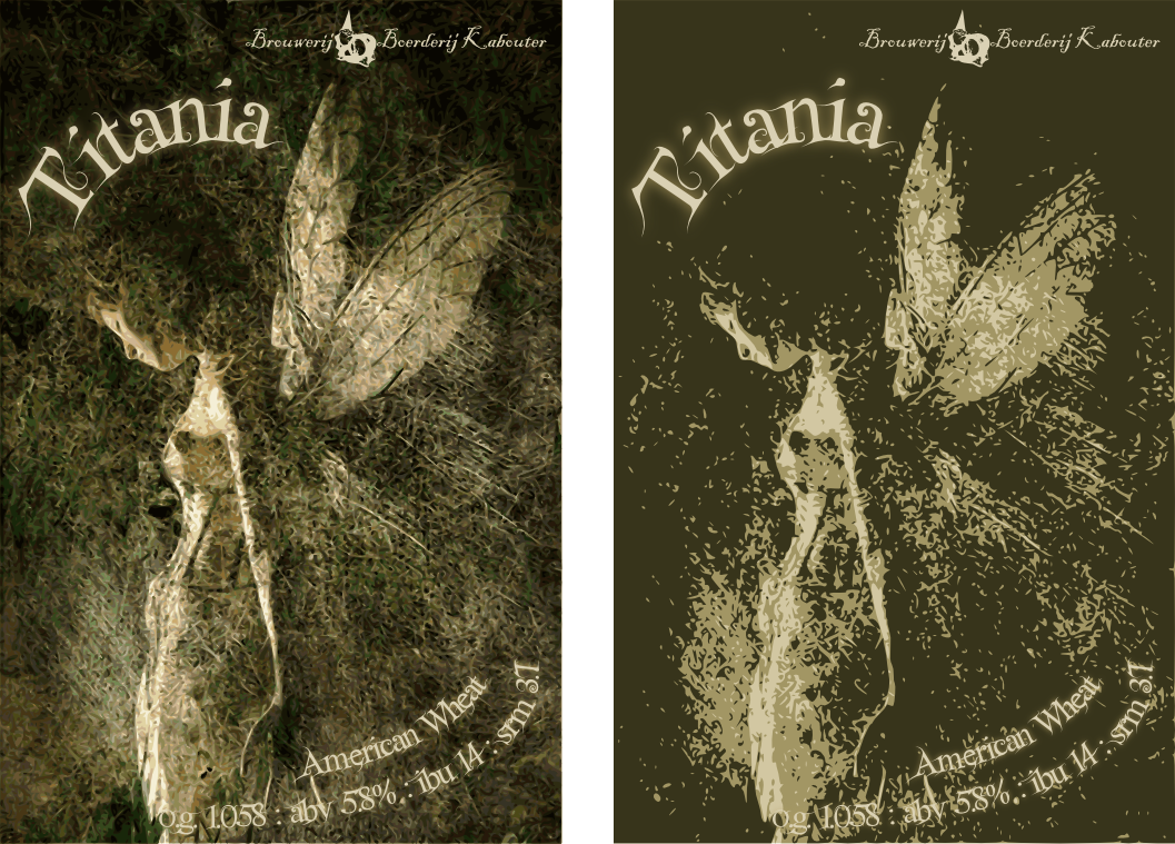
I decided instead of starting a bunch of new threads each time I want you guys to look at and critique my labels I would start putting them in one thread!

I am not a graphic designer, nor do I play one on TV. I love fiddling with Inkscape and come to this community to get some feed back to help me make my labels better.

... and without further ado here are my previous labels:

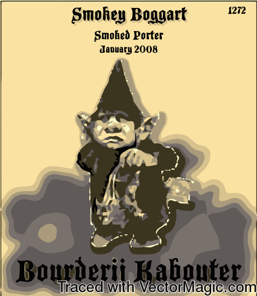
Label 1: This was my first brewing of my smoked porter. I had not yet learned about inkscape and used vectormagic online to convert to vectors. Not great but it was a fun label anyway.
Smokey_Boggart_vectorized_free.png


Label 2: For my Razzmatazz wheat. I like this label and format and plan to use it when not inspired by something else.
Razzmatazz.jpg


Label 3: This is my logo badge for my brewery
Logo_2000x1373.png


Label 4: My brewery name plate. I use this as my brewery label on most new labels now
Name_Plate_900x173.png


Label 5: 414 East Side Wheat. I made this for a 312 Urban wheat clone :D
East_Side_Wheat.png


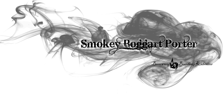
Label 6: Smokey Boggart Porter new style
Smokey_Boggart_III_768x324_svg.png


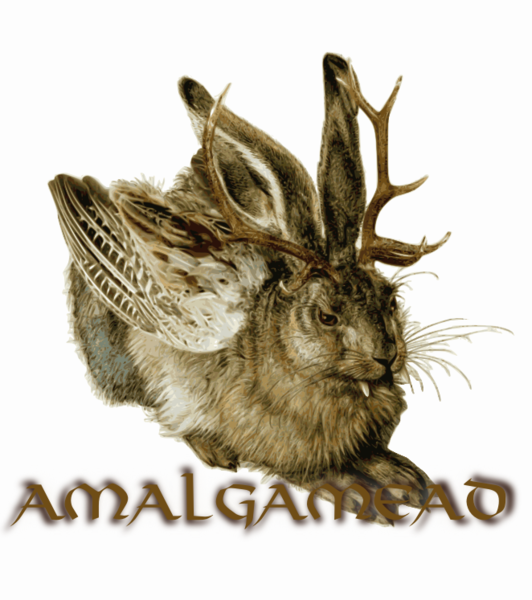
Label 7: This is the label for random meads. My brother and I like to keep a bottle of mead around and open. When we open a new bottle of mead we pour some into our amalgamead bottle. lol it is just a running joke about vikings drinking random mead
amalgamead.png


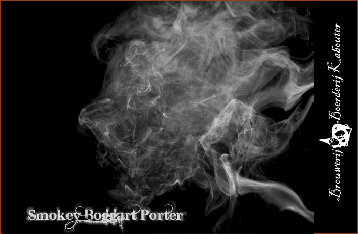
Label 8: And the newest Smokey Boggart label
Smokey_Boggart_V_700x459.png


Label 9: This is my stock mead label. I use different color paper and change the date to the brew day of the mead.
Mead_Label_400x405.png


So those are all my preexisting labels. Now onto some new stuff.....
 
Here is my first shot at my new IPA label

Sunrise_IPA.png


I brewed this at the beginning of a marathon brew day and watched the sunrise as I was mashing out. What a great day!

Any suggestions would be very welcome!!!!!!!:mug:
 
I really like the IPA label - I wouldn't change a thing. Is that label color close to the color of the beer?
 
I really like the IPA label - I wouldn't change a thing. Is that label color close to the color of the beer?

Thanks guys!

The beer is not that golden, I am not sure of the color yet, I just liked how vibrant that yellow was. It always changes and has to be adjusted once it hits the printer anyway though.
 
Wow, great job! I really like the IPA and the first smoked porter labels!! (The rest are awesome too!)
 
I like the 2nd, easier to read the text up top, although "o.g" and "abv" on both is a bit hard to read
 
Awsome labels! I like the 2nd Boggart label the best. Just a thought here, but have you ever thought about using a pic of Humphrey Bogart? On the Titania labels, I like the 1st one the best, it has more detail. I think the best of all is the one for your brewery, it really rocks. Regards, GF.
 
:off: What tv show are the gnomes from? Esp number 2?

The Gnomes are from a book illustrated by a Dutch painter named Rien Poortvliet. US Copy

I loved this book when I was a kid living in the Netherlands and the gnome thing has always stuck with me.

Also, David the Gnome was a tv series based on the book.
 
Last edited by a moderator:
I would suggest adding a little more 'awesome' to that, but I think it's got about all it can take.
 
I really like the 414 wheat. I've been meaning to do a spin off of the Goose Island 312, and living on the East Side with the 414 area code, well, it hits home. Well done on all.
 
Thanks for the compliment, but I have to admit to being a rank amateur. I don't make my own art, I just scavenge images and alter them to my purposes. None of my labels are original. The only thing I do is come up with simple ideas and then try to make them happen. I designed a lot of T-shirts for spending money in high school so the simplistic design thing comes pretty natural to me.

I really like coming up with the labels, it is fun! Literally anyone can do what I do after going through the very simple tutorials on inkscape.
 
My ONLY critique on the Pumpkin King label (and I'm really stretching here, because I think it looks GREAT) is that it is really going to be a b!tch to cut out multiple times...
 
You've inspired me to DL Inkscape. I've always used GIMP and it works great for photos, but I have problems with text using it. It's pretty difficult to get a good curve.

And Nice label
 
I'm not sure about this one. I like the idea, an aging or aged blond woman (or gnome in my case) is a good contrast to the typical busty blond or sexually charged logo that oft accompanies blonde beers. Not sure about the text, and I am not sure if this "pops" enough. Maybe it is just too blah.

I like the ambiguity of the title, I don't like my labels to be overtly straight forward.

Blonde_Upon_a_Time.png


Comments please! Comments tot he text, font, colors, or anything else. :tank:
 
I think the blonde upon a time is awesome. My only suggestion would be to put the time on it. The first time i read it i started looking for a time aged. Or did i miss it? :drunk:
Is it like a kids story once upon a time, I think thats what it might be. I age my beers for a long time so I dont think a non-homebrewer will think "time aged". They will be thinking about a kids story.
The colors are perfect I wouldnt change a thing.
The font is a little hard to read sober. So buzzed i wouldnt be able too :D
 
I like the idea and the woman but I don't think it blends well with the rest. Don't knwo what to recommend though. Maybe it's the sharpness of her hat against the oval....I dunno.

Can't read it very well. Have to strain to make the stuff out. and it seems crowded with the dueling BKB logos on her either side.
 
Maurice Sendak FTW

LOL. i don't know what it is about the FTW tag and maurice sendak being together, but it cracked me up.

BK, love the labels man, that's something I'm sorely lacking with and have wanted to try for some time. thanks for the inspiration.
 

Latest posts

Back
Top