Gearhead Brewery Logo

Homebrew Talk - Beer, Wine, Mead, & Cider Brewing Discussion Forum

Help Support Homebrew Talk - Beer, Wine, Mead, & Cider Brewing Discussion Forum:

This site may earn a commission from merchant affiliate links, including eBay, Amazon, and others.

GearBeer

Well-Known Member
Joined
Mar 4, 2008
Messages
727
Reaction score
4
Location
Clarkston, MI
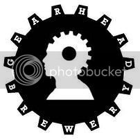
Here is the first iteration of my brewery logo. It's a little rough and some of the letters don't line up, but it reflects my idea pretty well.
Gearhead_Brewery.jpg

It's much cleaner when shrunk to avatar size.
Gearhead_Brewery_sm.jpg


Thoughts:
  • I'm not a fan of the font. I just used the PowerPoint default. I'd like to hear some suggestions for a good alternative. It needs to be simple, but something more angular would be better IMO.
  • Should I go smaller on the font?
  • What does everyone think of the hole in the gear?
  • Should I axe the shoulders to focus on the head?
  • Any suggestions/critiques?
 
I like having the full profile of the guy, but I would have the brewery name inside the gear, and not on the teeth. Its a little hard to read as is
 
I like it with the lettering in the teeth, but I think it definitely needs more tweaking.

Different font - something blocky and quasi-industrial, fixed-width. Kind of like the old label makers. The ratio of font-size-to-tooth-size needs tweaking too. More negative space in the teeth, less in the main gear body. A background or heavy multilayered border or some combination thereof might help too.

Also, I don't really like the "gearhead guy". But that's just one man's opinion.
 
Powerpoint? PLEASE tell me you didn't design this in powerpoint!

Good concept, like the idea. However I would go without the big black gear and focus on the head. The bigger gear just seems to serve as a vehicle for the text, and it way overshadows the coolest and most original part of the design (the head).
 
I would reduce the gear body by a little bit, and increase the size of the teeth. It may be an optical illusion but it looks like the gaps are larger then the actual teeth, which makes it look off to me.

As for the font, "Rockwell Bold" may work, as it has pretty uniform lines, I think.
 
I'll try the text on the inside. I'd originally envisioned the teeth as purposefully holding the letters (yes, Kilgore has me dead-on with that one) but maybe that's just too busy. I'll see about turning out a couple different versions, but my graphics skills are pretty weak.

Thanks BigK! I was planning on keeping it simple with the black and white, but a metallic finish wouldn't be bad at all! I'm not sure how I'd apply one; I'd have to move to a different program (Paint :rolleyes: ).

I didn't "design" this in PowerPoint but I "assembled" it in PowerPoint and saved it as a jpg.

I think you're right Ego, the gaps do appear to be larger. The gear is just a stock photo, I'll see if I can manage to modify it.
 
Ok, rapidfire text modification. I think I'll have to work something out using my home computer to get the text to wrap inside the gear. There doesn't appear to be an application capable of doing that on this one.

Rockwell (no Rockwell Bold on my work computer)
Gearhead_Brewery_2.jpg

Gearhead_Brewery_sm_2.jpg

Arial Black
Gearhead_Brewery_3.jpg

Gearhead_Brewery_sm_3.jpg

I'm thinking about perhaps running a wrench behind the image to help delineate where "GEARHEAD" and "BREWERY" are separated.
 
My coworker (also a brewer) was playing around with Says-It.com and we turned this out. It's much simpler and it really doesn't match my desire, but it's pretty cool in its own right.
seal.gif
 
Thwizzit,
That's GREAT! I didn't even realize I had 8 teeth on that gear. MrNate's right, the teeth do need to be bigger, but I'll play around with that a bit. Maybe I'll turn out my own gear on Catia.
 
Nice!! I like the letters on the teeth outer in the original logo. It's a good clean lookin logo.

Here's my suggestions (based on the first logo posted):

Try axing the shoulders, increasing the head a bit, and centering the
smaller gear/head pic so it looks like both gears are centered on the
same shaft.

Try increasing the teeth size a bit rather than making the font smaller.

Maybe add two more teeth for the bigger gear between the words
(between the B and G and between the D and Y) so its a bit easier to
read.

Cheers,

Jon
 
Hey, I have to do something with my degree. Service sure isn't exercising it!

I see you playing around with Jack and Jill over there...
 
I think it would look good if you continued the word "brewery" with the B being right after the D of "Gearhead" so it read continuously. Other than that I like the original, amybe i different font.
 
I'd left this be for awhile but I pulled out GIMP to put together a flier for my car show so I gave it another crack.

I took into account some of the previous suggestions (the ones I found easiest)...
15tooth12degv2.jpg

15tooth12degv2sm.jpg
 
Back
Top