Need a logo

Homebrew Talk - Beer, Wine, Mead, & Cider Brewing Discussion Forum

Help Support Homebrew Talk - Beer, Wine, Mead, & Cider Brewing Discussion Forum:

This site may earn a commission from merchant affiliate links, including eBay, Amazon, and others.

dukesbb37

Well-Known Member
Joined
Nov 23, 2011
Messages
129
Reaction score
3
Location
Durham
So im making my "homebrewery" label... and I like the name "Relief Pitcher Homebrewery" Because i was a closer in college....

Having trouble with a picture. I was hoping to find a pitcher of beer throwing a baseball... And i have to believe theres a image out there somewhere but google images was no help

Anyone know where to look, or whether theres online artist people who will make one for a few bucks?
 
i would look on other search engine's as well ....if you have the skill you can make it your self on photoshop or something but im guessing thats not a option for you. i have gotten thing like that made by an artist before but it was not cheap
 
I think your interpretation of the name is a bit too literal; may I suggest your college team jersey on a pitcher of brew, or the logo of your team with a baseball on a pitcher of beer? Side of the pitcher, top to bottom, logo, crossed bats, baseball, if you can picture it. Simple designs are always more appealing and memorable, in my opinion.
 
+1 to TheWeeb's comment.

I think your interpretation of the name is a bit too literal; may I suggest your college team jersey on a pitcher of brew, or the logo of your team with a baseball on a pitcher of beer? Side of the pitcher, top to bottom, logo, crossed bats, baseball, if you can picture it. Simple designs are always more appealing and memorable, in my opinion.
 
+1...rule number one of graphic design: you must find the essence of your subject matter. No need to be quite so literal.
 
+1...rule number one of graphic design: you must find the essence of your subject matter. No need to be quite so literal.

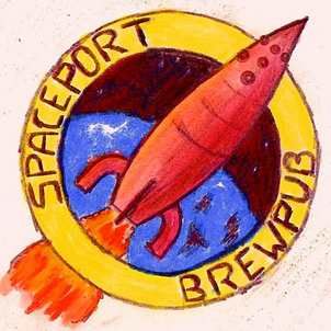
just to show a personal example of this, three logos, going from the first, hand-drawn rendering, to a literal interpretation of that drawing, to the final, simplified version. Most would agree that the second one is too busy; the third captures the essence of the place. That said, I think it could be simplified even further with dropping the wording in the outer ring and maybe loosing the center sunrise.

spbplogo0.jpg


spbplogo1.jpg


spbplogo2.jpg
 
Back
Top