Working on a new brewery label

Homebrew Talk - Beer, Wine, Mead, & Cider Brewing Discussion Forum

Help Support Homebrew Talk - Beer, Wine, Mead, & Cider Brewing Discussion Forum:

This site may earn a commission from merchant affiliate links, including eBay, Amazon, and others.

Tusch

Well-Known Member
Joined
Nov 14, 2007
Messages
1,379
Reaction score
14
Location
Spring Valley
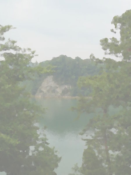
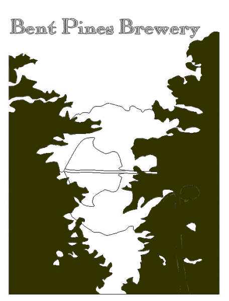
Well I have used this picture in creating a wine label for my blueberry/apple wine, but I wanted to simplify it so it could be used as my general brewery design. So I had some free time tonight so I started to create a "vector" image of it, though I was only using ms paint and gimp because I recently got rid of all other editing software.

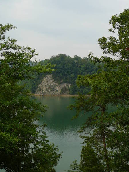
Here is the original
pics_422.jpg


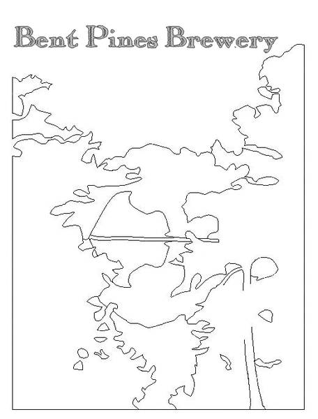
and here is the "vector" image
Vector_Pines_2.jpg


Any suggestions, warnings, critiques? I know it is overly simple right now, but this is just my first step.
 
I like to use the vintage paper background, so here is an initial version of that. I think with some more detail, to really discern what is what, and some grey scale shading prior to the vintage paper look, this could be pretty cool.

Vintage_Vector.jpg
 
Id remove the mirror image from the water or blur it so its obvious its a reflection On that paper it looks more like an old map of some strange land. "Beyond here be dragons"
 
I agree that the lines don't really look like much, especially if you haven't seen the original image.

I love to use the Cutout filter in Photoshop for stuff like this:

cutoutum5.jpg


Even still it's hard to tell what I'm looking at.
 
Fill the foreground (trees) with a dark brown, get rid of the reflection, and think about adding a little more detail to the rock face. But mostly, fill the foreground in with a dark color.
 
I intend to add some detail and shading to everything to really bring it out, I know you can't tell what anything is yet haha. Also, I see what some people are saying about the reflection, I will for sure get rid of the outline, but I may add some air brushing in to hint at the reflection like the original picture does. I plan on doing some sharp lines and shading on the rock face, but I am not sure how to add the detail I want back into the trees. I do want this to have an almost hand drawn look, so maybe I will just do that, do it by hand.
 
My .02 is that in your vector images there is just too much deadspace at the top of the label (above the rock/trees). Basically the perspective of the original photo makes it difficult to perceive your vision. The original is a pretty picture, but IMO needs to be edited, edited as a vector, or re-shot.
 
I think the vector graphic just looks like a bunch of random lines, can't begin to tell what it is supposed to represent without seeing the original image.

What if you did a Gimp "gimpressionist" filter which adds some abstractness if that is what you are going for. Then add a white layer with about 50% opacity to lighten it all up. This way you still have some color and can tell what it is but it is not overpowering.

Here is a quick idea:
label.jpg
 
I saw that too! I also see the rock/reflection as a big pimento stuffed olive. Seriously, ditch the reflection and put some blocks of color in there. Really, you should probably push the foreground trees outboard a bit and put something more visually meaningful in the center. Maybe something like this: Sand Pine photo - Kate Malone photos at pbase.com
 
I got a two-color map of a particularly craggy, rocky shoreline - maybe in Norway or something.
 
Well I was out of town for a week or so and I am glad to see all the responses while I was gone. My crappy internet didn't load that first filtered image, truello's, I really like that. That is basically what I wanted to end up at. I might try adjusting the color shades of the mountain versus the trees, so that after the filtering is done, you can better differentiate between the two.
 
Back
Top