Show Us Your Label

Homebrew Talk - Beer, Wine, Mead, & Cider Brewing Discussion Forum

Help Support Homebrew Talk - Beer, Wine, Mead, & Cider Brewing Discussion Forum:

This site may earn a commission from merchant affiliate links, including eBay, Amazon, and others.
OhCrap said:
Cheers
I tried to match the label style to the bottle. I prefer the hidden stash one as I got a wrong og reading due to 'tasting to much' but I estimated around 5% hence 'mystery ale' etc :)

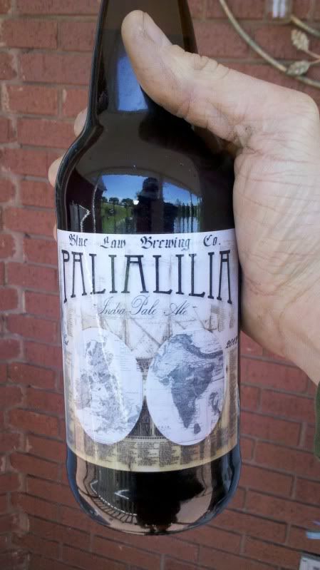
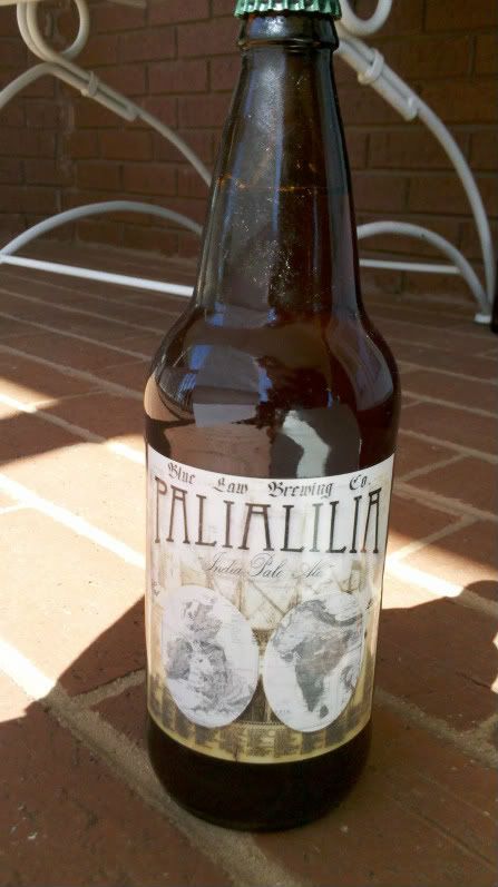
Small detail, but i like that your labels are cut away, and not just rectangle printouts.
 
whats the size we need for 12oz bottle labels? just to keep in mind when creating a label

Long neck bottles will usually accommodate up to a 3.5" high label, the stubby ones and flip top EZ Cap bottles only 3". Width isn't usually an issue since I think the diameter on the long necks is near 7" or 8". You should definitely measure the bottle you'll be using though (measure the flat vertical surface obviously), since there are a bunch of different bottles out there that have slight variations.
 
My first Apfelwein label, my plan is to keep the snow white theme going but getting a little more adult each time! :mug:c

snow apfelwein 2 copy.jpg
 
@brewbobaggins Love the FIF themed Hefe. I was freakin ecstatic when I found out they were back together and recording again. Basically grew up listening to them.
 
Hi, I just joined and I thought I'd show you guys some of the labels I've been working on

9QqVk.jpg


This was the first beer I made, a crappy kit beer, still tasted nice.

kA13U.jpg


Second beer, a Woodford wherry.

QG90x.jpg


And the third, a blood orange hefe-weizen.

I normally cut around the labels so that's why its a little messy on the outside.

What do you guys think?
 
iijakii said:
I like the artwork but I honestly cannot read that.

Is the bottom bit too hard to read as well? Or just the name of the beer? It being french probably doesn't help. Feedback is good :) thanks guys
 
The font may be a bit too squiggly. It's kind of whimsical, which goes with the fairy, but it goes against the other two fonts. I think if the bottom font was more along the lines of the above fonts it'll work better, and be more legible. Nice artwork and color scheme, though.
 
I cant make the bottom font the same as the top because its not legible at all too thin of a font disappears when sized down like that even with the shadowing inside and out. I really like the scripted font for the title as it is native French and the font is reminiscent of old french script. I changed the bottom font a bit to see if it suits you guys better lmk if I am on the right track here.

Originally, and for my family the whole bottom bit will be in french as well. I usually go with an english label but with this one I think my native french goes really well with scripted fonts.

LaFeeVerte2.jpg
 
PassionatePigBrewery said:
<img src="https://www.homebrewtalk.com/attachment.php?attachmentid=56551"/>

Great label. I take it this is just your stock logo. Do you have any brew specific ones?
 
Brewed up Charlie Papazian's Palilalia IPA as my first beer. Figured I'd try and make a label for it as well. Hope you guys like it! Have about 10 more days to condition and I CANNOT wait to try it.

PalilaliaIPA2.jpg


First bomber. Plain paper with laminate on. Plan on keeping this one.
2012-04-11_15-16-02_510.jpg


This one does the color's a little better justice
2012-04-11_15-14-55_302-1.jpg
 
My label for the clone of Stones 15th anniversary.

escon.jpg


Not too original, but I wanted to pay respect to the original label.

My standard label I use:

bulldogp.jpg
baltic.jpg


I usually just change the colors and text for each beer. Makes it easier when I been drinkin'.:mug:
 
Here are some of our labels. We seem to be getting better at them.

397343_320110544699817_320087338035471_962692_2062597244_n.jpg


403745_320110584699813_320087338035471_962693_539714526_n.jpg


395250_320110608033144_320087338035471_962694_2129382780_n.jpg


421691_346958148681723_320087338035471_1022012_1685861246_n.jpg


64913_346969418680596_320087338035471_1022028_1847295879_n.jpg


I don't have the label image, but here are some of our latest bottles all labeled:

380733_371665979544273_320087338035471_1086509_1054468229_n.jpg


We print up a few of the full labels for giveaways, and the rest we label with smaller labels that just include the main section in the middle, not pouring instructions or story section. You can see some of these smaller ones on the table in the last picture, and all the bottles you can actually see are labeled with this the small labels. We also make a matching neck label for each beer, which is really helpful for identifying the bottles when they are all down in a case box and the labels don't show. I LOVE the way my beer fridge looks now with all these labeled bottles in there. I swear the beer tastes better.:mug:
 
i use one label at this point, it's pretty generic, but the text on the right side of the label changes with the details of each beer, ABV/IBUs, contents of the grist etc.

the left side of the label is info on me, and where/how i brew each beer. comments on the process, batch sizing etc.
all of my beers are "card related" names. i host a home poker game, and my birthday is april second, and i jokingly refer to 4/2 as the "best hand in poker, play it like it's aces" so, people started calling me four deuce.

flush draw label.jpg


bad beat label.jpg
 
Brewed up Charlie Papazian's Palilalia IPA as my first beer. Figured I'd try and make a label for it as well. Hope you guys like it! Have about 10 more days to condition and I CANNOT wait to try it.

PalilaliaIPA2.jpg


First bomber. Plain paper with laminate on. Plan on keeping this one.
2012-04-11_15-16-02_510.jpg


This one does the color's a little better justice
2012-04-11_15-14-55_302-1.jpg

Super classy...love labels like this. Where did you get the images from?
 
Back
Top