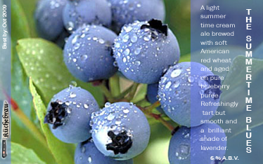
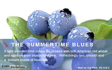
I like the first one, but I don't like the title placement. IMO if the title placement could be placed horizontally rather than vertically it would look better.
I like the first one, but I don't like the title placement. IMO if the title placement could be placed horizontally rather than vertically it would look better.
+ 1 on this, the 1st one rocks, but needs a horizontal title. I like the font too. The only other things that stuck out were the fact that "summertime" is one word; and I think I'd drop the word "puree" from the label. If you say "aged on blueberries," or "aged on blueberry puree," both are true, just the one is a bit more detailed. IMHO, I think "aged on blueberries" sounds much better, adds a slightly less processed, more wholesome tone/feel to it. Overall, a great design. Regards, GF.