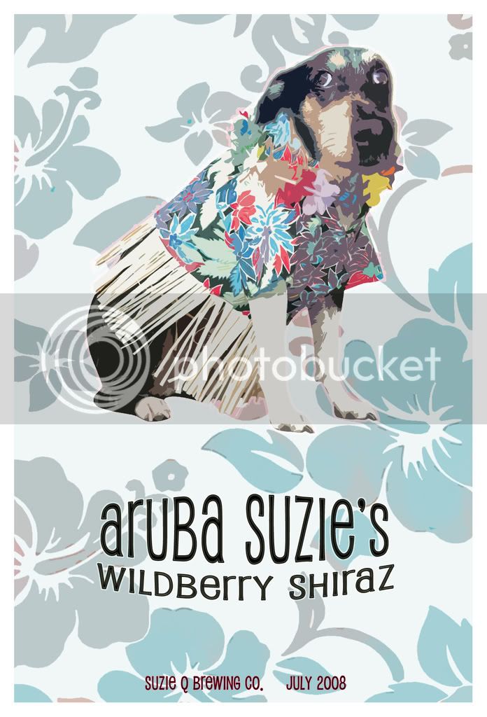
Excellent! The only advice I would have is maybe find a way (outline or brighten the dogs colors or something) to make the dog pop. It seems the dog blends into the background. If it was intentional for him to blend in then you should brighten the dogs colors in the center and fade around the edges.
I love your use of color though.. great design on all fronts! But make the dog more pronounced.
sweet label. i would say the "Aruba Suzie's Wildberry Shiraz" could be enlarged a bit, as there is a lot of negative space around it...but im just being picky.
That's one stylish dog! Though I'm sure he'll be a bit cold in Fairbanks wearing a grass skirt! I like the label also. +1 for adding a drop shadow to the dog to push him/her forward in the design.
Cool. Looks like you used the cutout filter on the image. Damn fine filter choice if ya did. Didn't think of the drop shadow idea but after reading some prior posts I +1 it also.
")

