Rip up this logo??

Homebrew Talk - Beer, Wine, Mead, & Cider Brewing Discussion Forum

Help Support Homebrew Talk - Beer, Wine, Mead, & Cider Brewing Discussion Forum:

This site may earn a commission from merchant affiliate links, including eBay, Amazon, and others.

Cape Brewing

DOH!!! Stupid brewing...
HBT Supporter
Joined
May 9, 2008
Messages
15,522
Reaction score
1,192
Location
Norton, MA
I figured Iw ould be the good guy and help our Maverick777 who was looking for some logo/label help.

I got a bit bogged down on just the logo but here's what I came up with... looking for a bit of feedback.


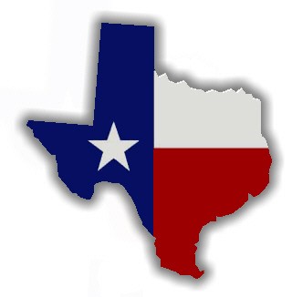
His last name is Bean... from Texas and a big Longhorns fan.

I think it might be a bit busy as a logo but it was my first shot.

Bean Logo.JPG
 
I kinda like the star and the state...I think the barley in the state is too intense, if you can knock it back a few degrees....and you need to make the words in the text stand out above the images more...thry a different color, or a drop shadow or thicker borders.....but the star inside the "o" is a bit too much....though that might not be so bad with tweaks to the text and the barley.
 
It sounded like Maverick wanted a picture of his uncle in the label. And the beer to be called "Uncle Kev" I think.

Are you creating a brewery logo for him?
 
That's funny you mentioned the star in the "o"...

I grabbed a map of Texas and that star was there for Austin... not sure why but I left it in.

When I laid "Ale Works" over the map, it actually fit absolutely dead center in the middle of the "O'... I thought it was too cool of a coincidence so I left it.
 
Logo version 2.0


I think the grains are now a little TOO light... it's almost tough to see what they are. I kept the text the same color intentionally because it's Texas Longhorn colors


(and for the record... i'm doing all of this in freakin' Paint and Powerpoint)

Bean Logo 2.JPG
 
I think the grain needs to go all together. Maybe a simple single barley plant or hop in the middle of Texas if you need something to go there.
 
The curving up on the Ale Works looks 'off' to me. Have you tried curving it the other way? (downwards) I think it would centerize and look better. YMMV :)
 
Been nine kinds of busy here at work today and just now got to sit down and take a look at this. I am digging the direction you are going with this. I also like the Bean Ale Works.... seeing how my bride has become a ton of help and supportive of my brewing. Hell, my 15 year old and 5 year old has even helped out .... so it is definitely a family affair.

A couple of extra stuff to throw at ya that may (or may not) help out some is maybe instead of the Hook'em use the Longhorn symbol :

Longhorns%20Logo.jpg


Also as far as the Texas map goes, maybe just use a Texas flag Map. Kind of like this :

texas-with-texas-flag.jpg


This may or may not help you out. Any way it goes I am tickled to death to have something. Cape you don't know how much I appreciate your help on this. Also I want to thank everyone who chimed in with ideas. I am very thankful for yall's input as well.
 
Whoa, remind me not to ask advice on graphics here. Too many cooks. Cape you did good. I think the ideas are great. Very nice of you to give Maveric a hand with this.
 
Thanks Alewyfe...

And nah... I asked for feedback and folks are just giving thier opinions, which is appreciated. Luckily, folks tend to give some good feedback without being jerks about it. You typically don't hear stuff like "Wow, that sucks!!" and like I was saying, I asked for people to rip it up...

I'll fiddle with it a bit more and see what folks think.
 
I think you should make the color of the star match the color of the Texas flag.

Blue on the left
White on top
Red on bottom.

Tim
 
Try making the state a solid color. Also texas state flag is blue on the left, red on the bottom and white on the top. I would change the star in the background to represent that. I like the star in the "o" better than with out.
 
That's funny you mentioned the star in the "o"...

I grabbed a map of Texas and that star was there for Austin... not sure why but I left it in.

When I laid "Ale Works" over the map, it actually fit absolutely dead center in the middle of the "O'... I thought it was too cool of a coincidence so I left it.
Stars in an O on a map usually indicate the state capital...;)
 
Back
Top