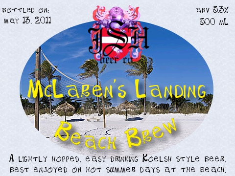
Me new summer beer label - please critique

Homebrew Talk - Beer, Wine, Mead, & Cider Brewing Discussion Forum

Help Support Homebrew Talk - Beer, Wine, Mead, & Cider Brewing Discussion Forum:

This site may earn a commission from merchant affiliate links, including eBay, Amazon, and others.

StittsvilleJames

Well-Known Member
Joined
Jan 19, 2011
Messages
505
Reaction score
44
Location
Stittsville
I just made this one up tonight. Took a while, but making labels is almost as much fun as making beer! Gimp is pretty powerful too, and I'm finally starting to get the hang of it (I think)

McLaren's Landing is where a good friend of mine lives on the beach, and because I'm off on parental leave until August, I plan on spending alot of days at his place over the summer.

If anyone has any suggestions for the label, or the neck label, or my logo, or anything at all, please let me know, I want my beer to look super cool when I'm hanging out at the beach with a bunch of people.

Thanks alot!

James
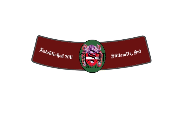
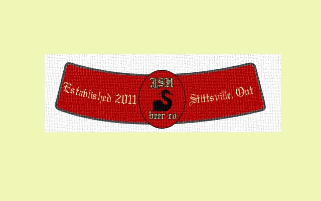
jshbeer_neck_label.jpg


summer_beer.jpg
 
Ready for the beach!

On the helpful critique side, there's a lot going on with your logo and I can't really make out what it is on the computer.
 
Ready for the beach!

On the helpful critique side, there's a lot going on with your logo and I can't really make out what it is on the computer.

It was supposed to be a family crest, but you're right, seems a little too busy on this smaller scale.

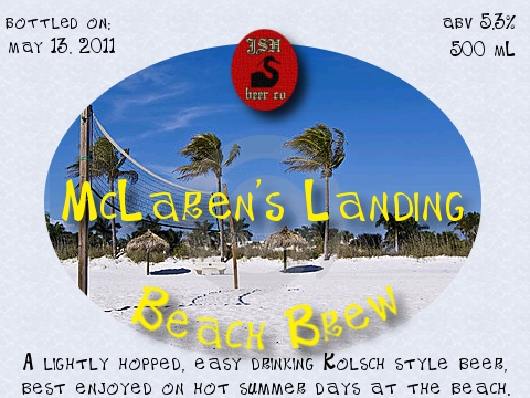
Here is a re-worked logo. I tried to make it look like it's on tapestry or cloth or something, and added a drop shadow beneath it to try to increase the depth of the picture (there are already shadows on the beer name).

Does this seem a little bit better?

jshbeer_neck_label.jpg


summer_beer.jpg
 
Like version 2 much better.

1 thing I will say is that I'm always a little iffy about using actual pictures on labels though. Maybe just use a simple filter on it to make it not so...sharp? Just a thought.

Oh, and how did you bottle this in that future, that's impressive. Is there some sort of device one can purchase to accomplish this? Oh, no, I get it you are just planning on celebrating my birthday by bottling some beer, well thanks:mug:
 
Version 2 is much better, well done!

I'm not trying to be negative, just my initial thoughts (constructive feedback): To me, the top collar doesn't match or blend well with the larger label. They look like they should be on two different beers. Maybe try different colors or a cloud-like background? I would leave the oval the same color top and bottom though. I like the yellow font but not really the black font on the main label. Also, maybe play around with re-wording the description at the bottom. "Lightly hopped and easy drinking. Perfect for a hot summer day at the beach." or something.
 
I second the comment about using pictures. I just feel that it looks unprofessional. That said, GIMP has an array of fantastic filters and it's really easy to alter it as you see fit.

Prost!
 
I actually would prefer not to use pictures too, but I couldn't find a clip art I liked and I can't draw worth beans.

I also agree that the top label doesn't match the bottom label, but that won't be a problem because I have decided the top label idea is not going to happen. Takes way too much effort to cut out properly, and because my bottles all have different neck shapes, they end up looking funny because they're all sitting differently and looking stupid.
 
Back
Top