Pennybacker Brewing Company Logo First Attempt

Homebrew Talk - Beer, Wine, Mead, & Cider Brewing Discussion Forum

Help Support Homebrew Talk - Beer, Wine, Mead, & Cider Brewing Discussion Forum:

This site may earn a commission from merchant affiliate links, including eBay, Amazon, and others.

zgardener

Well-Known Member
Joined
Dec 23, 2009
Messages
242
Reaction score
2
Location
Austin, TX
I finally settled on a brewery name and got around to making a logo. I'm a real noob when it comes to photoshop/gimp, so this was the best that i could come up with. Would love some constructive criticism and/or assistance in making this the best that it can be. I need to add a tag line, but not sure where, how, or what. I'm thinking something like 'Texas Born, Texas Brewed' again, any and all suggestions are appreciated!

PBC%20Logo.jpg


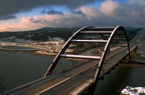
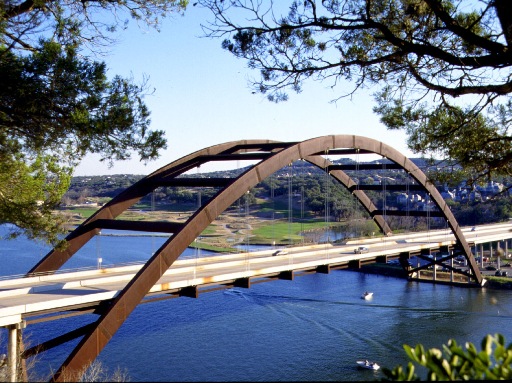
Named for the iconic bridge in Austin which I grew up right next to.
 
Neat image. I dont get the golden arches when I look at it. I would ditch the circle. inverse the image, let the style of the bridge "stand" more on its own.

The weak point I see after that change is the type. You have a lot of motion in the image already, you dont need the type to follow that line. Better yet, go against it. Bring up the size of the type so that it competes with the image. Not equal in size, but closer. Make the type interesting.

Its a cool graphic, dont hide it.

Jason
 
Back
Top