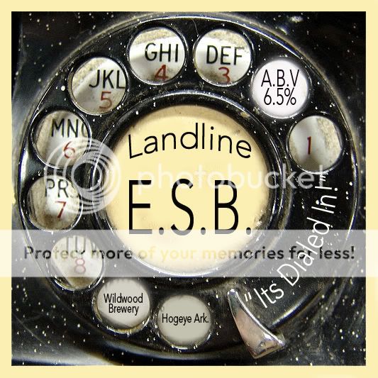
Very good concept, love the image of the rotary dial.
Take a second to make sure the background for your added text is the same background color as the un-edited ones, and take a second to make your text as thick and bold as the un-edited text. You may need to add a slight blur to make the new text seem less "super crisp". Reduce the size of "It's dialed in" to give it some breathing room as it seems slightly cramped, and treat the text the same way as above.
It is a very nice image, but the edits stand out because of slight differences from the original text in the image.
Good work!