Check out my labels

Homebrew Talk - Beer, Wine, Mead, & Cider Brewing Discussion Forum

Help Support Homebrew Talk - Beer, Wine, Mead, & Cider Brewing Discussion Forum:

This site may earn a commission from merchant affiliate links, including eBay, Amazon, and others.

brewskibob

Member
Joined
Jul 11, 2008
Messages
15
Reaction score
0
beermuggsy.gif


This is my first time working on a label. I'm using inkscape vector illustrator. What do y'all think, any suggestions?
 
the "Dizzy Hobitz" should be a different color...it gets lost in the background...other than that, it looks great!
 
thanks, Yeah I've been trying to decide on a different color for the text, but there are so many other colors in the icon that I can't decide what to go with. Maybe if i put a white outline around the text it would help.
 
A technique that I often use in Macromedia Fireworks is to copy-paste two or three copies of the piece of text that I want to emphasize. I take the bottom-most copy of it, and move it about 2 pixels to the right, and 2 pixels downward. I take the middle layer, and move it two pixels up, and two to the left. The bottom gets black coloring, the middle layer gets white or silver-grey coloring. Then the top layer remains in place, in a bright color.

I'll post an example in a few minutes. Fireworks is still installing.
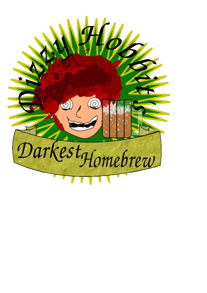
 
I was going to say the same thing as Chriso. Give the hobbit text a drop shadow, or better yet, a white outline(stroke).

Or mirror your banner below with one above and put the hobbit text in that. That'll create a nice visual balance.
 
Back
Top