New Apple Wine Label Design

Homebrew Talk - Beer, Wine, Mead, & Cider Brewing Discussion Forum

Help Support Homebrew Talk - Beer, Wine, Mead, & Cider Brewing Discussion Forum:

This site may earn a commission from merchant affiliate links, including eBay, Amazon, and others.

Alpine5654

Active Member
Joined
May 15, 2008
Messages
35
Reaction score
0
HI Again,


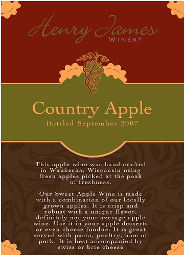
I'm working on a new Apple Wine label design. It needs
some formatting still, but how is the general design? I tried
to use fewer fonts this time, but I think it may need more
contrast.

2568008623_55868a4d84.jpg
 
I like the leaves, personally. I'd say bump up the 'Country Apple' 50-100% of its current size and go from there. Make it stand out a bit more.
 
I don't know if you need 'fresh' both places in the wording. "fresh apples picked at the peak of freshness". I'd go with 'apples picked at the peak of freshness', it has interesting alliteration, and nice imagery with the freshness bit. Other than that, colors are great, I like the fonts, very nice
 
Thanks for the feedback.

Yeah I just noticed I had "fresh" too many times.

I still have to work on some alignment issues and
spacing, but I think I'm going to use this background
as a template for all of my wine labels.

Also, the logo at the top, is that too hard to read?
should I reverse out the "Henry James"?
 
No, I think the Henry James portion looks fine. Aside from everyone else's suggestions, I think it looks good!
 
I think the Henry James part is my favorite part of the label.
I wonder if you could find some sort of apple graphic to take the place of the grapes though. It may look funny, but I'm sure that there is an apple that would fit with the theme of the label.

Looks better than any of mine, so I don't know if I would change anything or not.
 
I like the label... The "henry James" signature is very cool but I think it could use a little more contrast to make it easier to read. I also agree that the "country Apple" text could stand to be a little larger.

Also, have you tried different colors for the text at the bottom? I'm wondering if another color would be a little easier to read.
 
Back
Top