First Logo ... be kind!

Homebrew Talk - Beer, Wine, Mead, & Cider Brewing Discussion Forum

Help Support Homebrew Talk - Beer, Wine, Mead, & Cider Brewing Discussion Forum:

This site may earn a commission from merchant affiliate links, including eBay, Amazon, and others.

SAMPLER

Well-Known Member
Joined
Apr 22, 2008
Messages
537
Reaction score
6
Location
South Portland
Well, here it is. My first attempt at making a logo. I wish I had better computer skills but it's a start.

What do you think?

MFTH.png
 
I like the first fish in the second picture

I agree. One thing you might want to consider is to playing with the kerning of the text. It is slightly difficult to read some of the words, though I've seen much worse!!! Great start.
 
I'd use the first one and put another oval around it, allowing enough space to add the ABV and small description.
 
I like the first fish, a Mad Looking critter for sure. If this was a cabezon, then I'd say HECK yes he is pissed off.

My beer falls into a "happy / drunk Monk copying a text somewhere in Tibet" category. So more Buddhist and not angry at all. I mean really, if you are drinking beer and you are still mad, well, you are doing it wrong.
 
I like either fish. You can lose the comma between Portland and ME.
 
What about this one? I was thinking about filling in the white with red but figured I would leave it as is to start.

MFTH4.png
 
Good work so far! I'd relocate "Est 2001" or any other text besides your brewery name centered underneath and outside of your main oval logo. At the very least you won't be detracting from your fish, which is the focus, and you'll make that text more readable.
 
I like the first one. You may be able to find a higher res version of the pic, or take the original file and convert it/get it converted to to a vector image. Once vector, you could resize it as needed without losing quality. What program are you using?

And are you actually opening a taphouse/ Or planning on having several taps in the basement?:D
 
Am I the only one who likes the second one best!? :cross:

I don't know how important the name is to you, but I would prefer "Crazy Fish".......That might just be me too though. :p
 
I agree with what others have said about the first...that would be my choice. Some suggestions: the fish seems to be pointing down a little; I would try turning it counter-clockwise just a smidge. Also I'd try just having the fish image inside the circle, that way you focus on the image and you're also not trying to squeeze everything in there. Have the text on the outside of the circle (except the est. 2001 maybe) means you could make them taller and easier to read. You would also then have a logo that's just an image (t-shirts, bottlecaps, etc). The black on white background definitely looks better; gives better contrast between the image and text with the background.

It certainly look like a bad-ass beer!:tank:
 
Still working on it... my skills are definitely challenged!
Anyone who want to take a crack updating or modifing my start is more than wlecome ;)
 
I like the re-do of the first pic. Kinda hard to read the "est 2001", maybe a larger oval around the fish, could give a little more room on either side to put the est date on one side and something else on the other? Just a suggestion, great logo! Keep us updated!!
 
So I'm bored and I'm trying to figure this stuff out.

Here's another attempt.... still got some work to do but I figured I would post it to see if anyone had any input or suggestion. Maybe a magic the touch with the Photoshop editor.


Project5.png
 
How to work in higher resolution would depend which program you are using.

I generally work in Illustrator (vector based so resolution mostly doesn't apply) and Photoshop.

This I just found quickly on google as an example... when starting a document in Photoshop, resolution should be set to 300dpi, and the color mode set to CMYK since CMYK is what printers use.

http://designblurb.com/wp-content/uploads/2008/09/new-document-settings.gif
 
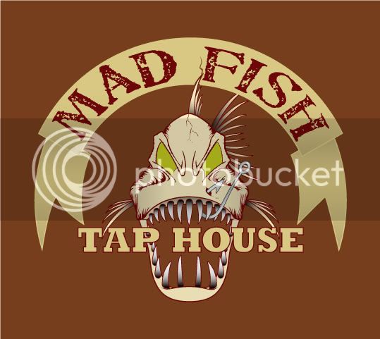
Ok so I allready had this fish done up, so I thought I'd toss some text on there and see what you thought.
Now the text could use some work, cause I did this quick like. I also made the background kinda close to what a bottle might look like showing through the image.

If you like/want the fish I'm sure we could work something out ;)
madfish.jpg
 
I really like the Tap House fish. The hook makes it for me. Very Cool. Perhaps a different color for the eyes?
 
I can change the colors in a matter of seconds. If sampler wants it we can work on it to his liking. If he doesn't then anyone else is free to use it.. just pm me.. LOL .. although I keep all rights to it unless discussed further. ;)

Thanks for the opinion.
 
I'm digging the green one. I say get rid of the drop shadow on the lettering. Also, having such a big arc on the lettering makes it a little hard to read.
 
Sweet!!!!!

Maybe a red inner eye?
The only thing I perfer would be an oval label with maybe a bouble line (outline) of red would seal the deal ;)
 
the same red(marroon) as the fish outline or a brighter red?
want the banner on or off it? I could also use a different font..
 
I would use the same rad as in the fish outline to keep a crisp contrast. I like the banner but is it possible to add a maroon layer/outline or shadow to it. Maybe the same to the "Tap House" font.

Thanks, it's awesome!
 
I did this just real quick but can change the eye color again. found the shock wheat I had done a while back and added it to the image. lost the banner.. thoughts.
madfish2.jpg
 
I think I'll draw a hop for the middle where the wheat meats at the bottom.
 
Awesome job!
I like the second one with the font from the first. Also, maybe we could fill in the mouth with a color too. I would keep the open mouth if I was making glasses so you could see through it, but if you could do both that would be great!

Thanks
 
Impressive...I have a little bit of photoshop experience, but you guys blow me away.
 
Awesome job!
I like the second one with the font from the first. Also, maybe we could fill in the mouth with a color too. I would keep the open mouth if I was making glasses so you could see through it, but if you could do both that would be great!

Thanks

What are you going to print them on? If it's just a white kind of paper we could add a colored background to the image this will fill in the mouth. If you have a way to make it on something clear then the bottle color will show through.

Impressive...I have a little bit of photoshop experience, but you guys blow me away.

Thanks this is done it Illustrator though. I don't use photoshop all that much cuase I usually design logos and you really shouldn't do that in photoshop. :mug:
 
Back
Top