a few more..

Homebrew Talk - Beer, Wine, Mead, & Cider Brewing Discussion Forum

Help Support Homebrew Talk - Beer, Wine, Mead, & Cider Brewing Discussion Forum:

This site may earn a commission from merchant affiliate links, including eBay, Amazon, and others.

Nova5

Well-Known Member
Joined
Apr 24, 2009
Messages
666
Reaction score
13
Location
Augusta, GA - Columbia, SC.
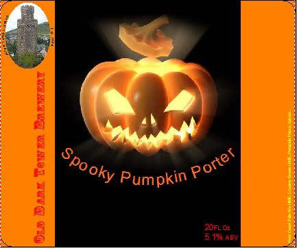
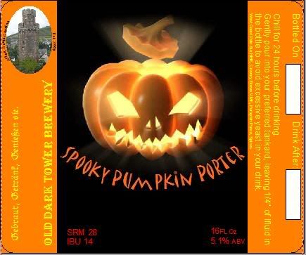
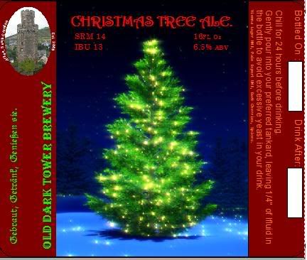
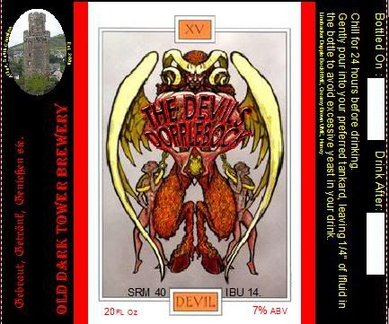
I like the way a standard label is so easily modifed to fit the needs of the next one. Quality isn't great as its a screenshot. Unusual letter spacing doesn't show on printouts.

2.
SpookyPumpkin2.jpg

3.
ChristmasTreeAle.jpg

4.
Devils.jpg

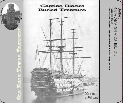
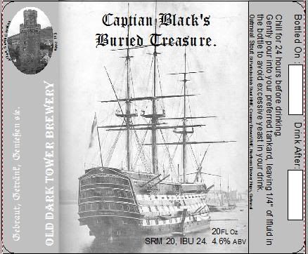
5. All black and white to fit the theme of old world sailing and "Captian Black"
Blacks.jpg
 
I love the labels. Especially the Devil's Doppelbock. Very cool.

If I have one critique, I am having difficulty reading the OLD DARK TOWER BREWERY on the left side of the labels. I think it is a combination of the color choices, and the font, but I had to squint a little to make it out. Maybe try a bolder font, and/or a more contrasting color.
 
I agree with the thoughts on the Brewery name. I think is mainly due to the hollow font allowing background color through. Noticed the same after a test print of the Pumpkin and Christmas ones. I have made a few changes to the right hand side, included a Bottles on and Drink on date spot including a whitebox for hand writing it in if i choose.

Left side now includes..

Gebraut, Getränk, Genießen sie.

German for
Brewed, Drink, Enjoy It.

Fits with the Tower as its a tower in a German town, and my heritage is half German.
 
Red was to hard to read against the orange. Yellow may fare better.
SpookyPumpkin3.jpg

The blue below the tree made the text hard to read. Moved it up and made it bigger.
ChristmasTreeAle2.jpg

Devils2.jpg

Blacks2.jpg


In general text will be clearer on a printout than modern day LCD screens (ol' CRT's were sharper!)

Label size is 3.5"x4.5"
 
Test sheet looks better, short of the spelling error of course. All are easily readable now with the solid font. The hollowness of the old font didn't define the lower half all that well. Thanks for the input.

I thought the Devil would fit a Dopplebock well since he's half goat. ;)
 
That looks great! And what a cool slogan too "Gebraut, Getränk, Genießen sie." Very formal too ;). I might have to include that in my toast when my friends from Germany come over this spring to enjoy a Dunkelweiß I plan to brew for them.
 
Reversing the translation on a word for word reveals Getrank to be Beverage. Hmm... Curse you babelfish!

I'll just have to ask my grandmother how to properly word it in german.
 
Back
Top