Short Snout Brewing Logo - Feedback

Homebrew Talk - Beer, Wine, Mead, & Cider Brewing Discussion Forum

Help Support Homebrew Talk - Beer, Wine, Mead, & Cider Brewing Discussion Forum:

This site may earn a commission from merchant affiliate links, including eBay, Amazon, and others.

ShortSnoutBrewing

Kwanesum Chinook Illahee
Joined
Oct 17, 2007
Messages
3,189
Reaction score
25
Location
Portland, OR
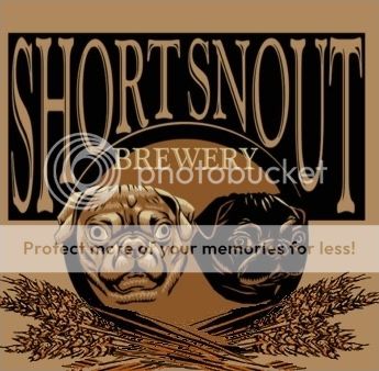
My bro-in-law is working on a logo for my "brewery". I wanted to get others opinions on it.

shortsnoutidealabel2.jpg


I'm thinking it's a little busy as it stands now. The hop cones throw it off.
 
Love it - but probably because I love pugs. I have a fawn and a black one as well - awesome dogs.

I actually like the color the hops brings - and think you should add a little more color to balance it out.
 
Here's one with no barley/hops:
shortsnoutidealabel.jpg


And one just loosing the hops:
shortsnoutidealabel2-no_hops.jpg


The first one just seems to be missing something. But the one with just the barley and no hops does too...But when you put the hops in it just goes the other direction. Maybe smaller hops? Maybe the two together in the middle under the barley?
 
I like the idea of losing the hops, the color throws it off. I like the barley but if you decided to lose that as well, I'd add Portland Oregon to the logo.

Short Snout.jpeg
 
Top heavy...that's what I've been looking for. You're totally right.
Don, love the idea of adding Portland, OR as well...Didn't even think of that one. Keep the comments coming, and thanks to those that have chimed in.
 
The layout is very top heavy because of the black background on the brewery name and the size of the font. I'd balance it by increasing the size of the barley or by placing a ribbon banner at the bottom and that's where the name of the beer would go.
 
I like the concept, but it feels very quick draft/prototype. It very well may be, but IMHO, the biggest improvemt could come by repositioning the text. It in no way feels "right". The "brewery" text feels like it is very out of place.

Working with circles and text can be tricky. I suggest you put SHORT SNOUT above the word Brewery. The below, use a half circle or beveled rectangle with the pugs mugs. Maybe it would work...maybe not. Just my $.02.
 
Okay, if I was at all unclear about my idea, here is a not-so-quick edit of the original. Didn't want to deviate much from the original, so I tried to keep many of the same elements but updated some stuff.
- Worked in a bottle cap silhouette instead of just a plain circle
- Different Font Placement and Font Type

Still really hate the circle in this one. If it weren't for two dogs, it could work out really well with some tweaking. Adios.

shortsnoutqw5.jpg
 
Thanks all for the comments, and even the reworkings of the logo. Much appreciated. I've passed all along to bro-in-law. He's reworking it and I'll share it once I get it.

Great thoughts and ideas by all.
 
What about getting the hops and barley worked into the oval behind the dogs as a muted background? To be honest, I really like the top-heavy feel, with the original font and everything. It's just the barley, hops, and "brewing" that seemed to be slapped on there.
 
Okay, more tinkering. I think I'm done for the night. Really just doing this for fun and experience. No vision really...just tinkering when it all comes down to it.

shortsnoutv3pw5.gif
 
Skunk...man, for just tinkering you're doing some great work! I'm afraid I'm going to have to start paying you soon or something!
 
What can I say.... I saw potential in what you had there and just wanted to tinker. Again, I knew it was a prototype, but I didnt want you to leave it where it was if something better could be had.

Oh, umm...got any ideas/input with what I've done so far?
 
Personally I love the last one you did. I'd love to stay with two pug faces as I've got two pugs and they were my "inspiration". But what you've done is great. Remained in the same color scheme but added some depth and more character to the whole design.

One thing that gets me with all of them is the fawn pug's eyes...I'm kinda surprised no one else mentioned it. He looks possessed! :)
 
Circles are tricky as Ive said. So my problem is trying to make two objects "fit" into an object with one center...the circle. I could put a BOTTOM "circle" with the other pug. Wonder how that would look......

Oh and what about the pugs eyes? I think I altered his look a little too much to look like a bulldog, but that's your call. I did want to make him look a bit.....menacing. You know, beer is "manly", especially craft brew, and so are.....labels! ha
 
You have the O's in Short and Snout evenly spaced off center. Why not try to use the dog heads inside the O's. This may help with the balance. Then you could use the space under for the barley and some text. You could even use a faded or distressed paw print in the background to frame in the barley and other elements.
 

No matter where you go, his eyes seem to...follow you...

[shudder]

Not to slam anyone's work or anything - 'cos it's light-years beyond anything I could do - but the dog is really creeping me out. It's got this crazy, hypnotizing "mesmer-stare" that's totally putting me around the bend.

Seriously. Look him dead in the eyes. Can't you hear him?

Can't you?!

Bob
 
No matter where you go, his eyes seem to...follow you...

Seriously. Look him dead in the eyes. Can't you hear him?

Hilarious. Glad the eyes are serving their purpose!

You have the O's in Short and Snout evenly spaced off center. Why not try to use the dog heads inside the O's. This may help with the balance. Then you could use the space under for the barley and some text. You could even use a faded or distressed paw print in the background to frame in the barley and other elements.

I dont think I fully understand what you're saying. But as far as the dogs heads as the Os, I don't really like that idea because when printed, the label is small and the detail in the dogs heads would be very minimal. Also the spacing of the letters would need to be altered, and I don't see it looking "good".

Great work skunk! What program are you working in?

Thanks a bunch.... Photoshop on OSX.
 
Turn the pugs to point out (side-on, away from the center), and give each one a St. Bernard style barrel ;-) ???

Or have them on the outside, facing in, framing the text?
 
Back
Top