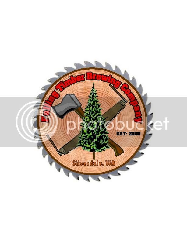
Working on a permanent logo so that I can get put it on Cafepress items. Let me know what you think. I know the GIF image looks crappy, but I have it available in other formats as well.
It's not too different from my previous one which is my avatar.
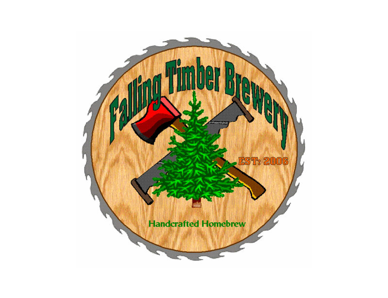
It's not too different from my previous one which is my avatar.


")