working on a label

Homebrew Talk - Beer, Wine, Mead, & Cider Brewing Discussion Forum

Help Support Homebrew Talk - Beer, Wine, Mead, & Cider Brewing Discussion Forum:

This site may earn a commission from merchant affiliate links, including eBay, Amazon, and others.

physast

Well-Known Member
Joined
Aug 6, 2007
Messages
199
Reaction score
1
Ok here we go.. I am working on a label and would like some comments and suggestions.

Here is what I have right now.

Click Here

Thanks.
 
Just a thought it would be nice if you keep most of the label the same and just changed the center section for different styles of beer you make.
Nice job!
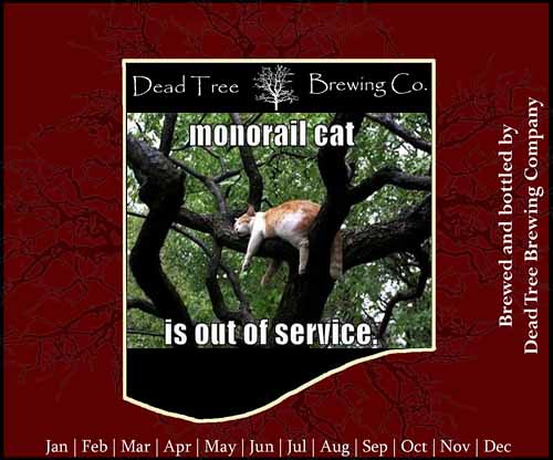
 
Just a thought it would be nice if you keep most of the label the same and just changed the center section for different styles of beer you make.
Nice job!

Thanks! I plan on using the center for the different styles of beer.
 
Is there a story behind the tree? Or with any tree?

I like the idea of the center being different for a different beer type. Maybe change the red background color for the different beers too.

Nice.
 
Der u go fix'd that fur u kthnx!

3672241485_afa64a13fe.jpg
 
I like it. However, the whole label looks very crisp and professional except the bottom curve of the center badge, which looks hand drawn. What are you using to make the label?

Also, just a personal preference, but I feel like the Papyrus font is way over used because it is one of the only "cool" standard font that comes on windows machines. You can find some pretty incredible fonts for free on the interwebs.... this is my favorite site:

Download Free Fonts @ Fonts4Free.net
 
I really like the label, and it does look very professional, but I agree with the bottom part of the frame looking hand drawn and not matching the rest of it. Play around with vectors in photoshop (if you've got it) to make a smoother looking curve.

Also, it might be overkill, but a neat idea is to have a % ABV scale on the left side, with low ABV on the bottom and high ABV near the top, with full and partial % distinctions (think an inch ruler). Then you could just snip/hole punch where that particular brew landed on the ABV.
 
Is there a story behind the tree? Or with any tree?

I like the idea of the center being different for a different beer type. Maybe change the red background color for the different beers too.

Nice.

changing the color of the background is a great idea! No real story behind the tree. My friend is a photographer and has been showing me how to use my camera. I had a picture of a tree and decided to use it. This was after coming up with the name.
 
I like it. However, the whole label looks very crisp and professional except the bottom curve of the center badge, which looks hand drawn. What are you using to make the label?

Also, just a personal preference, but I feel like the Papyrus font is way over used because it is one of the only "cool" standard font that comes on windows machines. You can find some pretty incredible fonts for free on the interwebs.... this is my favorite site:

Download Free Fonts @ Fonts4Free.net

Thanks I will check out those other fonts. For the center piece I am using Photoshop. I noticed the rigidness also. I am working on that.
 
I really like the label, and it does look very professional, but I agree with the bottom part of the frame looking hand drawn and not matching the rest of it. Play around with vectors in photoshop (if you've got it) to make a smoother looking curve.

Also, it might be overkill, but a neat idea is to have a % ABV scale on the left side, with low ABV on the bottom and high ABV near the top, with full and partial % distinctions (think an inch ruler). Then you could just snip/hole punch where that particular brew landed on the ABV.

I can't find how to use the vectors in photoshop? Probably because I have not played around with it enough yet..
 
Thanks! I am not sure I like the shape in the center anymore. Might try some new shapes and post them up.
 
Just a suggestion, but if you changed the shape of the bottom 'swoop' to look like roots, or redid the whole inside thing to look like a tree stump with roots on the bottom, that might look neat?
 
Just a suggestion, but if you changed the shape of the bottom 'swoop' to look like roots, or redid the whole inside thing to look like a tree stump with roots on the bottom, that might look neat?

That's a good idea! I will this..
 
I like the original one.

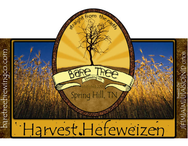
Put the beer name, brewdate, OG and ABV in the middle. Pick a font that matches the others.

Something like...

label1.jpg
 

Latest posts

Back
Top