GearBeer
Well-Known Member
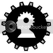
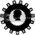
Here is the first iteration of my brewery logo. It's a little rough and some of the letters don't line up, but it reflects my idea pretty well.

It's much cleaner when shrunk to avatar size.
Thoughts:
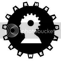
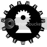
It's much cleaner when shrunk to avatar size.
Thoughts:
- I'm not a fan of the font. I just used the PowerPoint default. I'd like to hear some suggestions for a good alternative. It needs to be simple, but something more angular would be better IMO.
- Should I go smaller on the font?
- What does everyone think of the hole in the gear?
- Should I axe the shoulders to focus on the head?
- Any suggestions/critiques?
 ).
).