Show Us Your Label

Homebrew Talk - Beer, Wine, Mead, & Cider Brewing Discussion Forum

Help Support Homebrew Talk - Beer, Wine, Mead, & Cider Brewing Discussion Forum:

This site may earn a commission from merchant affiliate links, including eBay, Amazon, and others.
I find that late additions of steel are good for yeast metabolisms. ;)

The only thing I'd change on your label would be to angle the text in the clamp to make it look like it's laying on the same surface the clamp is on. Otherwise, I'm a big fan. Well done! :)


Thanks! That is a good idea.

The hoseclamp did add a nice aroma. Our hop addition bag (PVC 4" with hoseclamp and paint strainer, held by a copper cross beam) collapsed. So now it has screws below the hoseclamp for a nice ledge. Who would have thought!? :D
 
In the future I might go a bit more detailed, but I'm behind on my labeling. Anyway, this is a beer similar to Troeg's Hopback but with an overwhelming (and delicious) Simcoe flavor and aroma. It's also our first AG and it came out great! I was somewhat surprised at the notable difference in flavor.

Thoughts?

simcoe pale ale.jpg
 
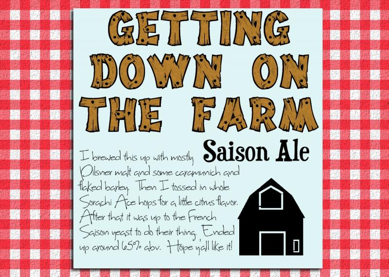
Cooked this one up for my Saison. Stole inspiration from Great Divide's Colette, not totally sold on my color scheme.


I love the center section! Great font. I like your "story" you tell, too! Looking good. I think trying out different patterns or colors would be good for the sides. What about a more fabric looking flannel? Or barn boards as a red texture?

j
 
I love the center section! Great font. I like your "story" you tell, too! Looking good. I think trying out different patterns or colors would be good for the sides. What about a more fabric looking flannel? Or barn boards as a red texture?

j

I fiddled with it a bit... what do you think?

farm.jpg
 
How doesn't taste? What would you compare it too?

It is quite strange. Not terrible, but definitely… cheap. It has that wheat beer finish, which is nice because the alcohol comes strong at first and would probably dominate throughout if not for that. It has a decent hop aroma, but the hops get lost in the flavor.

It is very strange to have an otherwise very generic wheat beer with this amount of alcohol. There is probably a reason that isn't common… but it was cheap, easy and there are plenty of Summer nights where the 7% ABV will be very important :p.
 
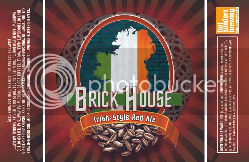
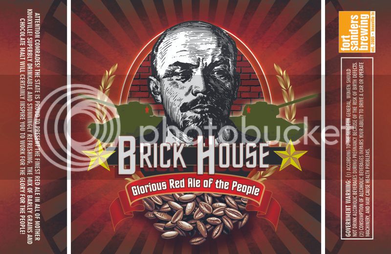
Made a label for an Irish Red, but I couldn't leave well enough alone. I ended up taking the idea of "Red" and running with it...

The Irish version:
BrickHouseIrishRed.jpg


The Commie version (lolz):
BrickHouseRedBottleLabel.jpg
 
Wow, nice design skills Zeus. That looks great!

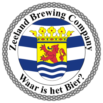
Here's something I whipped up this morning:

beer_logo.png
 
blizzard blonde.jpg
Newest label (ABV is a sample, I have to get the numbers at home tonight). Thoughts? I think I like my dog cartooned like this. Not a big fan of the pure photo version. (Starring Seamus, my Jack Russell.)
 
+1 on the stylized image of your dog- I think it works well, very ephemeral. Plus most people who have seen dogs in snow know exactly the kind of positive energy your jack russell is enjoying at that moment.

Not having seen the original photo, I can imagine it being a bit overwhelming. The illustration look lends it a certain timeless quality- almost Norman Rockwellesque.
 
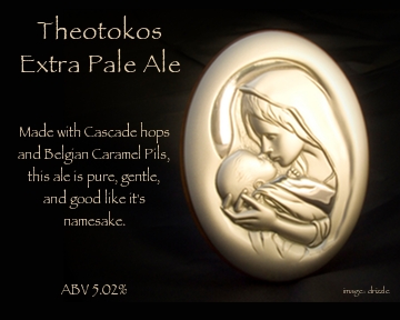
Here's my latest label. I bottled it with a friend on mother's day, so we decided to name it after the greatest mother of them all.

Theotokos Label -1 4x5 .jpg
 
I was going for a 1950s type diner theme with a sort of stamp/letterpress distress. ... The label is going to be permanent (more or less), with the black circle in the center being chalkboard paint where I can write the beer name/stats for that particular bottle. Thanks for any critique!

circlesm.png

This is great. I love the look and the idea of the chalkboard paint in the centre. Great work! :mug:
 
This is my first label. I just whipped it up kind of quickly because my brother is graduating from college on Friday and my mom is throwing a party at her house on Saturday...where I'll be debuting this batch of beer. Nothing crazy. Text-heavy because I just lack the time and talent to create something more graphic at the moment. A friend of mine designed the logo.

label 2 parts.jpg
 
...btw, I know there seems to be a typo in the side label. The word 'of' is supposed to be before 'fresh grains,' but it got hidden behind the QR code when I was formatting...I don't read sideways very well, apparently. I'm fixing it before I print.
 
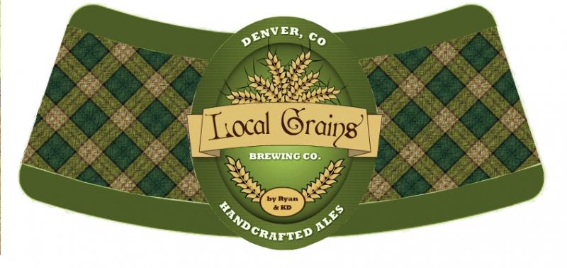
Not entirely original. I saw something similar on a graphic design website. A student submitted it for a design project for a fictitious bourdon bottle tag that would hang from the neck.

I saw it on TheDieLine.com
 
Also, just a thought...what about moving the QR code on the back label? Maybe replace the bottom spade with the QR code. Something about its current location just seems a bit off. Also, the bottom spades should be upside down, I think. Most playing cards do it that way. Otherwise, great!
 
Wow! There's a lot of artistic talent here. I don't have one ounce of talent for creating the art for labels. I don't even have a Brewery name.
You guys are great.
 
Back
Top