Agentaaron
Well-Known Member
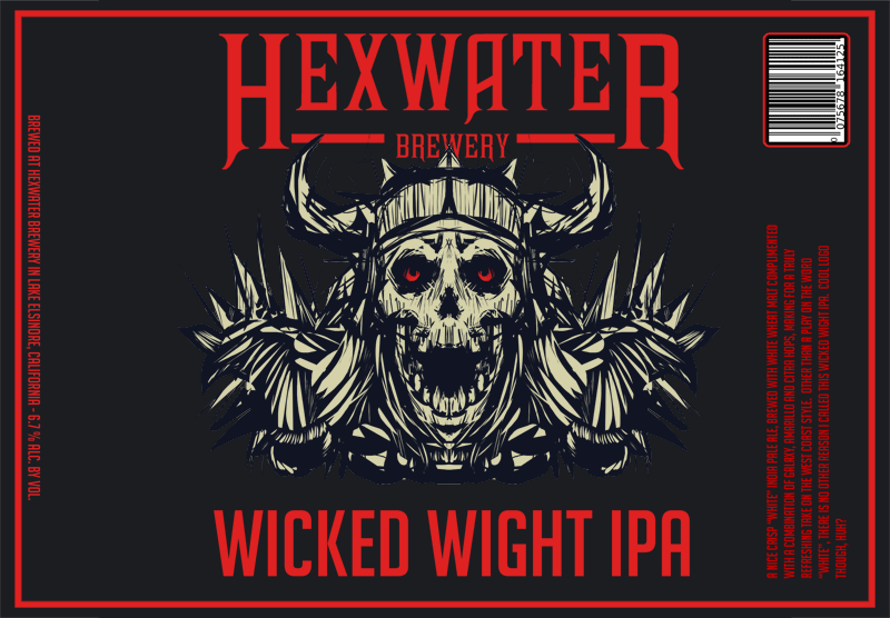
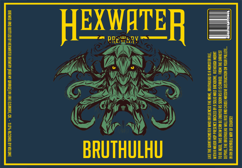
Working on a few labels...trying to keep them consistent...done in photoshop using borrowed ideas and elements from beerlabelizer.com
feedback is welcome and certainly appreciated...Cheers


feedback is welcome and certainly appreciated...Cheers