JasonToews
Well-Known Member
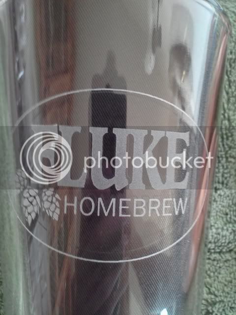
This is mine so far, still being worked on


Name of my brewery is is Rough Draught Brewing. Thoughts?
first shot at what may become something; hand drawn center scanned and then colored in with a very old version of photoshop. Critiques welcome!


I like it. Clean, simple logo. Eye catching.Name of my brewery is is Rough Draught Brewing. Thoughts?


I suggest trying various brush typefaces.
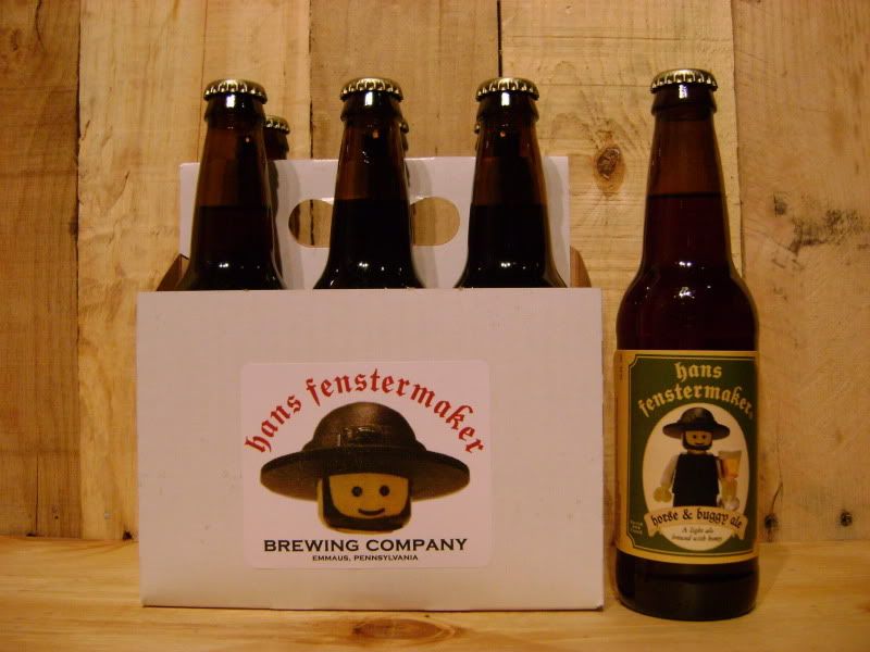
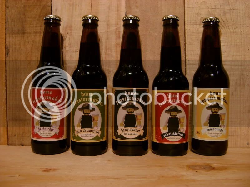
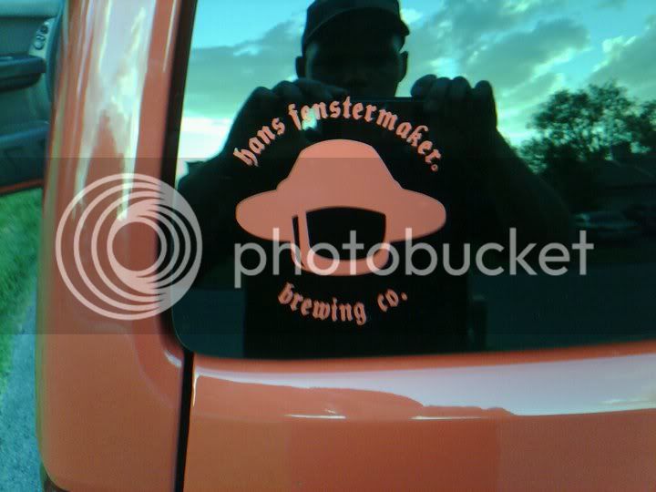
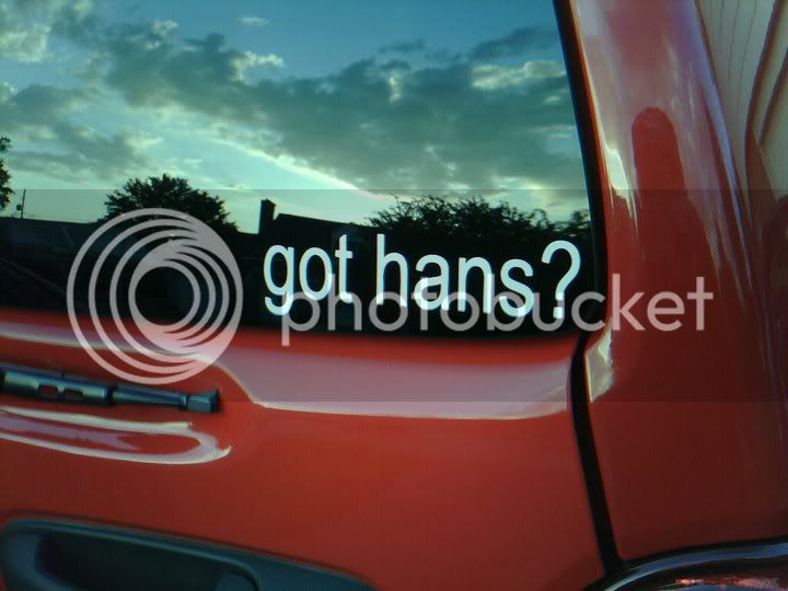
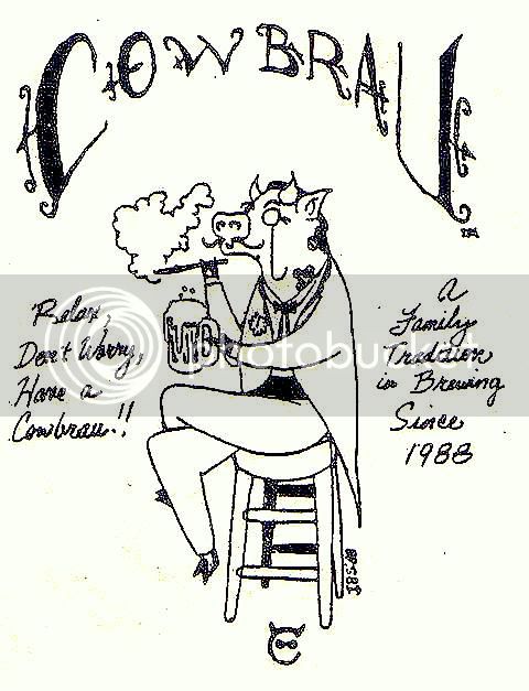
Hans-Brau is one of the best I have seen. Great work!
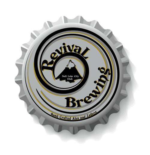
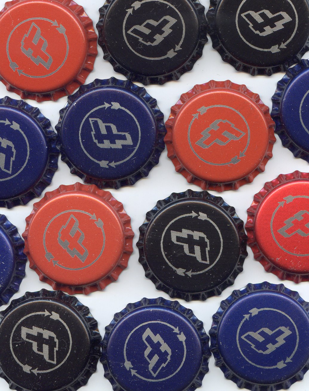
I had a few caps made so I created an icon but haven't progressed past that yet.


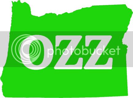
Little Ninja Brewery.
My logo is a work in progress right now.
If anyone has any suggestions to add.. Please feel free..

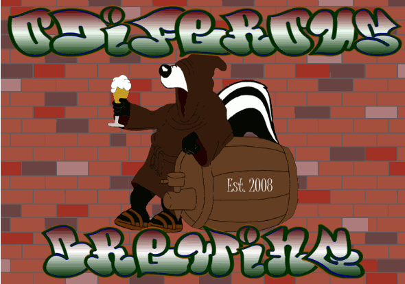
Its nice and simple, but honestly the first thing that comes to my mind is 'winery'. Maybe its the toned down colors and slender font. If thats kinda what you were going for, I like it!
Thanks for the input.. Not really going for the winery look.. I'll make some adjustments and repost..
Little Ninja Brewery.
My logo is a work in progress right now.
If anyone has any suggestions to add.. Please feel free..
Enter your email address to join: