I finally have someting GOOD!

Homebrew Talk - Beer, Wine, Mead, & Cider Brewing Discussion Forum

Help Support Homebrew Talk - Beer, Wine, Mead, & Cider Brewing Discussion Forum:

This site may earn a commission from merchant affiliate links, including eBay, Amazon, and others.

BigKahuna

Senior Member
HBT Supporter
Joined
Feb 3, 2008
Messages
5,902
Reaction score
64
Location
Eastern Colorado
Check this out. I finally have a logo and label that are actually good
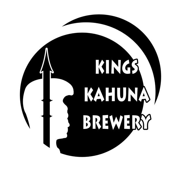
logo_3_copy.jpg


and the label:

Label_1_Tiki_copy.jpg


Thanks to
-McKay
 
Is Kings supposed to be plural or possessive?
Yeah, you need the apostrophe on that bad brutha (King's). I love the logo, love the style, now where's the beer?!!!!:mug:

Edit: has anyone noticed that at the current time there are more posts on this thread than views?! (4 posts, 1 view)!!! weirdsville
 
Yeah, you need the apostrophe on that bad brutha (King's). I love the logo, love the style, now where's the beer?!!!!:mug:

At this point....I'm thinking that we're going to take some artistic license here and leave out the apostrophe.

It's actually plural possessive, and kinda eludes the meaning of "The One That Teaches Those Who Lead"
 
The label is awesome! Excellent balance and color.

The logo just needs the font to be bigger... great design, but the lettering needs more mass.

My $0.02...

Eric
 
r2eng is on to something. Overall those are some fantastic graphics! Love the Tiki! I wouldn't change a thing about the brewery logo. I would find a way to make the central design of the label more prominent. Start by shortening the width of the label. Rather than a radial fade, try a linear fade. Another idea would be to have the palm trees bursting from behind the tiki logo. Also adding something else to the label on the end, comments or recipe etc. would help to complete the label. Not being too critical just offering a couple of improvements that could help with what little room for improvement there is! ;)

Schlante,
Phillip

Ps Are you polinesian? Sorry if I butchered the spelling, feel free to spell Scottish with one "t" :eek:
 
BK:

I love the label... post a pic on a bottle with all the "filler" when you have 'er done. 1st rate! Better than most labels I see on the beers I buy...

My comments on the logo come from a test I learned from a true design master: Look at any logo upside down and mirrored... if the balance and composition are still solid, you have a winner.

Eric
 

Latest posts

Back
Top