Mason's Brown Ale Logo

Homebrew Talk - Beer, Wine, Mead, & Cider Brewing Discussion Forum

Help Support Homebrew Talk - Beer, Wine, Mead, & Cider Brewing Discussion Forum:

This site may earn a commission from merchant affiliate links, including eBay, Amazon, and others.

BlackCoffeeandBourbon

Well-Known Member
Joined
Oct 24, 2008
Messages
46
Reaction score
1
Location
Monticello, FL
MasonWorkingLogo.png

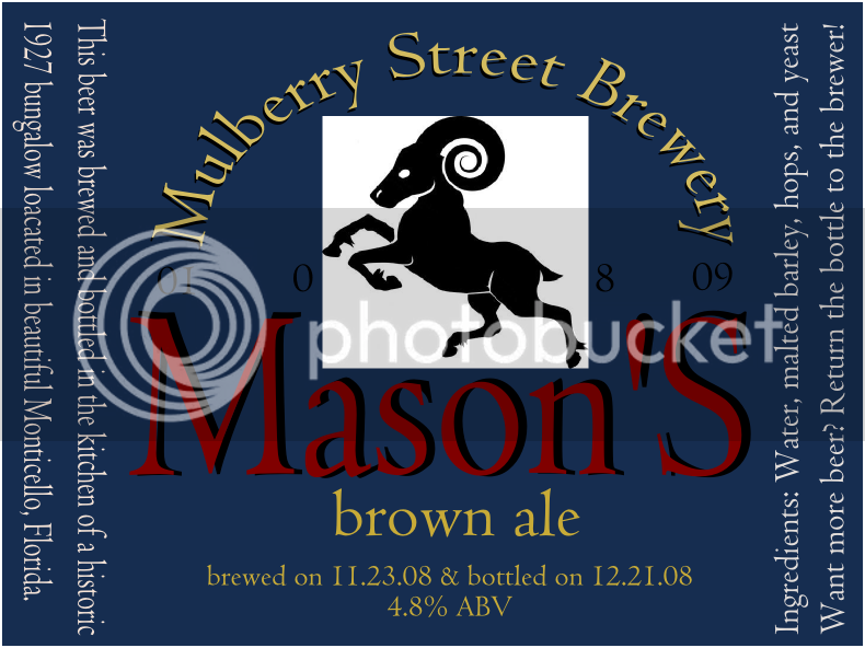
My final brew session of the year was back in November and the purpose of this beer was to brew it to comemmerate the birth of my first son, a boy we have named Mason.

Cleverly, I named the beer Mason’s Brown Ale and have been thinking about drawing a label for some bottles I plan to keep. Tonight I was messing around with Inkscape and came up with the above logo.

As for the main body of the logo, we did his nursery in a sports theme that uses a lot of brown and tans. However, also utilized are dark blues, maroons, forest green and some deep yellows and I incorporated these lesser colors into the wording and background colors.

The ram is pictured on the label as Mason will be born sometime in January (it’s supossed to be the 8th but I am not holding my breath) and as a result, will be born under the sign of Capricorn. I pay zero attention to astrology but was looking for a symbol that represented the month and felt this was a pretty good one.

The final piece of the label are the number 01 0 8 09 that are located under the word Mulberry, on the left side of the ram, on the right side of the ram and under the word brewery. These numbers represent his date of birth and depending on when he decides to grace us with his presence, will be adjusted accordingly.

Thoughts? Any and all comments are appreciated. :)
 
I like the color selection and feel of the label myself. One of the things that throws me off is the date. Seems to me it is a bit scattered across the front. I wasn't sure it was a date until I read your description. I'm thinking I would find a way to bring it together more. Also I would make the text description on the sides a tad smaller to separate it a little more from whats going on in the middle.

All in all I like it..... Also congrats on your future addition to the family....:mug:
 
+1 on Mav's comment. I was thinking the same thing about the date. Maybe put it right under the name of your brewery, curved text similar to the brewery name? Just a thought. And as for the text on the sides, I would either make the label wider, so as to separate the text from the main portion of the label, or shrink the font size. It does all kinda run together. Other than that, I agree, a fine looking label.

And again, congrats on the future new brewer!!
 
The first thing I notice when I look at it is the white background for the ram. My suggestion would be to change the background of the ram to the same blue background and then make the ram white. I also agree with the layout of the date from the previous posters. Other then that, I think it looks great.
 
Cool. Thanks for the suggestions. After doing a little more digging I learned that the symbol for a Capricorn is a Seagoat (WTF?) or a goat. Looks like I'll need a new symbol in the middle. I'll also try to move the numbers and see how it turns out. I can't wait for my new brewer to arrive! :)
 
MasonWorkingLogo-1.png

Here is a second version of the logo and thanks for the feed back! I substituted the ram for the seagoat, moved the date to above the goat and made the side text smaller.

Thoughts?
 
Looking good bro! I like how you moved the date around. Looks a lot better.....

Only suggestion I got is adding dots to the top date to keep it uniform to the other dates on the label.

Keep up the great work bud.....:)
 
Back
Top