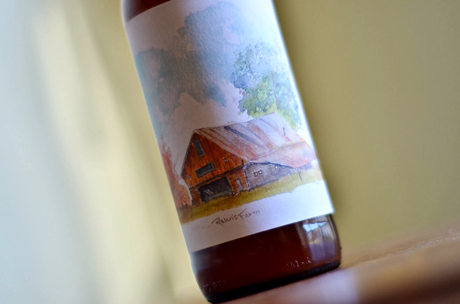
My Labels

Homebrew Talk - Beer, Wine, Mead, & Cider Brewing Discussion Forum

Help Support Homebrew Talk - Beer, Wine, Mead, & Cider Brewing Discussion Forum:

This site may earn a commission from merchant affiliate links, including eBay, Amazon, and others.

DisturbdChemist

I'm drunk 60% of the time, all the time!
Joined
Nov 22, 2011
Messages
9,801
Reaction score
2,802
Location
Between-the-keggerator-and-the-couch
After making this first one I have to make them for the rest of my Brews :mug:


Here is my first one for my IPA

Hop people IPA copy.jpg

MST3K for LIFE!


This one is for my Mead (JAOM)
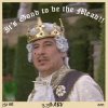
good to be the mead copy.jpg


Next is for my Apple cider
Apfelwien copy.jpg


I'm proud of how this last one turned out. Its for my apple cranberry cider
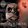
Invisible drunk copy.jpg

If there is anything I need to change please let me know or your opinions. What do ya'll think about my logo for my brewery? Right now it just dont in Paint. I'll Update this form for my future labels.

Cheers!
:mug:
 
the thing you have to remember is that when you print these things, you are limited by the dpi of your printer and the image resolution. you need higher res stock images or you will have artifacts in your printed image. right now, your image for the mead has alot of artifacts, that unless you created them when you shrunk the image for upload, are likely to ruin your printed label.

personally, i make my labels using the largest stock imagery I can find for the task at hand in a 300 or 600dpi file. For example, my latest label had printed dimensions of 3.75" x 4" but the ps file was 2250x2700 pixels at 600dpi so when it is printed, i lose little.
 
by artifacts you mean the fuzzyness? Yea that one for the mead wasnt the best picture and i found that one on the internet. I might just take a screen shot of the movie on my labtop to have a better quality picture that i can put in its place. They still need a little tweeking and just a few hours on Photoshop i made these. I'm not looking for a perfect looking label, I like the little imperfections but they have to look good printed so everyone can read whats on them. :mug:
 
"fuzzyness" are just one type of artifact as well as color imbalance issues.

if you are taking a cap of a dvd, it will be 720x480 so it still is on the small side. if you are taking a screen cap (ala print screen) you are limited by the resolution of your window size but then you are also going to generate artifacts from pausing the video.

just a word. i have found that when i am working on a project (label or other) and i have a particular image in mind...it is often better for me to change my design rather than compromise it when I can't find the right starter image.
 
Back
Top