paulster2626
Well-Known Member
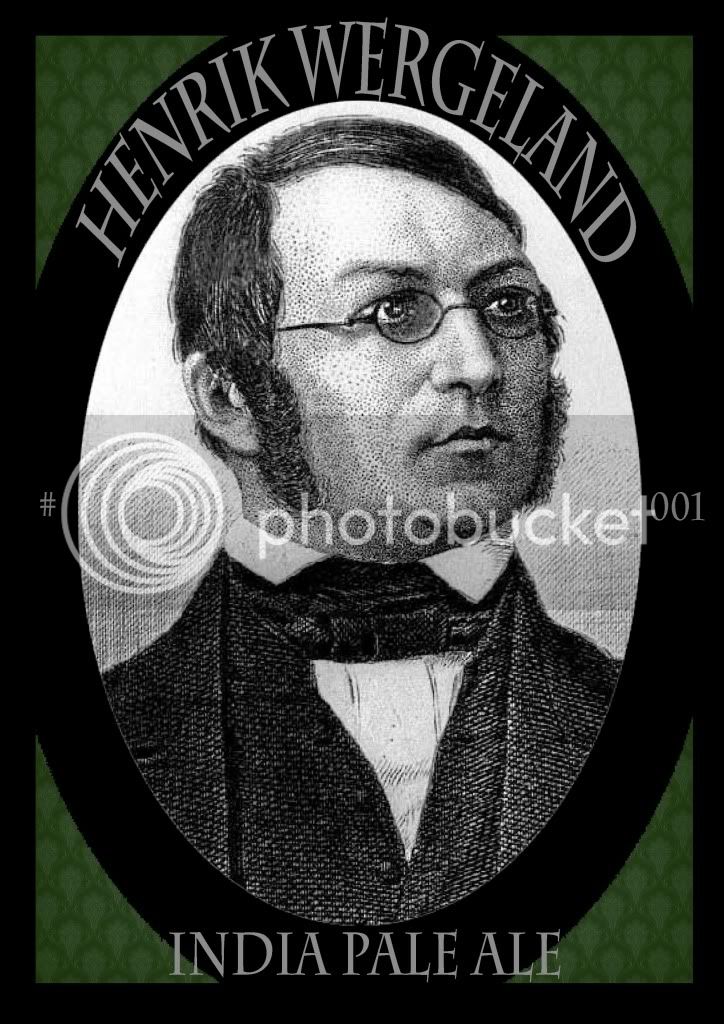
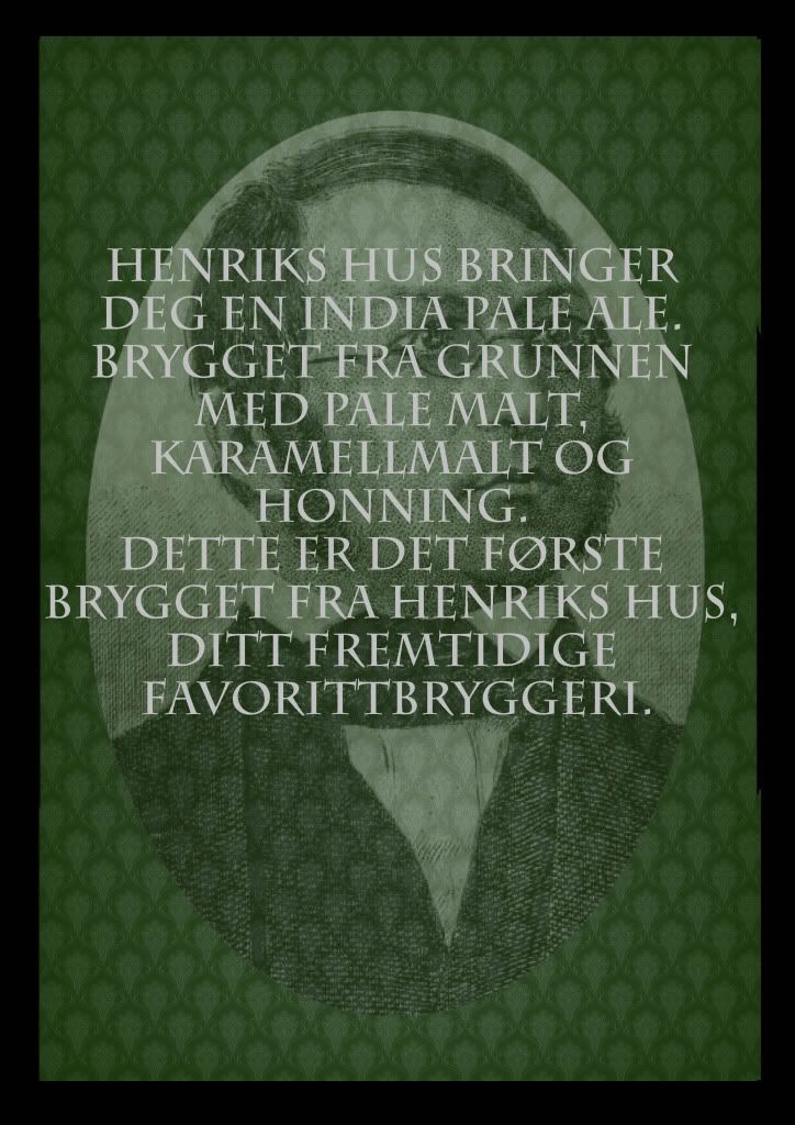
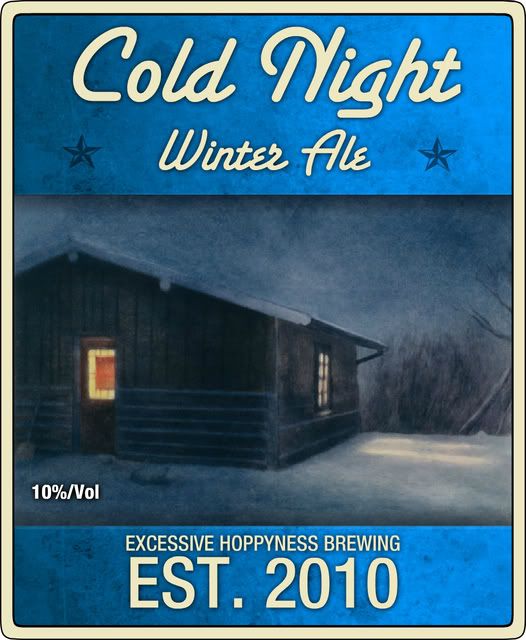
Zeal said:Did two more
EDIT: Make that three... They are still works in progress.
You need a logo or something to tie them all together. Maybe a badass-looking heart (is there such a thing?) with a crown on it. Perhaps a ragged looking heart with a barbed wire-ish crown would look cool.
You could try substituting your little logo as the "O" in King Of Hearts. It'd look neat.